visuallyのTwitterイラスト検索結果。 3,308 件中 20ページ目


NGL #9590 is the most visually distinct @AzukiOfficial currently listed below 20 eth
When building a personal brand - go for something distinct
Disclaimer: Not mine and I don't know the owner. If you know the owner and they're open to a trade + ETH I want him!


#yogiyarntailandme didn't enter The #Dad #Jokes #WallHangings
#DesignChallenge @ #Spoonflower but here is a look at my #favourites which I found either #funny #unique or #visually #outstanding . . .
https://t.co/YMeGIDFvW6
#Votenow
https://t.co/Qc0eVPSZl3


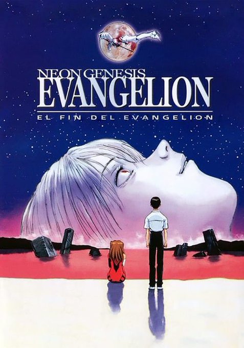
Neon Genesis Evangelion
This one also broke me 😅
This one I finished last summer, but it’s still so fresh in my mind I might have to wait a bit before I start the very recent Reboot
But visually this one was also so pretty


Hextober Day 23, the month where I draw a certain purple pair every day (or at least try to : D)
(ive always wanted to do one of these aaaaaa) (template from https://t.co/vqnQTqFFcL, visually edited slightly)


All of Cylcone’s scenes in #BlackAdam were visually so beautiful 😭


Enrollments are open for IDEA Academy's new course:
- Blender for Concept Art -
Speed up your workflow and create visually striking environments!
Taught by Industry veteran Davide Fabrizzi
Learn more at
https://t.co/Pr5nzfm05e


Wordless books visually tell their story plus each reader gains a different story - Australia has some gems in this form https://t.co/eMio6hI1zk


The 4th #Deity #NFTart for my #NFTcolletion is live @KodaDot Pls. check it out, a series of #art #goddesses visually interpreted in my own way. @bsx_finance $KSM $dot #PolkaDot #NFT #NFTartist #NFTCommuntiy #art #DigitalArtist
Link: https://t.co/d6usCpMpp7


I had to pause this ep just to find this shot of Dorothy bc I was so visually reminded of it


this is just a mock-up, but i wanted to test an easy style to do for comics. scratchy lines with some decent shading - not so simple but not so complex. enough to easily do a page or two. would something like this be visually appealing?


small alterations to adas' design, probably need more belts and chains to visually capture his personality - somewhere between King Diamond's 'Tea' and that Devil Trigger/Love Shack mashup ;)


✧*:✧*:・゚✧*:・゚✧
🌸🤍I play Genshin Impact almost every time, usually play it as a side game in which in case I don't feel like playing anything else.
🌸🌸Genshin Impact is visually beautiful and fun to play despite it's many incredible flaws.
🌸I'm also a Diona main <3

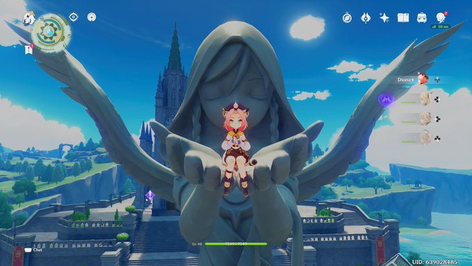

❄️🌼💮(Game 8.5, side game) GENSHIN IMPACT
💜💮Date of my purchase
Oct 18, 2021 - (PS5, digital)
🤍My Rating
3.9/5 - Pretty Good
A side game for me that came between Doki Doki LC+ (8) & Omori (9), Genshin as game 8.5. It's well, fun, has its flaws but it's beautiful visually.

The 3rd #NFTart for my @KodaDot #Diety #NFTcolletion is live. Pls. check it out, a series of #art #goddesses visually interpreted in my own way. $KSM $dot #PolkaDot #NFT #NFTartist #NFTCommuntiy #art #DigitalArtist
Link: https://t.co/NSL8INrswh

2nd mint @KodaDot is live. 😊#NFTCollection "Deity". A series of #NFTart goddesses visually interpreted in my own way. $dot #PolkaDot #NFT #NFTartist #NFTCommuntiy #art #DigitalArtist #goodmorning
LINK: https://t.co/IkkiiVZt1X ⬅️


@StarMunMun I think they copied my oc. visually they look different but they're both:
-named august
-red focused
-in a band
-bisexual & trans


Another one of my older illustrations of the forest spirit Klokić that I recently visually updated.
Enjoy~
#art #digitalart #digitalillustration #klokić #slavicmythology #childrensbookillustration


The show does a really good job of visually showing Bocchi's loneliness, and the voice acting really drives it home. They're really going all out for this and I am all in for it 😤