proportionのTwitterイラスト検索結果。 9,971 件中 193ページ目


for scale.......let's see how well i can keep up my proportion consistency as i try to jankily edit the upcoming designs into this lineup too....


I keep thinking about how silly it would've been if Cell Games Gohan had Goten's proportions, lmao


Day 1844: Saved! Boy this one has been a struggle to get looking right. Plenty of proportion issues whenever I tried to compare them. Finally got it to where I want it though! Definitely going to take a push tonight to stay on track though, but I think I can do it in the end!


@jaymisaeki @extyrannomon @Sorrowful__Owl *heres Zarrus & Natticus as gomas, tho they aren't much different ^^;
Natticus art by blitzdrachin, plush by magnastorm & DMO ss - body is proportional (like a sea lions), teal eyes, red mane, "virus" paw markings
Zarrus by @Doodlelot - smol, magenta markings & bright orange mane


This has always been my head canon look for samus, I always thought she should be a top heavy broad shouldered woman to mimic her power suit while showing it takes physical power to wield it…I also like the cartoony proportions
Not into gymnast bodied samus, doesn’t suit her.


@aimseytwo I love starry space themes, so I got you on that front! XDDD
I have a variety of styles, from cell shaded to more painterly to anything in between! I generally stay with more cartoon-ish proportions though!
Feel free to contact me here or on my art account @pastelsketch64


Trying to compare an old drawing (left)
with my recent draws (right).
You got any thoughts guys?
How's the proportions? lines? style?
Sometimes its good to hear from others.


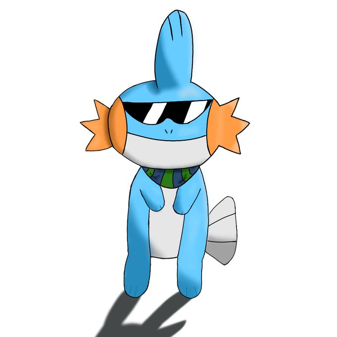
shhhh i know the proportions are weird as fuck i'll redraw him later but male glyph
aka
Hiero


Serious Question:
How proportionally/anatomically correct is this? https://t.co/OSeaUnP6ZJ


Sorry this isn't strictly kpop-related, just exoposing me and my friends as furries.
(Disclaimer: the proportions might be SLIGHTLY inaccurate)
@izumisenmx @purplejooong @Chichi80967205


I'm surprised at how many people do not know this. But, the artist for X8, Tatsuya Yoshikawa got his start in X7 and was simply drawing in his own rendition of the artstyle of the previous artist, Haruki Suetsugu.
That's the main reason why X7's proportions are actually "normal"


honestly its kinda sad that yashahime have a problem in keeping consistent artstyle in the animation, like sometimes riku make unintentionally funny weird faces, sometimes he looks cute, sometimes his proportion is way off, i wish they fix that in season 2


Timelapse
(i'm bad at proportion, so crop is the only answer xD)


@PlayAvengers this is a bit of a nitpick but I think you made Mark III's helmet too big & shoulders too small. I think I went a bit too far on the shoulders here and made them too big, but I think the proportions for the head definitely look better. It's just too big in the game.


15. Voltaire and Jalen are equally difficult, but for different reasons:
- Voltaire is difficult simply because of his armor and proportions.
- Jalen is difficult because I don’t draw quadrupeds often, and I don’t know how to draw wings well.


If people were proportioned the same way TFP Optimus was...


