FontのTwitterイラスト検索結果。 5,199 件中 197ページ目


Parfois j'ai l'impression de sentir quelque chose, caché derrière les apparences. Une présence, le temps d'un souvenir. Fleya et Fëanor font désormais partie de ce petit monde caché.
✨ https://t.co/mGTaon6j7t ✨
✉️ Ex-libris ou Carte postale
⌛ Fin : demain soir
#Tipeee




You can see the words “GIO” next to all the other “JOJO” in the first Opening
It’s referencing Giorno from Part 5 (GIO GIO’S Bizarre Adventure) (The same font is used on the official JoJo volume covers)


6. PSD File dan konten ekstra lainnya!
Saya akan share file PSD salah satu dari wallpaper dan halaman komik. Semoga ada yang bisa dipelajari dari situ :) Brush juga, font, atau breakdown naskah juga :)
Dukung saya yaaaa.. di https://t.co/NtbC8VKGdJ :)


Las ilustraciones de Marta Font parten del interés por la figura humana, especialmente el retrato, siempre cargados de nostalgia del pasado y aires vintage. Te animamos a que conozcas su obra: https://t.co/ngmnDMruUk #ilustración #arte #illustration #art

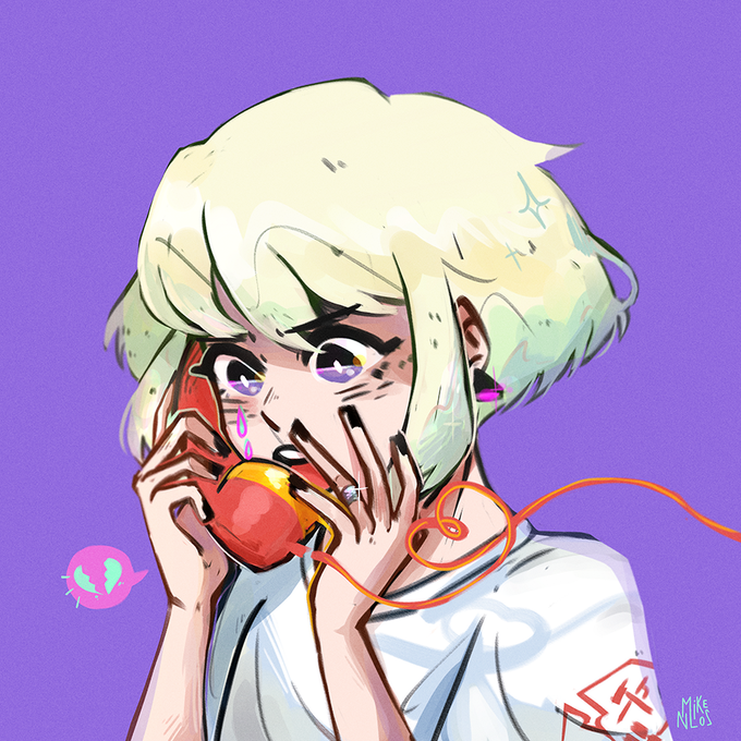

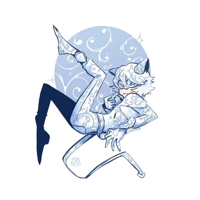

@Eupholie_ snouf mercii!!
moi c'est Mike et je fais surtout des fanarts de fandoms que j'adore et qui me font ressentir énormément de choses


@Eupholie_ Je euh snirff, je te vois tout le temps dans ma TL et je réalise que maintenant que je te suivais pas, pourtant tes pôtits dessins font tellement marrer 😭

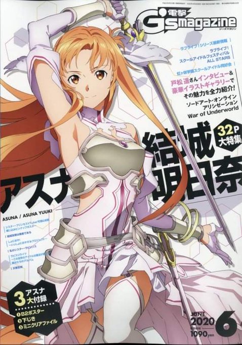
Dengeki G’s Magazine 06/2020
※Cover : Sword Art Online Alicization War of Underworld
※Webshop : https://t.co/YOxZgw8HCd
※B2Poster, Mini Clear Folder & Shitajiki
#sao_anime #SAO #ソードアートオンライン
Font: https://t.co/1LaRBCBZNG

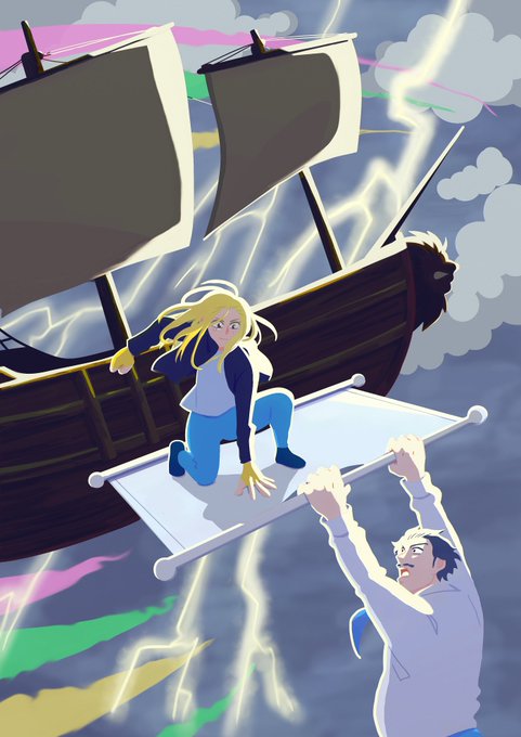


Illustration pour le roman "Chloé Landry", écrit par un ami ! C'est un roman jeunesse avec une héroïne attachante et des super-pouvoirs !
Dispo en lecture gratuite ici :
▶️https://t.co/emPtWYf4x5
▶️https://t.co/QNKKpHp5Y0
Les RT font plaisir !




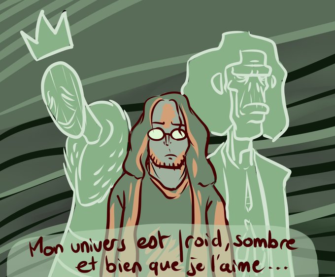


Bon ptite BD vite fait (j'avais besoin de dessiner rapidos), parlant de la façon dont certains univers me font revoir tout ce que j'ai pu faire. Certains arrivent à représenter la douceur d'un calin, la tendresse qui semble mourir en ce moment. C'est fort, et ça remue.


@SpoctorTech I made you some Album Covers based on you (1 for the font cover and the other for the back) I hope you like them.... If i need something to work plz tell me. Thank You. ACE'EM


(FR) Mais que font donc Moïra et Pralin à la préhistoire d'Aria?! Pauvre Pralin...
Disponible jusqu'au 30 Avril Minuit!
Lien de l'Illustration : https://t.co/foWeq4zlSE
Commander les Contreparties : https://t.co/PKX2Txdr33
#Tipeee #ExLibris #Impression #BD #Bookmark #Crossover


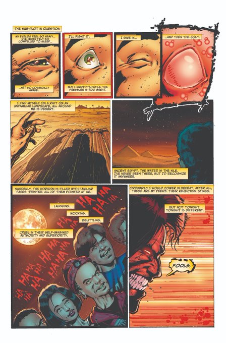
CYBERFROG: UNFROGETTABLE TALES #1 is the very first CyberFrog comic I published, black and white, back in 1994. @deafcolorist has colored it for the first time, and @eric_weathers was good enough to re-letter the book with the current Frog font! 🐸🤷♂️🌈https://t.co/46zgC1XD6z




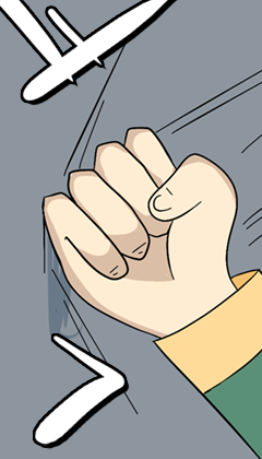
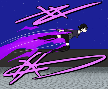
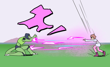
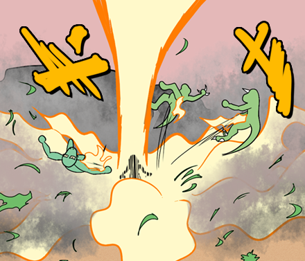
I started doing this weird thing lately where I do scribbles with dark filters to invoke sfx, not sure if I like this, but I didn't like just font to invoke sfx either. I'll be trying something new next chapter.
- N.K


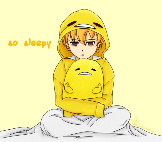
6. I used texture brushes for the hoodie, plushie, and the blanket. Lastly, I downloaded the gudetama font for the text and also made some color adjustments.
I finished it at 10pm on the same day! Yay!



Designed a logo for the Galar region.
I feel like I overdid it, as some of the other ones look super basic now? lol
(also changed the font I used for all)
Still not happy with the Kalos one, but no new ideas for it still.


Which is why I'm saying this cover screams xiao zhan. Because it's a combination of both his art and design. The brush strokes in the heart complement the clean font and minimalism. It works.
It just /screams/ xiao zhan to me. And it's so fitting for a personal song like this.