CONTRASTのTwitterイラスト検索結果。 198ページ目


contrast with this serene #wwx from a montn ago


@KaijuQgle (Hey that’s cool, plus he is neat and he does sorta fill an RF spot, with his green+black suit contrasting Bart’s red+white-yellow suit)

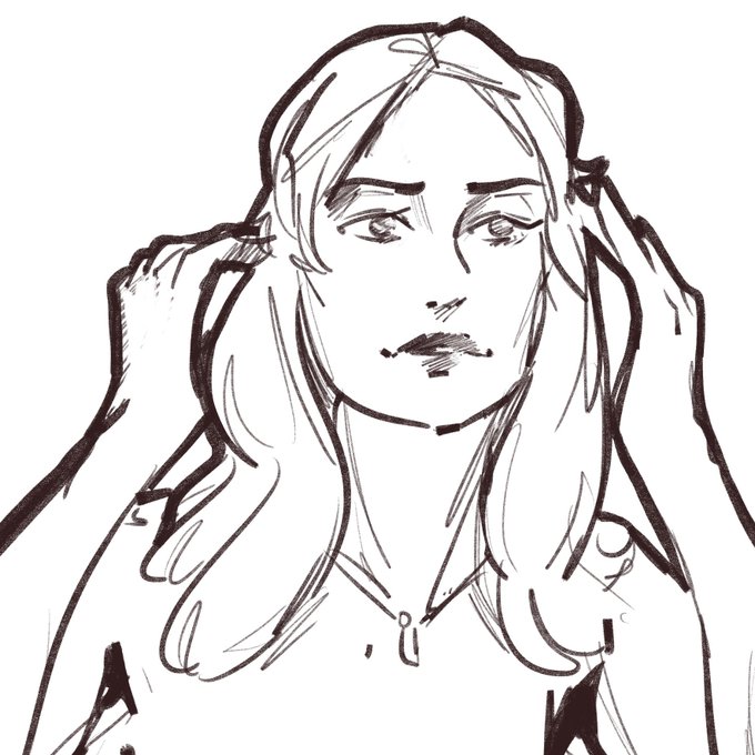
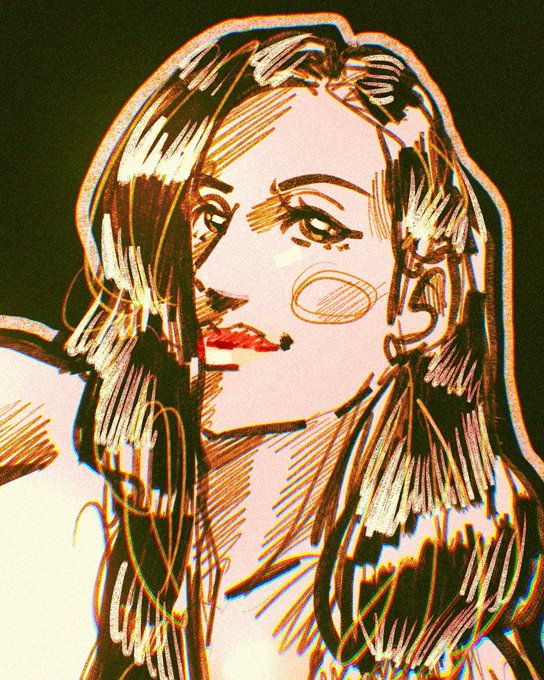
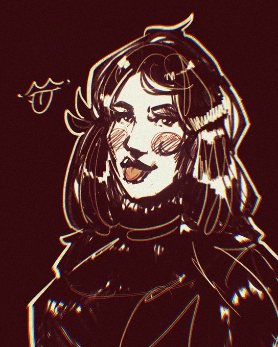


[Color Contrast - Scarlett Oakre]
❤️The Magician of RED❤️
Happy Birthday @KarotteRave !!
Thank you for being one of my bestest friends and fam! More love and power to you!


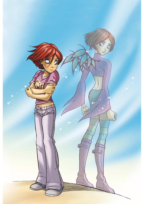


dan alone .. this design just screams y2k with the low rise jeans boot-cut jeans, compare and contrast with other protags from that era like will vandom


Sample screenshots of my remastered version of episode #1 of DIC's Sailor Moon classic dub: "A Moon Star is Born". Thanks to @ThomasFan1945Pr, I was able to restore a lot of the original colours without blowing out the contrasts. Full episode coming soon! #SailorMoon


A lot of my recent art is darker*, and it’s because I finally got a new tablet which handles colour and contrast better.
Huge recommend for the Huion Kamvas Pro 24, it’s been brilliant!
*in values, but yes subject matter too haha


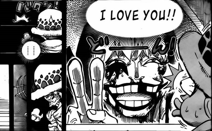
En muchos casos, expresado con un realismo que nos hace ver con seriedad sus problemas e injusticias. Oda logra contrastar estos momentos con las personalidades divertidas de los mugiwaras, lo que aliviana estas situaciones tan serias.


If I ever talk about how long I spent on a drawing it's bc it's the most work if but into a piece and it took me a long ass time. Like look at the stark contrast between times
The third one was an abomination and the canvas size was so big my phone would slow down and overheat😭

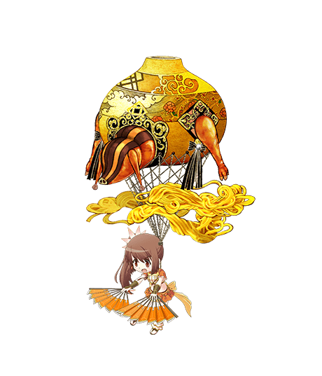
Yu Hong, Doppel de Tsuruno yui:
El Doppel de la armonía. Su forma es jamón. El dueño de esta emoción está bastante insatisfecho tanto con la apariencia como con el comportamiento de su Doppel. En contraste con sus propios deseos de lograr grandes hazañas a través de su arduo-->

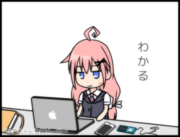
色がくすみがちなのでコントラスト補正とセットが良いかも。
% convert in.png -define convolve:scale=60,40% -morphology Convolve Gaussian:0x3 -contrast soft_blur_contrast.png


The only thing I am sad about is that in the new visuals they didn’t differentiate their civilian looks vs their Mew Mew looks enough like the OG. Where their eyes and hair color are vastly different. I respected that contrast cuz most cuz that’s what made TMM stand out to me.

Like dang. That contrast. I like them both for different reasons. But for me the most fun part is just watching my fave authors and seeing their art evolution. It’s just really fascinating for me.


wanted to do some comparisons on how the joint's were done on the different versions of ironman's suits,
and i gotta say...
quite a Stark contrast


@Tysmurph You know how many times I've been told to remove that from designs and commissions :(
Most people have it and it is actually a nice smooth contrast in spite of its actual contrast because the eye knows to see it.

@LArtdvc @InfinityArk Hi! Tito here, nice to meet you 😃😊
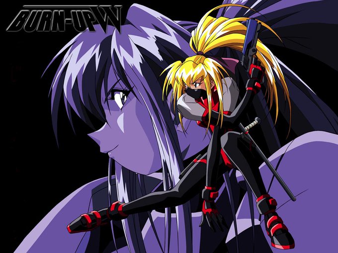
The colouring in contrast it's a characteristic of the 90's colour style. It's not an Obari signature colour tho. Even Kou Kawarajima, Kazuto Nakazawa, Tsukasa Kotobuki, or Toshinari Yamashita used to colour like we're doing now.


With that basic structure in mind, I think it's easy to observe in splash art style how much detail frequency and material contrast is invested into the focal areas - usually around the champion's head and source of power - in this example, Graves's portrait and his gun.