ContrastのTwitterイラスト検索結果。 10,510 件中 200ページ目


Mareeta doodle. I want to highlight the contrast between her clothes and her jewelry based on that one old portrait of hers
#FireEmblem #FEH #Thracia776


2014, agenda de première
J'aime toujours beaucoup cette illu, je la trouve douce, les filles sont plutôt heureuses. Gros contraste avec l'état dans lequel j'étais à l'époque x)

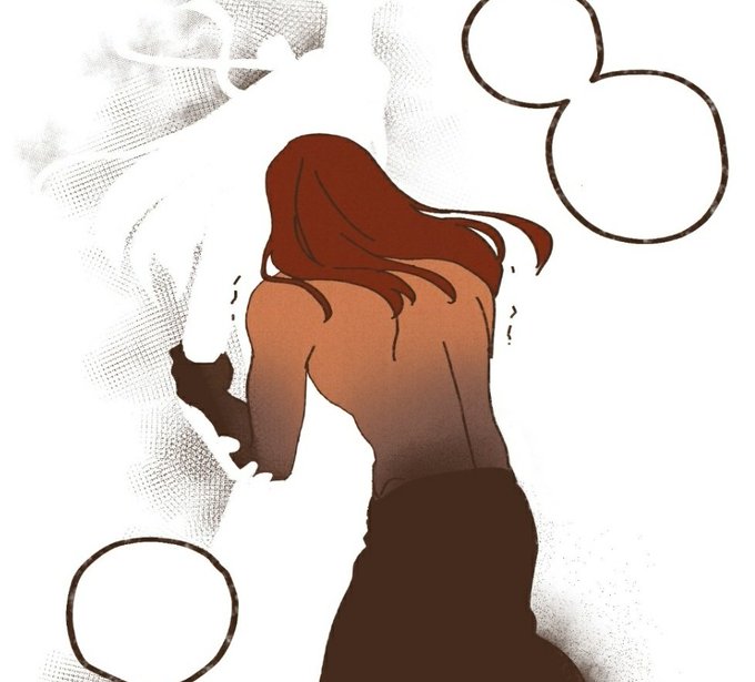


Seth is shown to be such a touchy person in the past, and was always physically affectionate Nephthys whenever they were together. But yesterday he was holding onto her out of desperation and being utterly terrified rather than love, and the contrast HURTS.


~{ROL ABIERTO}~
Puede ser escrito o dibujo
Te encontraste con un chico de primero bastantes llamativo , te animarías a hablar y pasar bien esa noche de fiesta ?
Rolaunquenoterminesufichqporquesi
#RoyaltiesInstitute


once again I'm being predictable, talking about female mentorship, Kylo and Rey as contrasts and parallels again, yelling about finnrey, and doing my damndest to love Rey and Poe in this movie


Esta es la única escena que no quería que corrigiesen, es mi shot favorito de todo el episodio por lo simplista que se ve y por no ser on model, pero era de esperarse que lo hicieran, contrasta con otros momentos... Al menos ya pude disfrutarlo en la emisión. https://t.co/b40mW0EyHM


Watercolor #painting of the dramatic #storm sky, titled "Sky No. 6'" (30 x 40,8 cm, 2017). I just love those contrasting colors!
You can find the original watercolor and signed art prints of it here:
https://t.co/BO4WBzUoE0
https://t.co/cSVqObweKm


Declassified doodles for my #dnd campaign. Truly my encounters are a land of contrasts. Which one you could like to ✨experience ✨

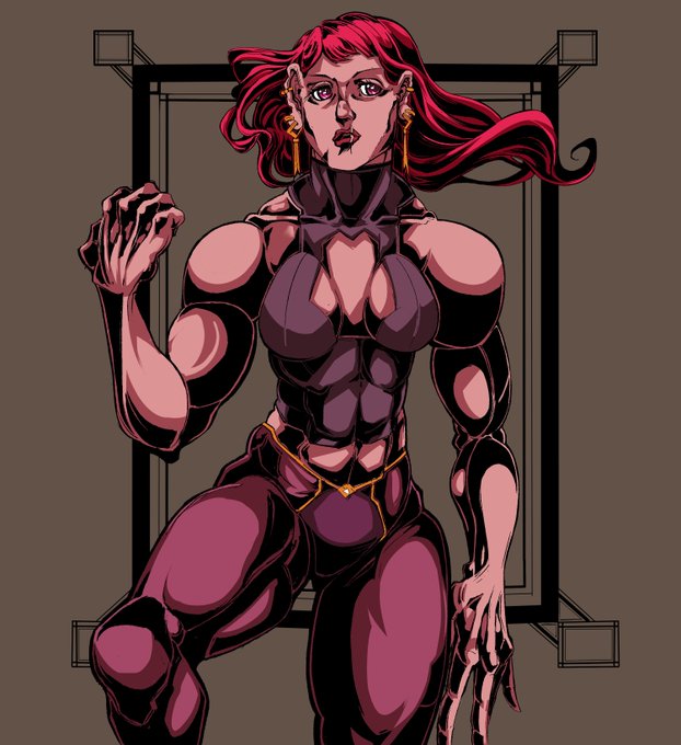


don't call it "rushed", call it "utilizing detail contrast so viewers will focus at the face"

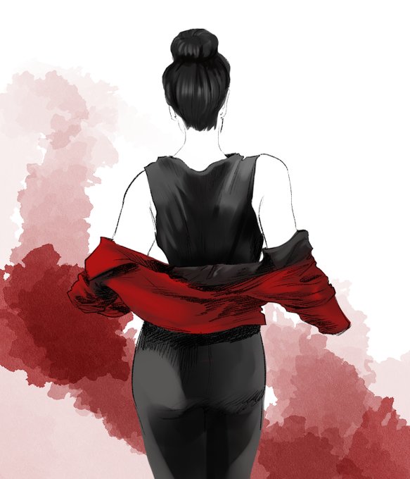
A play on contrast. And it is Missing Season 3 hours.
.
.
.
#lenaluthor #supercorp #contrast #digitalart


Artist Janet Chaplin's exhibition is in our St Davids Room until 27 November.
Inspired by the contrasting colours of the #Pembrokeshire coastline, Janet explores the relationship between land & sea in this exhibition.
Free Entry.



【VOCALOID4】The vocal synth of the hour is Masaoka Azuki.
Azuki is a cheerful girl who tends to act first and think later, in contrast to her best friend Kobayashi Matcha.
Originally released for VOCALOID2, her voicebank wasn’t public until her V4 release.



i think i made a good choice keeping him in the same pose for every ref because its easy to compare and contrast. saar bimbofication 2020-2021 ...... ITS ONLY BEEN A YEAR???


@Admiral_aqw @ItzHikari Looks Nice. I'd add a bit more of contrast on your shading. Check the one on the right to understand more


MEAN psychic dog for contrast
HUGE thanks to @ranchuppi for helping me with this design!