comparison.のTwitterイラスト検索結果。 2,021 件中 3ページ目


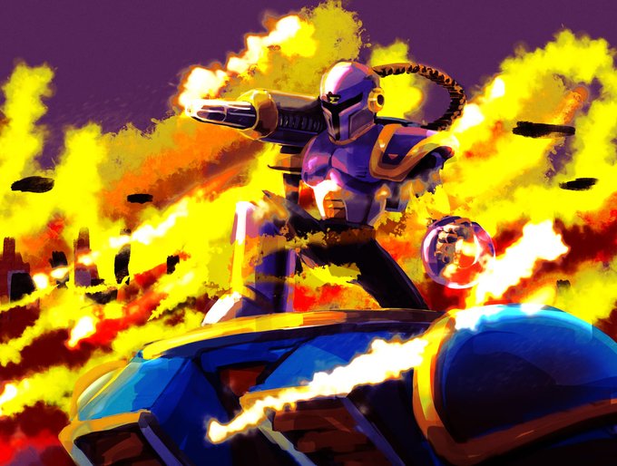
Dragomir's skill with the bow knew no equal in Wintergrad. He could (and did!) bullseye a fly on the tip of a spear from two hundred paces. Zombies are simple by comparison. Except that there are a lot of them...
Sign up to be notified on launch: https://t.co/3Keve5uKeN


@artetak's blue Baphomet is still her most recognizable, but her other figures are even more unrestrained and her palates trend very purple, so blue Bapho is almost conservative by comparison. ...relatively speaking, of course.
All these at https://t.co/uT98QzIxhG


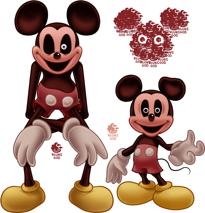
a more sketchy style comparison..his widdol baby face


Irl vs Online (used another picrew for slightly better accuracy)
Even though my character is cartooney and also just flat out an animal, diz isn't that different from myself
Maybe I should just draw the comparison... https://t.co/i2WyA23dWa


271. I am running out of facts about myself but one of my hobbies is drunk karaoke. Here is Total Eclipse of the Heart from back in 2020. I included my real voice for comparison. This song is quite hard.


Side by side comparison. Doodle was just stream of conscious no planning just draw. Updated to be more lively and eye catching


The original, for the sake of comparison. I think it came a long way.


Still lovin' Pizza Tower. And here I give ya'll sprites of em, with my lady Viva there for a little height comparison.
#pizzatower #Pizzatowerfanart #pizzatowergame


I finished my panel for #STCReillustrated 3! We're recreating the very first #SonicTheComic strip with one artist per panel, in celebration of the comic's 30th anniversary this spring. Here's my contribution and the original, with lettering, for comparison.


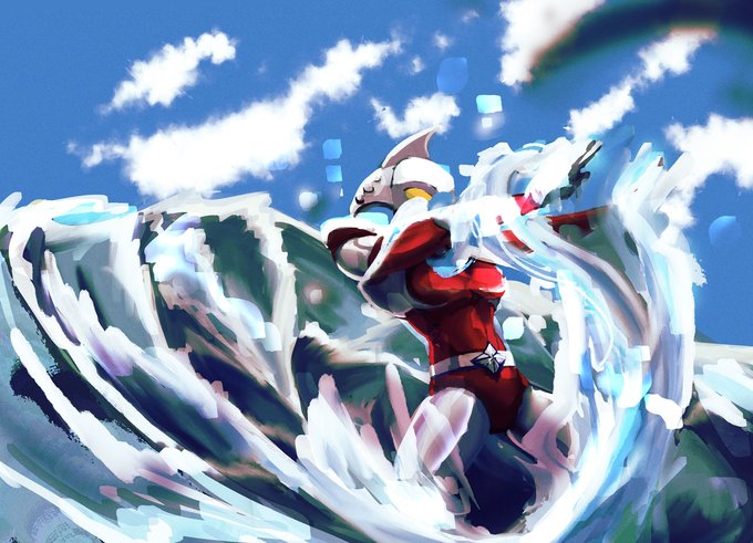

Rework of Ultrawoman Beth from last week for patreon, old version shown for comparison. #ultraman


HolaraAI and NovelAI
i use old Noelle's prompt setting using NovelAI and HolaraAI for comparison.


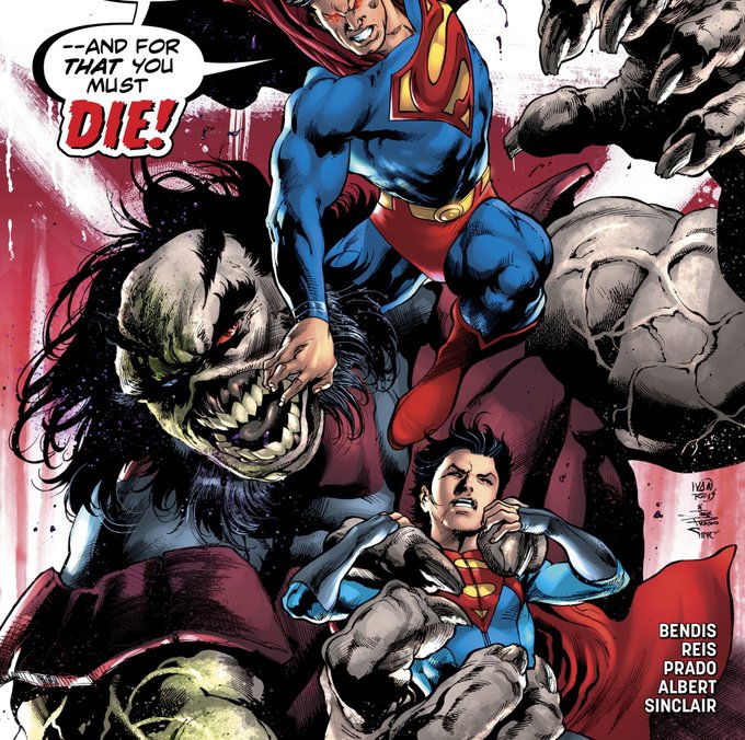
The only good thing of the Bendis run are these hot ass covers I want Jon getting fucked by that monster like. LOOK AT HOW IT GRABS JON. HE'S SO SMALL IN COMPARISON. THIS IS SO SEXY


