imoのTwitterイラスト検索結果。 13,074 件中 3ページ目


idk man... yue qingyuan is pathetic imo
#qijiu https://t.co/nCQ3ms3Edx


DID ROCKET MARK/BRANDED HIM OR SMTH???? HELLO?? LIKE- DID HE ASK FOR SOMEONE TO CARVE ROCKET RACCOON INTO HIS CHEST???😭😭 Like I get loving your homies but this is beyond platonic imo- like it’s sweet and all but HELLOOOOOO????? This is crazy to me https://t.co/Mn8fRb5gM2

C58a imo10pic(薩摩井 @imo10_)と
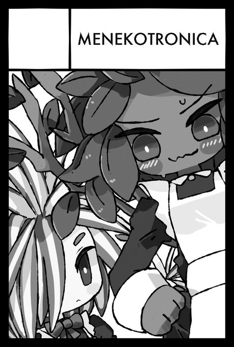
C58b MENEKOTRONICA(ナツ〆ネコ氏 @MENEKO_TMY )
では一緒にお会計いただけます


Ok, I think this is looking ok. I still gotta make some changes but this is much nicer imo https://t.co/ZirpsVNPIg


Selena aria of nymph coating.
Imo, this coating is the most beautiful coating ever.
#战双帕弥什
#punishinggrayraven
#Selena #セレーナ #赛琳娜


🙏its a great album name imo, apalagi buat penutupan wkwk https://t.co/Rix1u3Kxj1


改めまして、明日の #関西コミティア よろしくお願いいたしますー!
昨年の新刊と、2025卓上カレンダーいくつか、それとグッズ持っていきます!
O-01 imo_logyにて!
どうぞよろしくお願いいたしますーーー!!
ᓚᘏᗢ https://t.co/zDVSi2dNLi

1/19の #関西コミティア72 のお品書きです!
関西初参加です!美味しいもの沢山ありそう!うおーーーー!
O-01 imo_logyにて!
どうぞよろしくお願いいたしますーーー!!


Bill Everett's Zombie is one of the coolest looking comics character ever imo


Savanaclaw Till and Diasomnia Ivan!
Heartslabyul Till sounds funny as hell, I just imagine him getting collared the very first day- But I think Savanaclaw Till makes more sense character wise (Imo)
Ivan in Diasomnia because I imagine him being a spelldrive athlete
#ivantill https://t.co/84TEyRy4xv


Imo i think this event would be a whole lot more interesting if it focuses more on Makiatto, her thoughts after leaving G&K, about SKK, etc.
Other than that, pretty alright event, much better than the Ulrid one, that one is mid.
Sharkry is fkin annoying #GirlsFrontline2
