logo..のTwitterイラスト検索結果。 212 件中 3ページ目


@whosthisdesigns That's daft! I don't think Etsy even challenge any or the requests.
I had this pulled ages ago by Hells Angels for apparently using their logo...


logo...for a possible webcomic...about viking lesbians


Latest work I did for my elder sister's school requirement...
Its my first time creating a logo....and I'm not used to drawing swords so yeah....


torchic fried chicken #logo... for @Pixel_Dailies
#pokemon #pixel_dailies #pixelart


Gracias @Mafer_Lear *-* xD me encanta. El pobre de Max intentando conquistar a Ursa. No va a ser fácil xD y esto viene con un mini diálogo...


To be clear this isn't related to Hasbro & the actual 'Power Rangers' brand - This is Kollect teaming up with Toei, which is why the example uses (some) Sentai names. Although Kollect keep calling it "Power Rangers" and using the old official PR logo...
https://t.co/XR1j1xsTq1 https://t.co/mby8mIJmlJ


¡GEODARTE TIENE NUEVO LOGO!
En este hilo os propongo un minijuego que he compartido en Instagram sobre el origen del logo...
¿Te apuntas?


Alex é do tipo que resolve as coisas no diálogo...

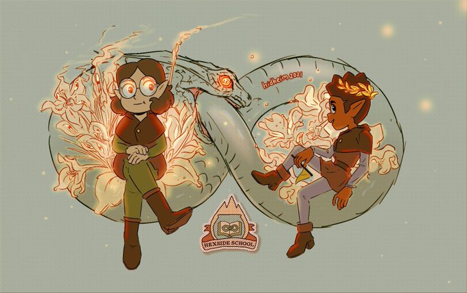
Day 1 of #guswillowweek2021 Hexside
.
Gus and Willow hanging out with the Hexide's pet logo...
Apparently, it's an ouroboros on the book in the cauldron on fire. That's the design I can *clap* for.
🐍📖⚗️🔥🎀
#tohfanart #theowlhouse


this chocobo in the final fantasy tactics logo.....ideal, perfect, transcendent


Pequeño dibujito que he hecho esta tarde, la primera que noto otoñal, con la idea de sacar un logo... pero al final es que me emocionado.
#illustration #ilustracion #procreate #nueblu #noeliacabo


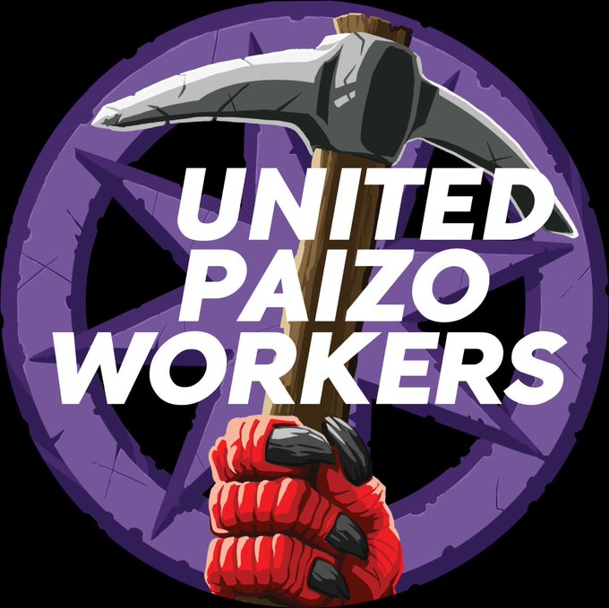

HEY. HEY, WAIT, HOLD ON A MINUTE. HANG ON.
This #UnionizePaizo logo...
Is this a reference to the Kobold workers union from Agents of Edgewatch?!
Love it!! #BattleLeaderRekarekDidNothingWrong


@Jariiitaaa no problema todo se soluciona con dialogo...

