comparisonのTwitterイラスト検索結果。 22,153 件中 202ページ目


Comparison of the two designs!! ^^ Most people and now myself thought the princess witch suited me more, so we’ll be sticking to the princess witch theme!! ^7^


krises that are inadvertently quite similar but make for a fun comparison :-P 1st one is from 2019 and incidentally one of the first krises i ever drew


I made a 20s version of #CharlieMorningstar's 30 outfit from the #HazbinHotel pilot. Here's a comparison between the two decades' silhouettes, the canon design being made by one of the series' artists. I found one of the inspirations (1933) for one of the concepts by Amessicle.


@Variety Exciting, but are they better than the 'single ladies' look? Here's a really good picture for comparison...


excuse me gen 2 but what the hell is this (gen 3 shown for comparison)


even Faa-san seems like a decent person in comparison, fuckin' christ


Side by side comparison (WIP) 💝
ꮺ VTuber: @CooksieCupig
#Vtuber #VtubersUprising #VTuberAssets


Last set of side by side comparisons of the old vs. new artwork AP #1 #queercomix #globalcomix #indieartist #comiccreator


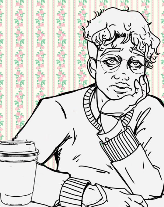
Side by side comparison of the issue #1 reboot, the new versions are still wips ! #queercomix #globalcomix #indieartist #comiccreator


Another comparison! Just finished the new hair. Getting there. https://t.co/2ogGrChuLf


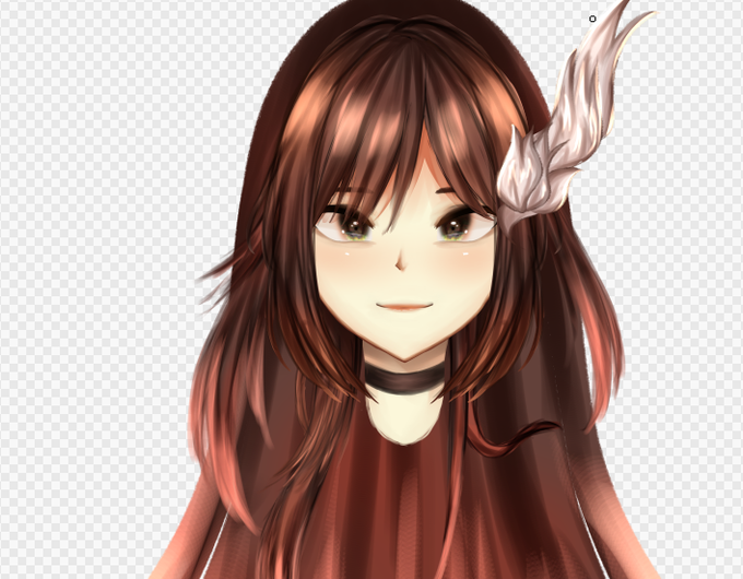
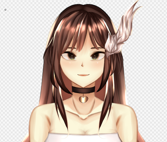
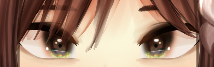


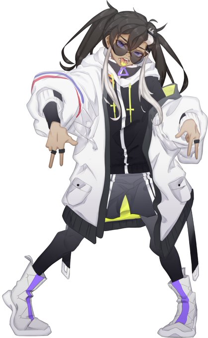


I revamped my vtuber/persona design recently. Here's a comparison of Kiro 1.0 vs Kiro 2.0.
I think I've improved a lot with by my models and my artstyle in less than a year! 🏗️🚧
Any critique or tips would be appreciated!
#Vtuber


@serenedreaming YEAH that's a good comparison. To me it's Gen 3 that gives this vibe the most, with how a lot of Pokémon have this very subtle texturing to them that I almost never see in any other gen


i did colour practice 2 days agk and wanted to see what I've learnt so far so i recoloured this, with old next to it for comparison


Comparison of my style before and my present Style
#KanojoOkarishimasu #Chizuru #Mizuhara #ChizuruIchinose #ChizuruMizuhara #kazuya #rentalgirlfriend #ColorArt #fanart #木木ノ下した和かず也や #かのか #水原千鶴 #kanokari #ProjectFanColor