ContrasのTwitterイラスト検索結果。 10,815 件中 203ページ目


@Re_Thinkin EZ: simplify
that could mean minimizing a color palette or removing some aspects of a character altogether, mostly to maintain the contrast between the fore and back
too much detail for characters in the bg can either distract from or clutter the foreground


Un diálogo que dice Caín me encantó porque resalta el contraste entre él y Yahwi.
En sus pensamientos dice. "Estoy muy molesto, quiero ir y destruirlo todo. Algunas veces me siento culpable incluso por tocarte"
Y en otro vemos que Yahwi no tiene problemas en golpear a Jooin.


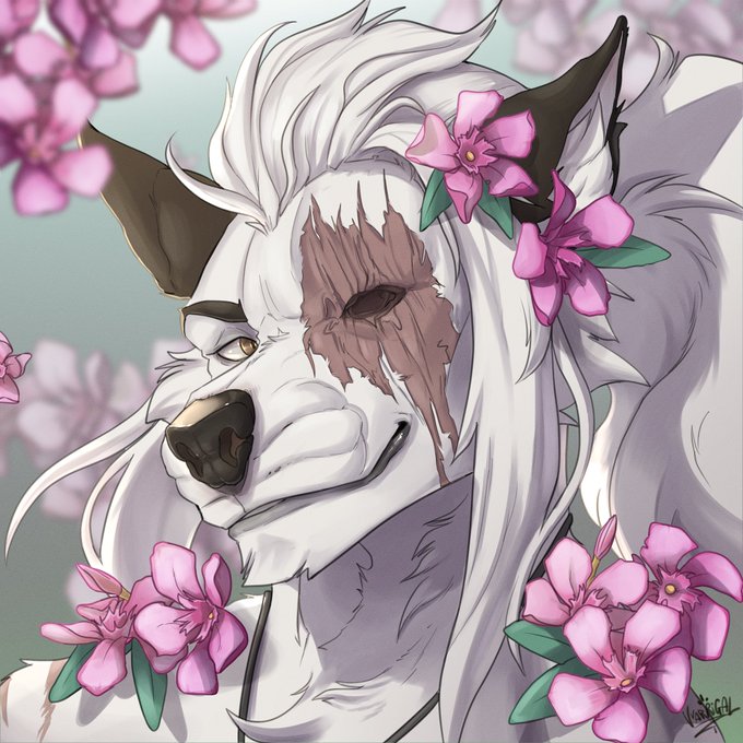
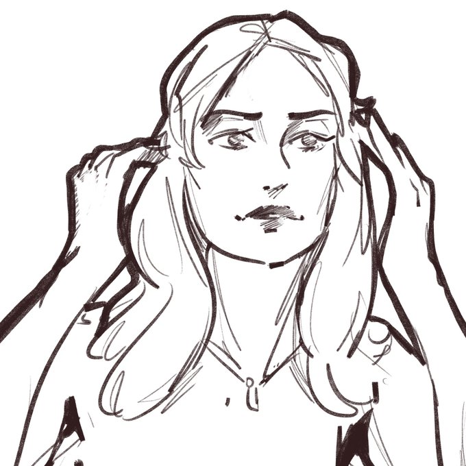
Headshot for @pastkesis I love the contrast of the white and pink here. I feel like I definitely need more flowers in my art now 🌸🌺💮🌷 Thank you~ Unfortunately deleted the timelapse for this one 😭


"maldita navidad" jaja 🎄💛🌟
.
Te encontraste a la mantecada de la suerte... Comparte con 5 amigos y dale like o tendrás 5 años de mala suerte y 5 navidades sin regalos🎁 🎄🙌🏻


Do you see the contrast? Irene, the one who invented Dragon Slayer Magic for the noble cause to fight the evil dragons, ended up turning into a dragon herself. She ended up despising the thing she dearly loved, losing her humanity amd her sanity.
#FairyTail #giveIreneachance


My stock art packs are 25% off. To promote them I've been picking some of my favorites and making them into ads. Recently I've been tweaking many of them to improve contrast, etc. Check them out. Each has over 100 images for just $4.50.
#ttrpg #ttrpgsolidarity #dnd

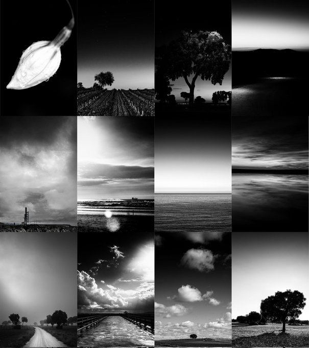
Unless I can think of a better name, the "High Contrast B & W" collection will be dropped today on @rarible.


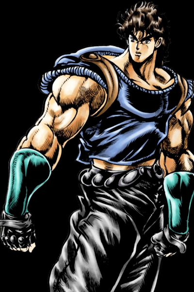
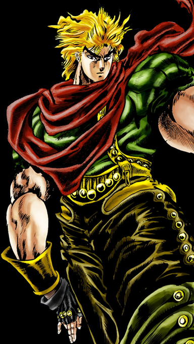
With Phantom Blood, Dio is a uber evil prick but he worked hard for his devious position. A well done contrast to Jonathan Joestar. Who is my favorite Jojo. That first arc will always be my favorite because of its aspirational nature. https://t.co/qWzIgBZmY0


The way value contrast is arranged in an image also supports the depth and readability of the space. Higher contrast will tend to come forward to the viewer, lower contrast will recede away from the viewer.

Along with values - the whole range of tints and tones - contrast is very important. This is about how the values are arranged in the image - areas of high contrast (very dark + very light) draw the eye, areas of low contrast (similar values) are restful

Here are a handful of helpful value structures - these are common frameworks to enhance clarity, theme, mood, tone and focus the viewer's eye.
Dark on Light
Light on Dark
Contrast on Midtone
Low Key
High Key


contrast with this serene #wwx from a montn ago


@KaijuQgle (Hey that’s cool, plus he is neat and he does sorta fill an RF spot, with his green+black suit contrasting Bart’s red+white-yellow suit)


[Color Contrast - Scarlett Oakre]
❤️The Magician of RED❤️
Happy Birthday @KarotteRave !!
Thank you for being one of my bestest friends and fam! More love and power to you!


dan alone .. this design just screams y2k with the low rise jeans boot-cut jeans, compare and contrast with other protags from that era like will vandom


Cosa succederebbe se il mio comfort characters di quando ero piccola incontrasse il mio comfort character attuale?
"Ancora in fissa coi PG introdotti come 'cattivi' che diventano buoni?" https://t.co/YCZ2aLjewG

