ContrastのTwitterイラスト検索結果。 10,510 件中 203ページ目


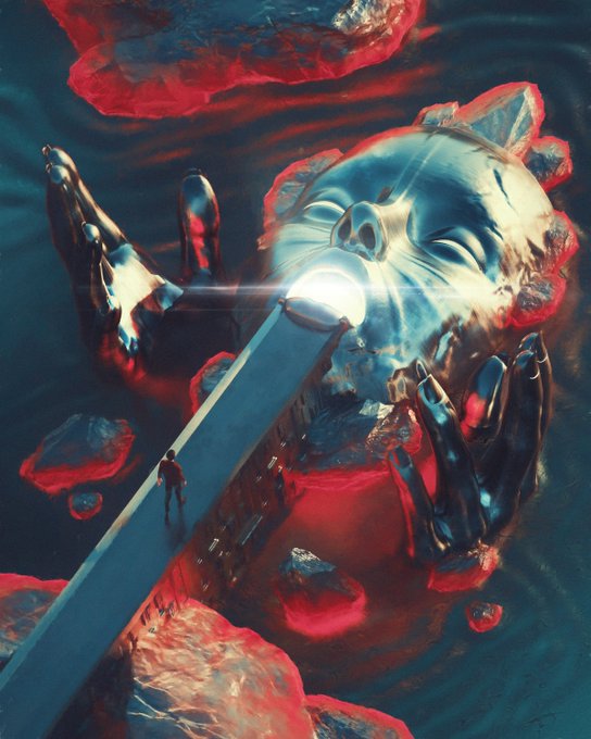
@SurrealReality6 Really neat and contrasty 3D artwork. Love it 🤍
https://t.co/HnR3XRcCag
https://t.co/DWs43n5w8f


Linda O'Neill creates inspirational paintings that invite joyful contemplation. She brings a powerful and expressive range of contrasting colors, forms and depth to her works of art. This dynamic work of art titled "Foundation". https://t.co/CLSt7oeo6I

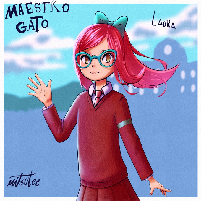
illustration of laura from cat teacher (maestro gato).
I actually like the design and the contrast in her colors, and.. well that´s it, i´d like to do a more dinamic pose but it was an old sketch.
#maestrogato #catteacher #fanart #maestrogatofanart @paulinaapc_art


Not sure whether the contrast between Runo Stromkirk's two #MTGVOW arts is meant to tell us "this is your brain on Lovecraft" or "blood vials are the greatest glow-up". Imagine them in the sequence you prefer 😉


God i miss GOOD ANIMATION! GOOD ART! Lets contrast.. On the left we have Steven Universe by CARTOON NETWORK. on the Right we have Stefon Galaxy... WHAT THE FUCK happened to artists in animation??!?!


In stark contrast to the Mawkin tribe, the Thoha was a tribe of Chozo that had significant prowess in their scientific capabilities. The Thoha would create the Metroids on SR388 after colonising the planet. The Thoha would later be completely eradicated by the Mawkin, bar one.


In contrast, we also have these images of Lumbridge from a few years ago.


/ DSMP / Roleplay
[ Two sides of the same coin ]
I just think Unicorn DreamXD contrasts nicely with Sheep Dream :]
#dreamfanart #dreamxdfanart #dsmpfanart #mcytfanart @artists_mcyt


@AncientFroggy @Designbyzarko @reverse_visuals @OdysseyHeart @katyahavok @wildalps @Vojaart @crownandpalette @thinknima @TheFrenchWitch @rezvaexe @gio_masia_art @ritanevermind @umutsezerkoc @ilcarux @edit1ng @ayaz_psd @RealEyEm @FantasyNFTss Amazing. Love the contrast between both works. 👏👏
Here`s mine
@walasavagephoto
@zeus_creates

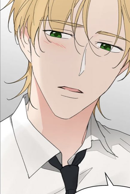

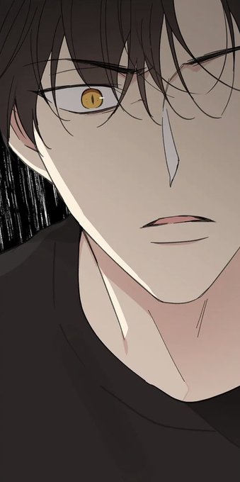
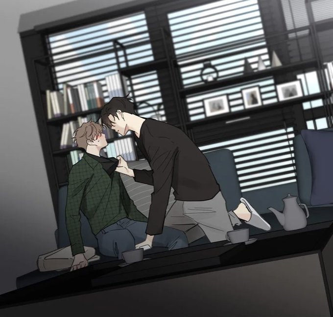
What I liked about this chapter is it highlighted the contrast between Cain and Yahwi’s character. Both felt Jealousy, but they reacted differently.


Quick painting practice, where I tried to play with contrasts and bright colours.


Lavender Trail is a fallen angel of Seasur. Oh no she's fine- being fallen is just an aesthetic choice for those that swap from angel to demon. She's a stark contrast to her love, North Star...


👷♂️WIP🚧
I love contrast/complementary colors vs Adjacent colors 😊😊😊
#Fanart #commissionsopen #TCG #TTRPG #ArtistOnTwitter #DnD #worldofwarcraft #dungeonsanddragons #Goblin


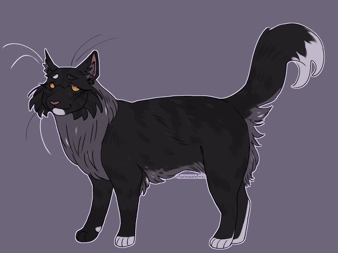
made moth a giant blind norwegian forest cat, sharp contrast to the tiny anxiety tortie lol


@TheSpaceshipper Are you saying you know why?
I mean, some of this art looks like visions from NASA. Quite the contrast from the tone of the movie and ultimately what the Cygnus became.

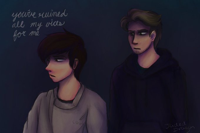
a lil angsty up in the house
attempted a new coloring method so that’s why there’s high contrast and jazz #dreamfanart #georgenotfoundfanart #dnffanart