ContrastのTwitterイラスト検索結果。 10,510 件中 205ページ目


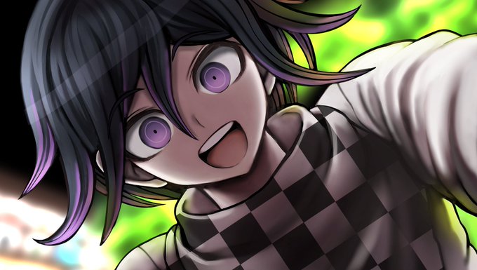
kokichi’s hair is a weird contrast of blackish purple right ? i think the purple came from his attempt to look cool with the help of dice to dye his hair but these dumbass bitches didn’t know u were supposed to bleach first so it ended up being just a purple tint over black hair

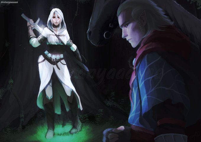
I still wonder whatever happened between Avallac'h and Ciri in the span of 5 years... their relationship in the book to the games is so wildly contrasting.
I hope to see any canon story about these two.
#Witcher3 #ciri #avallac'h #FANART #witcher
Somhow i ship them... a bit.


henry / fire emblem: awakening
i have NO clue what drives me to love henry as much as i do, but i LOVE duality so maybe i just enjoy how his macabre and bloodthirsty nature contrasts to how brightly he smiles to cope with how hard life is. plus he turns out better later!!


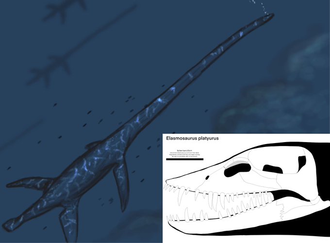
Okay while the desins of the aquatics look cool as their own things,they dont work in the context of the creatures there ment to be. And with how much they contrast with one another its really odd,with some been closer to real animals while others arent.


Today's color-contrast pairing is Player/Noob from Gametoons! ❤/💜


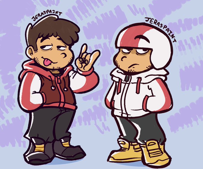
kinda wanted to compare-contrast my elder!kick's design with @/jourd4n's kickolas drip and HMM... Ideas... 🤔
#kickbuttowski


hues
imposing one another with
melody, harmony and contrasts.
curved lines,
winding roads
weaving each other,
like world’s
tumbling through
the artists soul,
as a river.
#vssLiminal #prompt #artist #WritingCommunity #poetry #amwriting #art #acrylic #amwriting


Some notes on the von Karmas' designs... I had a lot of fun with them! I made the kids purple to contrast pleasingly with Athena's yellow heh


Contrast and soft commission for @Baph_Blood 🩸
#oc #ArtistOnTwitter #portrait #commissionsopen #Commission


Apparently I'm stuck in the mindset of portfolio sites where posting newer stuff is important. So here's some "not too objectionable" older work from 2013-2015. I guess I really liked warm light and orange and blue contrast back then.

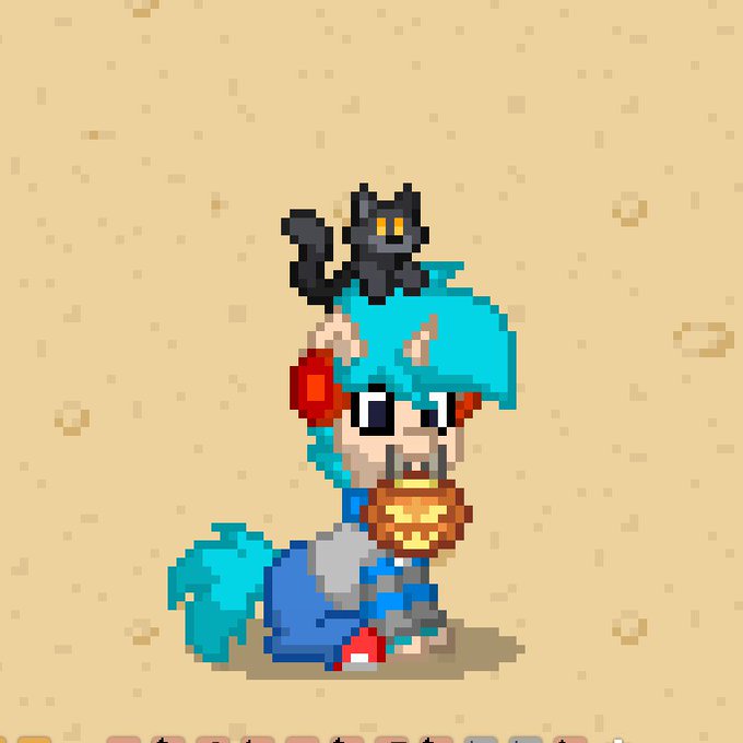
Felicidades! Encontraste al Keith con un mishi en la cabeza, pidele un deseo y continua tu camino 💙💙


My last card for this set! ( and for a moment bc I dedicated the rest of the year to LOTR set). I hope you will like it! We tried to play on the contrast between the slaughter and the allure of the circus number!
Creepy Puppeteer
AD: Ovidio Cartagena
© Wizards of the Coast 2021

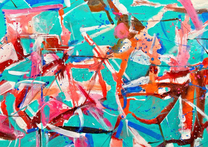
just collected ✨the flamingo 🦩from @Joplop3
I loved the colors and it’s contrasts 🤍💐
in hen 👁 https://t.co/ztrVS4H7jE
#art


3) This is solely based on your preference, but softer colors typically make a character feel more soft and cute. Pastels or bright happy colors depending on the mood! Keep color theory in mind!
Example: Blue means calm/water. Yellow means happiness and the red contrasts!


Watercolor #painting of the dramatic #storm sky, titled "Sky No. 6'" (30 x 40,8 cm, 2017). I just love those contrasting colors!
You can find the original watercolor and signed art prints of it here:
https://t.co/BO4WBzUoE0
https://t.co/cSVqObweKm

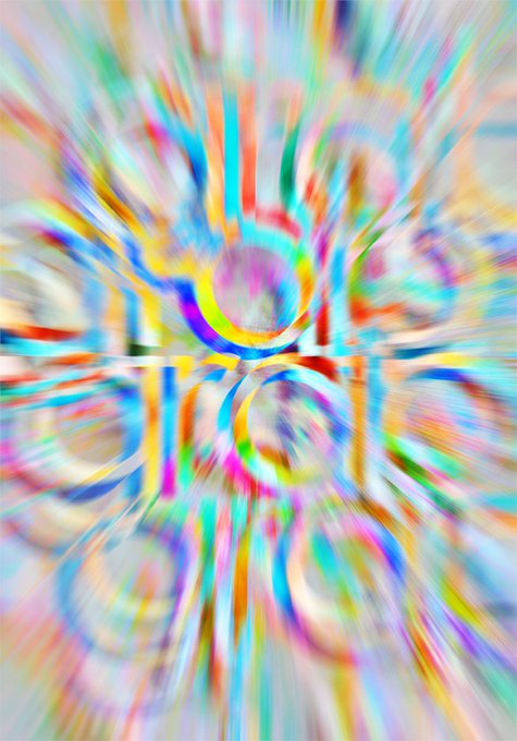
Sneak peek of forthcoming #NFTdrops from my #digitalcontrasts series Grab#13 #nfts #digitalart #art #digital #cryptoart #cryptoartist #Crypto #token #grab

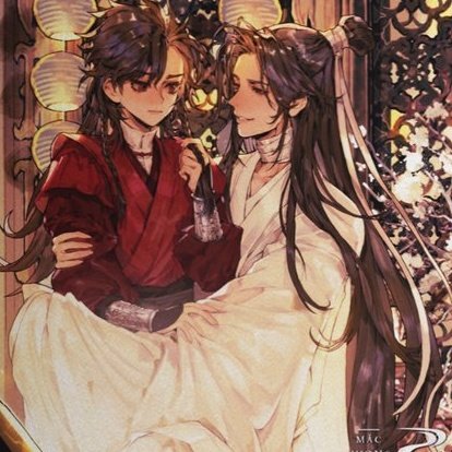
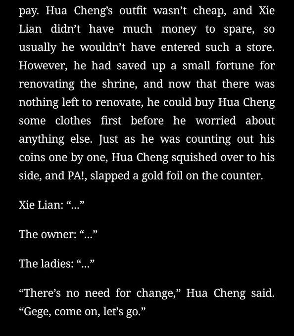
I love these scenes so much for the contrast of mini fafa looking so cute and tiny but his actions being so very hua cheng

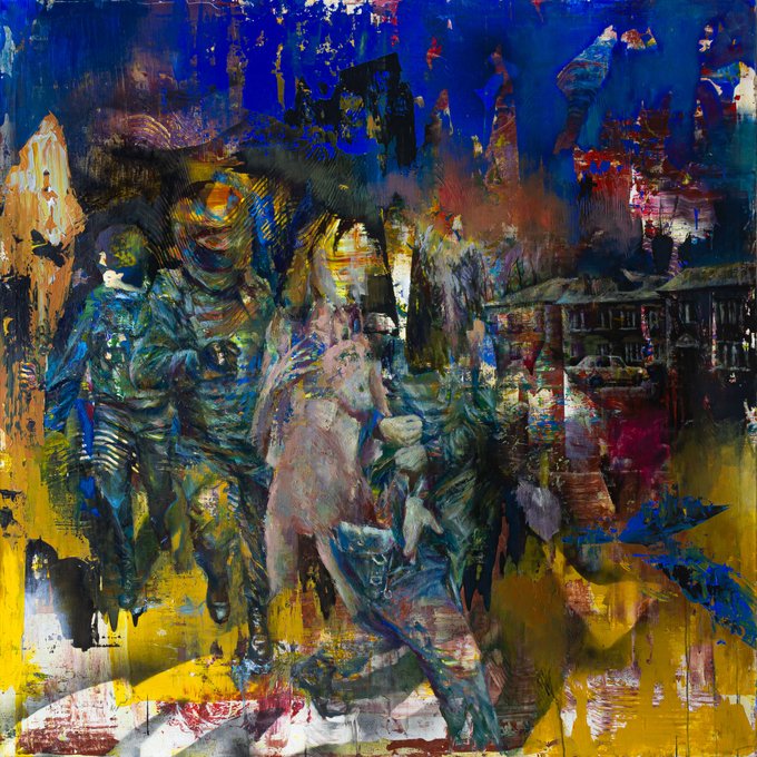
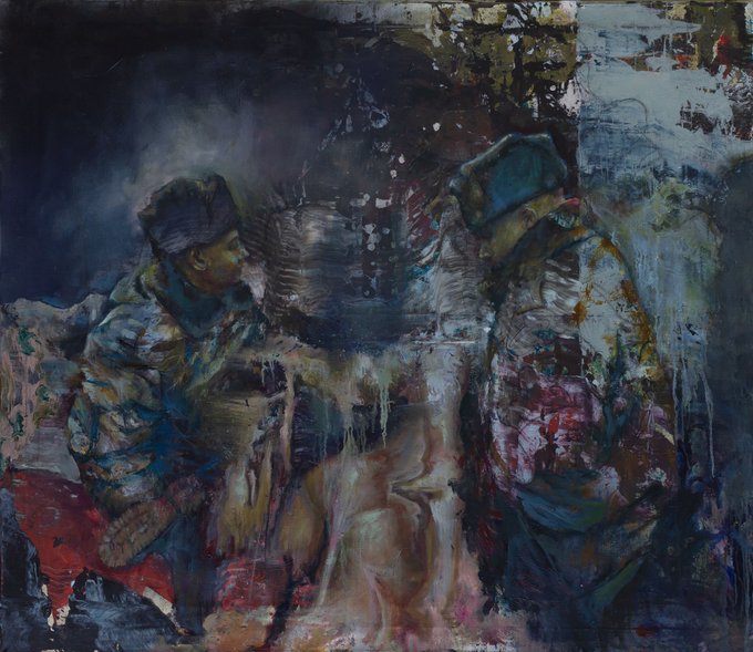


(12)Paintings capture the contrast of this unequal confrontation: technogenicity versus flesh, abstract and figurative, spatial and flat, narrative versus incoherent.
KO https://t.co/YRnRbmmRiT
Some studies drop on HEN https://t.co/qdgzr4OSKY