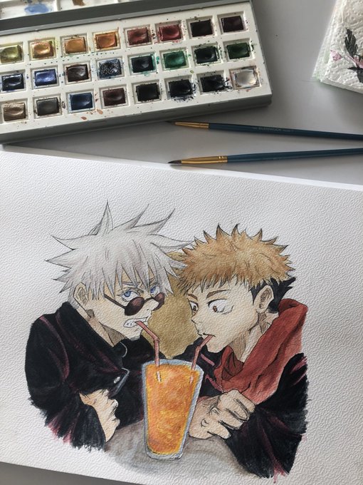
contrasのTwitterイラスト検索結果。 10,764 件中 210ページ目

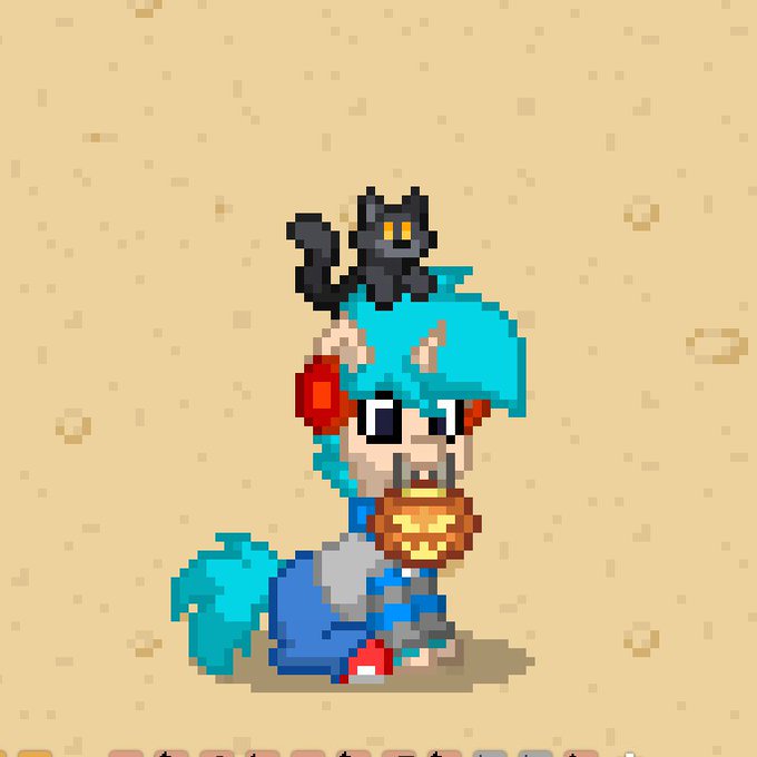
Felicidades! Encontraste al Keith con un mishi en la cabeza, pidele un deseo y continua tu camino 💙💙


My last card for this set! ( and for a moment bc I dedicated the rest of the year to LOTR set). I hope you will like it! We tried to play on the contrast between the slaughter and the allure of the circus number!
Creepy Puppeteer
AD: Ovidio Cartagena
© Wizards of the Coast 2021

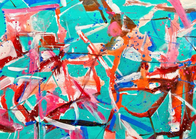
just collected ✨the flamingo 🦩from @Joplop3
I loved the colors and it’s contrasts 🤍💐
in hen 👁 https://t.co/ztrVS4H7jE
#art


3) This is solely based on your preference, but softer colors typically make a character feel more soft and cute. Pastels or bright happy colors depending on the mood! Keep color theory in mind!
Example: Blue means calm/water. Yellow means happiness and the red contrasts!


Watercolor #painting of the dramatic #storm sky, titled "Sky No. 6'" (30 x 40,8 cm, 2017). I just love those contrasting colors!
You can find the original watercolor and signed art prints of it here:
https://t.co/BO4WBzUoE0
https://t.co/cSVqObweKm

Sneak peek of forthcoming #NFTdrops from my #digitalcontrasts series Grab#13 #nfts #digitalart #art #digital #cryptoart #cryptoartist #Crypto #token #grab

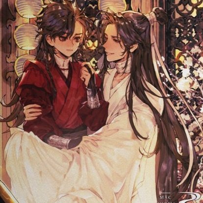
I love these scenes so much for the contrast of mini fafa looking so cute and tiny but his actions being so very hua cheng

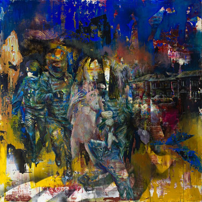
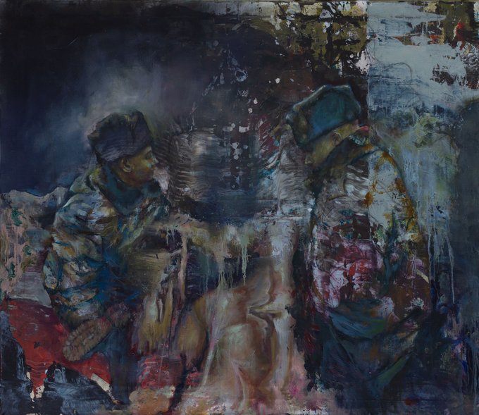


(12)Paintings capture the contrast of this unequal confrontation: technogenicity versus flesh, abstract and figurative, spatial and flat, narrative versus incoherent.
KO https://t.co/YRnRbmmRiT
Some studies drop on HEN https://t.co/qdgzr4OSKY


but then i hate donghua djz bc he just looks boring.
but manhua djz is perfect bc a) the blue contrasts lu ya's red which is perfect bc water vs fire
and b) hes got straight hair originally, and then his hair turns curly. unlike donghua djz whose hair is already fluffy/curly ish

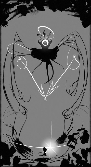
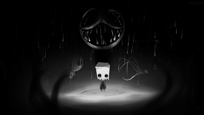


Added a variety of my drawings including an old one, I really like my Contrast https://t.co/fOG3S4PaLU


@alexpixelk // eye contact , high contrast b&w
i see the mono filter does my art well

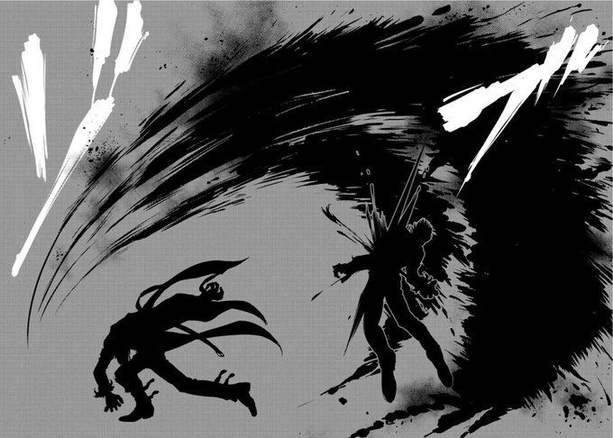
This panel is the best illustration in the whole #ANBmanga. So gorgeous! I love the contrast between black, white and gray and the line quality is superb! Also the movement is so well expressed, you can see it, although is a still image.
#Kyokusanagi #Ioriyagami #KOFXIV #Manga



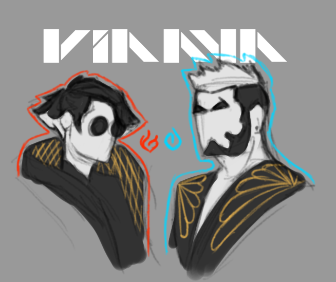
Also, I love the contrast of Celine being fire, but wearing a warm clothes and Damien being ice, but wearing a outfit that you would never wear in cold times. If you ask, they are doing the darkiplier pose, where they put both arms behind

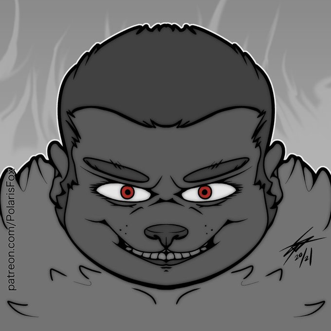
Probably could of gone with some darker shades to increase the contrast.
#digitalart #anthro #furry #CLIPSTUDIOPAINT #lineart


Redesign Commission for Deathlight! I had a good time with this one. I realllllly wanted to splash some darker colors into the whites to contrast nicely /)

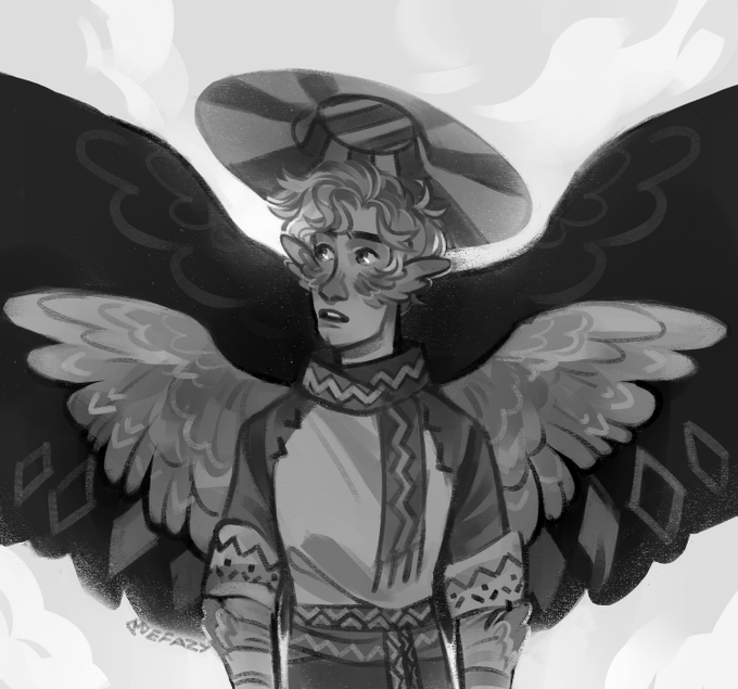
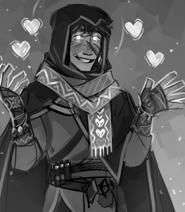
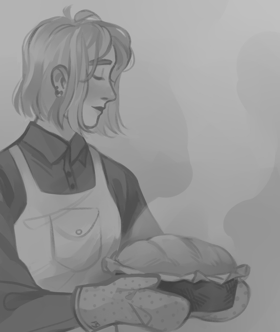
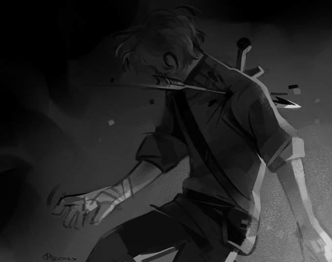
@alexpixelk i mean, it's not bad but could be better
I'm too much of a fan of color contrasts so i rarely bother to check the values


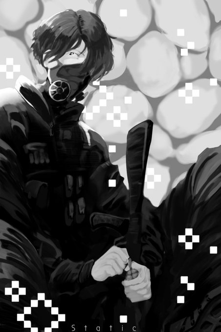
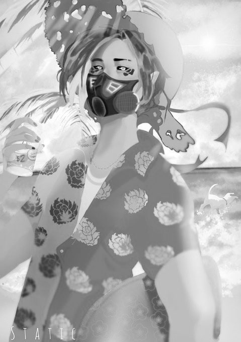
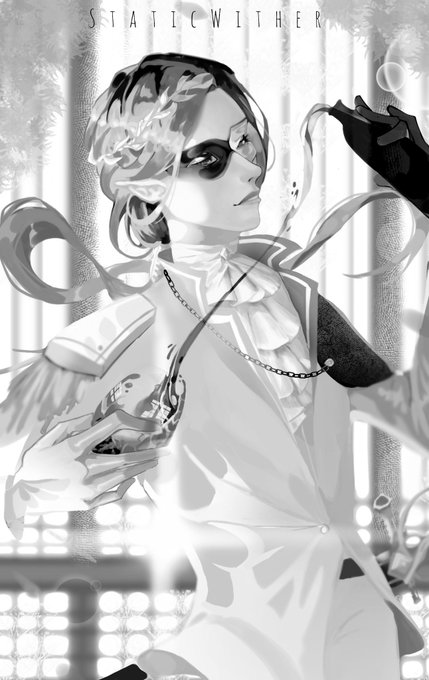
@alexpixelk Huh I use pretty high contrast. Must be why the awesam and sir billiam never looked finished to me