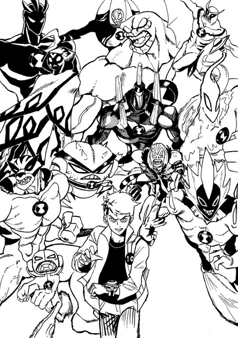
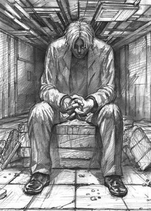
ContrasのTwitterイラスト検索結果。 10,825 件中 22ページ目


Pues...es algo que tarde mucho en pulir como todos y la vdd me gusta como voy , amo el color negro y por eso lo uso mucho aunque aveces sea demasiado , talvez les disguste a unos pero amo ese contraste... https://t.co/yq1jn3bIW0


@danicorelove @NeosMisfits They look so good code is so fuckin talented
Also love the fuckin contrast between Malison and your lass its so funny to me lmao


Tragic implications are a constant whensoever a contrast between her bygone version and current circumstance intermingle due to political machinations that come her way. Through thick and thin her family unit stands firm in weathering the storm so as to triumph over any obstacle.


@SarahMasonArt @KharGoesVroom @NatasaIlincic Yeah here's an example...I messed up the edit as it was done in a hurry now, but left is directly shared from procreate and right is more what it looked like on the retina display. With a bit more contrast and oomph, but you catch my drift.


Forgot to post this here. I think Ai looks better in pink. Adds a bit of contrast.


@j888885 I guess because they are more contrast than light ones🤔 Oh almost each piece of mine turned from dark in more or less degree.
This one owned by @Blockrocker_eth is specifically about accepting darkness. without light we wouldn't be able to see it and make it an ally.
Thank you!


This Uzuki is a master at hiding his presence. I wonder if that's a natural skill or practiced.. It's such a contrast to the overwhelming bloodlust of X.. Would be so cool if we get to see the second persona being born during this arc..
#ShadzSAKAMOTODAYS #SAKAMOTODAYS108


@InariLeor Temporary. Test. Draft. In progress.
Closer to appearance inside many dreams lately.
Improved contrast.
🟨/⬛Color scheme.
https://t.co/7itRqBdkHA
Like reallife:
A bit tan skin🤚🏼Slant eyes🧒🏻Black hair.🐈⬛
From🇯🇵Japan dad 🇧🇷Brazil mom.
I look 🇹🇭Thai/🇲🇽Indio.


The pathos of Christ condemned stands in dramatic contrast with his image of a tyrant king leading by fear. Women running from Satyrs (1850), Ecce Homo (c1851), The King Continues to Reign with Order (1851) & Bathers (c1852)


Hope people know that Rouge wasn’t designed “sexy” for no reason.
Her design and mannerisms were supposed to contrast to Knuckles masculine, rougher nature. He’s also stated to be shy around women, which makes Rouge more of a tense challenge lol.


got carried away with testing colours on my sketch so here it is in grayscale lol. i gotta fix the colouring on the horns so that there’s more contrast


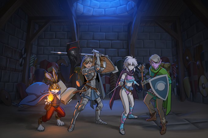
6. Fire Emblem: Three Houses - Ashe Ubert & Yuri Leclerc
I am THIS CLOSE to writing a compare/contrast essay on their backstories and personalities and philosophies. The sheer potential makes me insane.


@MisterCrowbar @Tkacz_art I just love exploiting that contrast of warm and cold. I feel like it's a bit of a cheap trick but hey, it works... 😁


a surreal and dark mystical space exists in contrast within these bright sparkling temples.


Landscape Palette
bunch of greenish grays for all kinds of grass
bunch of grayish browns for all kinds of rocks and stones
bunch of sky colors
bunch of mist colors
a few high contrast star colors
a few popping "magic" colors as accents

UI Palette - Primarily used for icons
bunch of grays & browns to depict weapons, items, glass bottles, etc.
high contrast accent colors to give each icon it's own distinct, immediately readable flair
many shades of almost black for UI panels


warmup!! been enjoying some midcentury magazine artists who do cool high contrast stuff. gave it a whirl myself!