contrastのTwitterイラスト検索結果。 11,163 件中 22ページ目


I changed the painting of her fur, because I think that way the contrast is more interesting and more in line with the appearance of a marmoset.
#furry #furryart #furrygirl #furryfandom #furryartwork #furryartist #wip #adoptfurry #adoptable #anthro #characterdesign


I always have so much fun doing the lineart in that rendition style! It's so crispy and textured ♥
As usual, I went for vibrant colours for the shading >w<! I love the contrast between them and the overall "evil" vibe emanating from that pose and glare OWO/


For contrast, this is the first character sheet I made of her persona 5 years ago, back when I used skin tones.


Fmylife I posted the non-contrast corrected version. https://t.co/sN9d6OYra3


Watercolor #painting of the dramatic #storm sky, titled "Sky No. 6'" (30 x 40,8 cm, 2017). I just love those contrasting colors!
You can find the original watercolor and signed art prints of it here:
https://t.co/BO4WBzUoE0
https://t.co/cSVqObweKm


Absolute lovely art by @eddynyan based on the events of our previous gremlin VRC stream. Thank you for your work, love it so much💛For the first time i have so many things i want to play on stream but struggle to find time for all of them. Such a contrast from previous years!


fixed contrast and few details,thank you for b eign patient,
@Felixtehcoyote
!
#furry #art #drawing #commission #oc


são os rostos redondos, que contrastam bastante com os designs do anime -que são pontudos- mas a maneira como ele se adapta é impressionante!
Aono também soube manter a aparência das personagens bem consistente


You'd think with it's emphasis on kinstones, it WOULD have a greater focus on characters, like Majora's Mask. It's such a stark contrast to Link's Awakening, where the writing is so strange, and every other character is an eccentric weirdo.


Ivysaur takes everything I like about Bulbasaur and makes it better. It’s a little more complex, a little “cooler”, but still feels believable as a fictional creature. The palette is hugely improved here too, the colours contrast so nicely! 9/10


🍫Valentine's Sale 50% OFF!💝
Until Feb 24!⌛️
🤵♂️In contrast to Chihiro's aloof appearance, this super masochistic secretary strikes this misbehaving boy, Ryunosuke from all angles!
Read now:
💕https://t.co/bADqGY6AGZ
#masochist #ceo #spoiledson


Normalmente trabajo con varias capas de sombras y colores base pero la ultima capa es la clave.
Con un solo tipo de pincel de textura parecida al lápiz doy los detalles más pequeños y precisos como brillos en las escamas y en el contorno o sombras para crear más contraste.


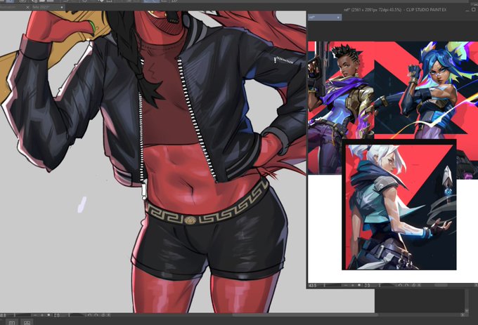
Another, lol. I'm trying to figure out how to make my line drawings look less flat - I think I'm afraid of contrast. Stylized skin rendering is not proving to be my forte. #art #artistontwitter


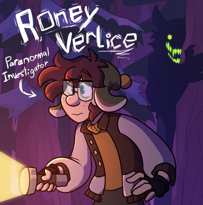
#FFOCWeek DAY 1
Roney Verlice, the Paranormal Investigator!
I made Roney sometime last year, but recently redesigned him. I thought he would have an interesting contrasting dynamic with the main band, being an obnoxious "Almost" antagonist who kinda gets in the way occasionally.


New color page is great. Back to just our Hero & Sidekick. I love the brighter & more vibrant color palette Suzuki uses on these. A contrast to a lot of current titles that are going darker; either to match their themes or last act narratives.
#ShadzSAKAMOTODAYS #SAKAMOTODAYS107


Hello @Lunaris_Regina , a belated #tkrbyumeVDay2023 to you!!
I really liked the contrast of Luna wearing blue makeup while Bushi has red, so here they are applying it for each other~ I enjoyed reading about them immensely 🙏💕


the Forth Rail bridge was built in 1889 and soon after that the phrase ‘Painting the Forth Bridge’ was coined as a colloquial expression for a never ending task… by contrast I have only been painting for nigh on 15 years
Forth RailBridge (continued)
oil on panel ca.2008-22


This is definitely cheating but here gave a more contrasted version lol
#oc #digitalart https://t.co/kQOxSLj0wk