layout,のTwitterイラスト検索結果。 612 件中 22ページ目
💜New Layout, Theme & Oc!✨
Mwah 🥺🌱
I'll still be the same color, personality and cat lover uwu
👇👇
@diogo_oldskull I've been working on art, layout, and editing for Dungeon Crossing! Cover mockup here, everything about it is subject to change.
In "works already available", people should check out my DM's Guild profile, maybe you'll find something you like!
https://t.co/SKTu7jlbwK
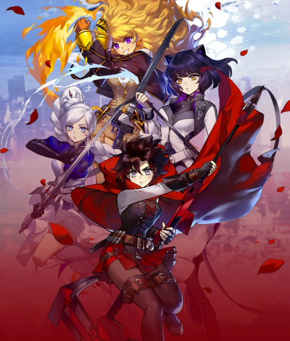
I'm so bored of RWBY's promo art being the exact same thing rehashed every year. Don't get me wrong, Einlee's art is amazing, but I'm tired of seeing this tired layout, but with Einlee trying to think of new poses to put the girls in. Where's the creativity?
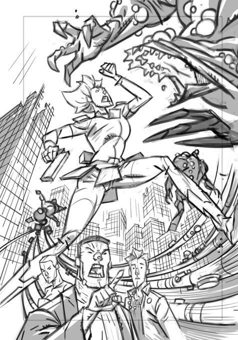
Continuing my cartoony "Crash Bandicoot"-esque take on #TheLastofUsPartII with an alternate take on the Rat King boss fight, this time as a corridor chase sequence. This is a rough previs layout, since I'm painting the characters separately.
Welcome to my account, I Draw cute gals and on the off chance show my Train Layout, Enjoy!
hi i made a hugh icon for my friend em bc she wanted a hugh layout, so i made her a banner and drew her an icon <💙😌3
Here is my redone #MeetTheArtist!
I’m way happier with this layout, coloring, and facts!
I love y’all!
birthday hat version! Feel free to use as a layout, pls just credit me in bio 💜 https://t.co/XFWNQhrFZU
I did the background for this!!!! Here's the full painting, layout, and breakdown of the different layers. Reminder that I am still on the lookout for background paint and design work! ;) Go check out Tyler's work too and HIRE HER FOR STORYBOARDING!!!! 🔥🔥🔥 https://t.co/06rb1wPwzo
#commission for @guitarpunkmast1
Some buttons for his twitch layout, go check it out and give it a follow!
https://t.co/uPohCDDs3o
PROCESS! My steps for the cover to BIG GIRLS 1. Digital layout, pencils, colors. Traditional inks.
i have acquired two people since i last changed my layout, art by @anaoldrin !!!
worked on 2 patterns today! messing around with the secret garden: fairy wren layout, and leaning to a darker bg for the moth design ;v;
@BStokkermans Criminally talented young artist and photographer. The layout, colours and composition are unbeatable.
oh my god someone tell me to stop changing my layout, i just changed it but now i wanna change it again to use these
So, basically: why am I drawing less lately?
Because I now study 3D actively in my free-from-work-and-comms time, sooo...
Here is my handpainted sci-fi portal!! I'm super proud of it (and mostly of my UV layout, though its far from perfect, but god, I spent some time on it)!!!


