redsのTwitterイラスト検索結果。 2,249 件中 22ページ目


@JamesMarriottYT hi james! i love drawing with reds and pinks and teals! you said no music (but surprise, i also do that!)


@RhlPixels in general i've found i like dark, saturated reds and blues together. i used to use that a lot when i was more fashionable too.


@selfshipqueen Oooo I think you would definitely suit one of the more mature type brands 👀 I'm thinking Spicy Ageha!!! It's quite literally described as sexy-type brand ajdoerjfh lots of deep reds and purples w/ gold accents, extremely stylish which I think would be the vibe for you ❤️✨

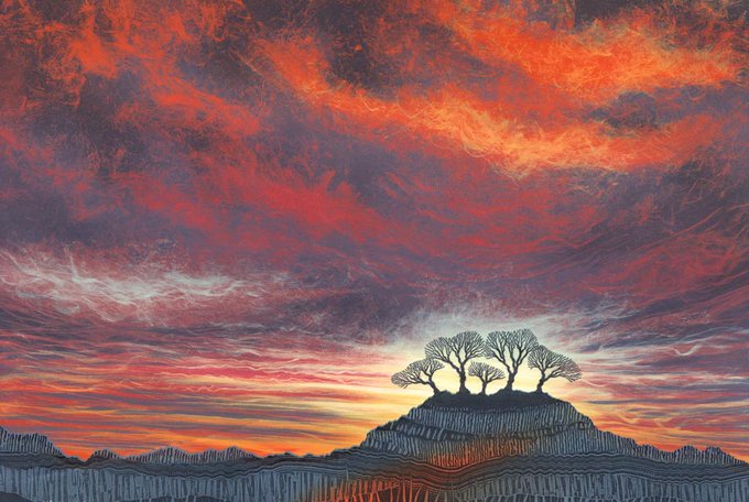
Touch a Chord: one of a series of fiery skies I made recently. As in music where a chord gives a richer sound than a single note, so it is with colours where a range of reds and oranges are more powerful than a single colour. Original sold, card available
https://t.co/eNODVGcxdV


This fiery sky began as an exploration in colour. I wanted to achieve a #sunset sky that wasn't delicate pinks but brooding, powerful reds. People often ask me how I get the colours to glow - the blues and greys activate the reds and oranges. Original sold https://t.co/6g2BVZR8nC


@SupermanEnjoyer I wish the suit look more like this. The brighter blue and reds looks so much better than the near black suit he wears in the movie


@cherryfullart IM SO DJDJDKDKKDKDKD ITS THEM!!!! my god your sense of color has gotten so good, the reds, the pinks, and purples mesh so well together without clashing and are just so pleasing to the eye…I love these two SO MUCH


@hy_hav I love blues, purples and reds massively. Though I have a huge adoration for cyan


Sheep in Wolf's Clothing
ft. @vixyart's sona, at least my reimagining of her.🐑
I usually don't work with reds, oranges and yellows but ey, I tried to make them work for me


Happy birthday Dave! #BigRedMachine #OldCollegeArt #Reds https://t.co/0nXLiPDSAm


(The color correction is necessary because actual GBC hardware--devkits & retail--used lower-gamma panels that desaturated the colors. Emulation sometimes confronts us with harsh reds and neon greens that don't represent what it looks like when you flick an actual GBC on.) (5/24)


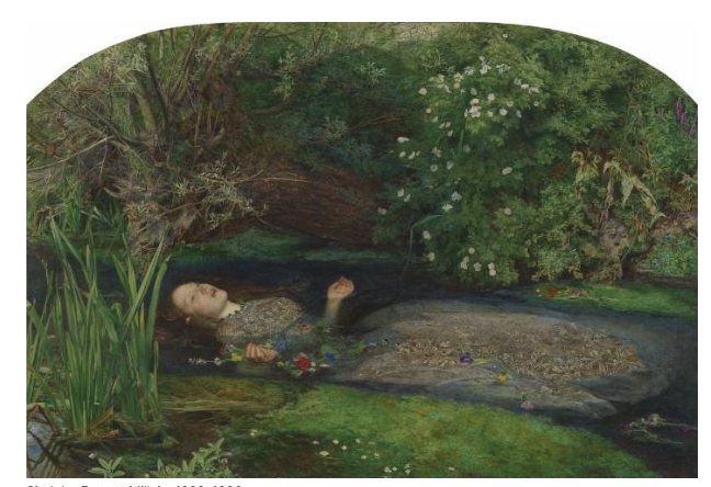
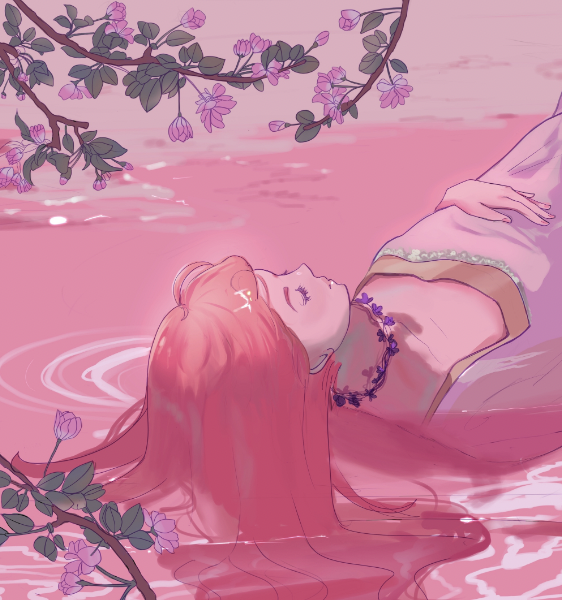
The artist Zoya's permutation of Ophelia on the right, the original on the left, @Llemon_milk used pinks+reds to highlight Lizzie Siddal's beauty. The incorporation of Sakura is a nod to the artist's appreciation for Japanese culture+aesthetics. #anime
https://t.co/ynivVGSIkj


@__IBoogie @0xSocialClub @0xJDIEZEL @photobums Only got one for now but once my liquids up ima sweep the floor on some reds 🟥


@EwylanaR My favourite is blue but I’ve been using lot of reds and purples recently!