ComparisonのTwitterイラスト検索結果。 212ページ目


You can see here, for comparison, how the world is actually arrange compared to the artistic liberties I took to make it work in a condensed space. Note that perspective is throwing the scale of areas off in the map viewer (ie Duke's archive is close to camera, not actually huge)


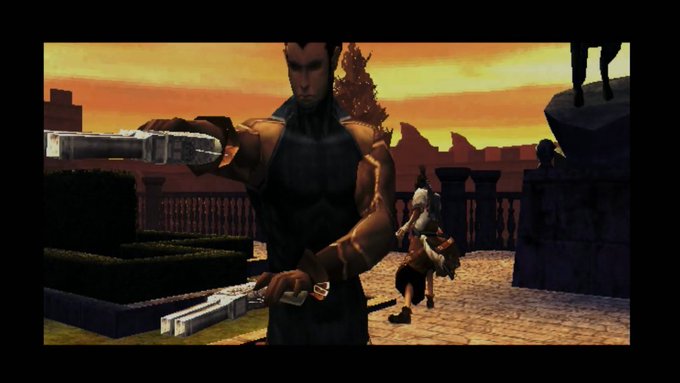

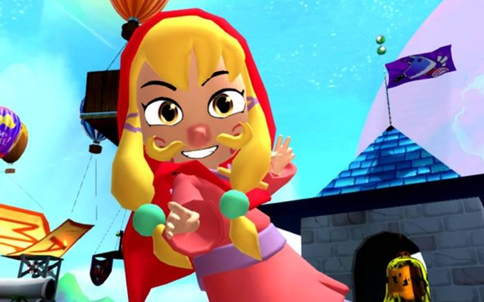
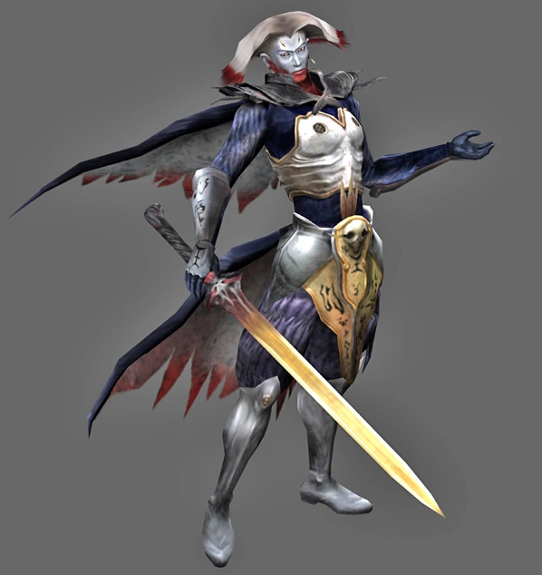
Also, a Vergil isn't limited just to using a katana
The weapon is a means to the end that is to make the rival character cool in comparison to the player character


Comparison between JWST's and Hubble's Stephan's Quintet by ArgentFrequencies
source: https://t.co/TvUwgJh90n


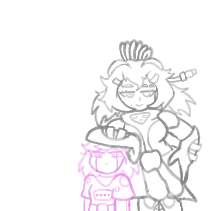


@friedPeeP Sure, I'll bite!
Here's a comparison of two of my latest art fight attacks!



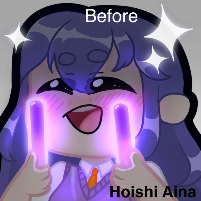

Comparison of my first emote next to the ones I make today, I've come a long way! 😋
#Vtuber #artist #Commission


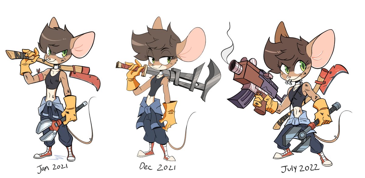
Oh yeah, might as well update this comparison thingy from half a year ago.
Thick lines are in again babeey. 😎

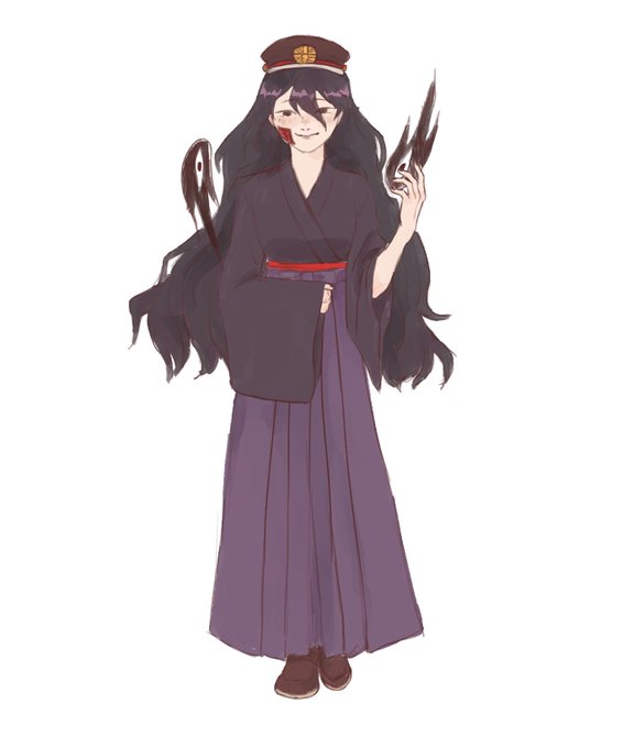

the effort i put into mari in comparison to sunny is astounding #OMORI #OMORIFANART #tbhk


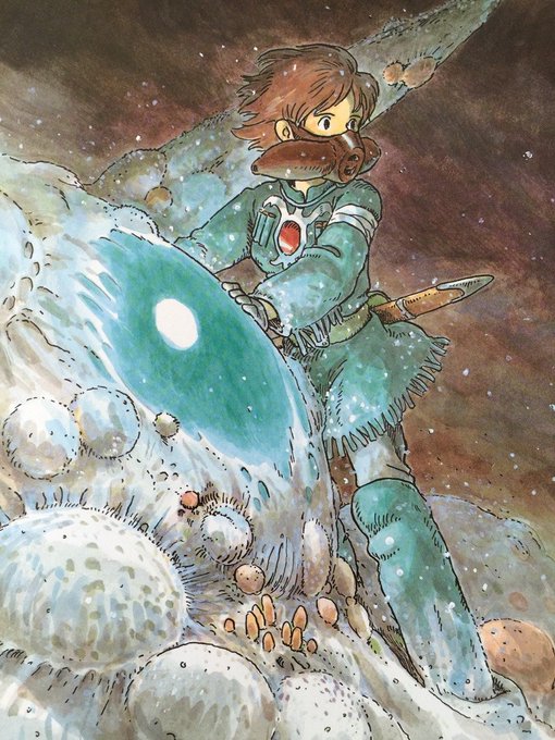
Original for comparison. Looking at it now I'm missing a lot of the glow coming off the Ohm's eye.


JUST FINISHED: Resident Evil 4
With my first RE game being 8, it was really awesome going back and seeing all the comparisons made firsthand! I probably still prefer 8 (hard to top since it was my GOTY last year), but this was pretty much more of the same that made that game-


In the MIRI image (mid-infrared wavelengths), it doesn't seem to have an inner molecular ring, at least at JWST's resolution.
Comparison image is NGC 891 in Spitzer IRAC 3.6 μm and MIPS 24μm from Hughes et al. 2014 (https://t.co/wmUgpK0aME)


…..yea I think the comparison speaks for itself. I like the design, think it’s very pretty and fun but it’s still not Lagoona. It’s a bit too pastel for my taste and the black accents feel a bit forced. So while it’s not a bad design it definitely feels like a new character

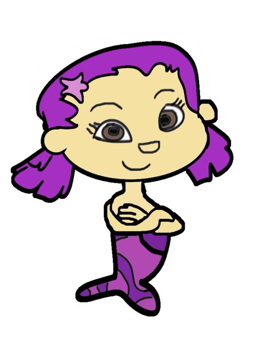

This is something I was going to post yesterday 😅 but here’s a before and after comparison of my Oona sketches from last year and this year and how it went from amateurish and sloppy to crisp and detailed 😊💜💗 #beforeandafterart #bubbleguppies #oona


Here some comparison of my last headshot and one of the first ever headshots I've ever done of myself~ Did my art change that much?
#digitalart #AnimeArt


@hankgreen You guys are loving these so I'll keep the comming !
"Carina Cliffs" - NGC3324, Hubble / JWST comparison
Mind blowing again
#JWST #Hubble #CarinaNebula