imoのTwitterイラスト検索結果。 12,989 件中 216ページ目


this is the one! ok so in comparison sumeru looks tiny, yes? so, if it did end up this small, do you think it would compensate in story? considering it's the land of wisdom and knowledge and yadda yadda- you'd think it should have A LOT of story stuff, right? imo


FF Type-0 get's a bad rap imo. The story is wacky and sometimes incomprehensible but, it had a pretty cool and creepy vibe to it. There was some weird cosmic horror stuff going on that's wasn't always addressed.




With @OthersideMeta done, it's time to look for new projects.
I've always been and will always be a strong supporter of real creators. @chain_runners just chill and create.
I've been in hundreds of projects and imo, this is the one.
#nft #nftcommunity


@acranegbp @NotYourBroNFT @RebelSocietyNFT They do great giveaways and still have the best art in the space imo


A New Mint by Our New Certified Artist,
imo_guru (@imo_guru_NFT) sensei!
"A girl in a Nordic commune"
0.1 ETH 1/1 ONLY!
#NFTdrop #nftcollector #anime #ANIFTY #AnimeNFT #NFTJPN
Purchase here:https://t.co/cI5FazNoNC


@CrashFan03 Thanks but I personally think the eyes look fine, mainly cause his eyes always change distance in the art, so there’s no real way to draw them imo.


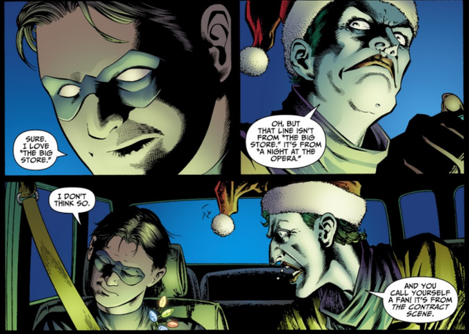
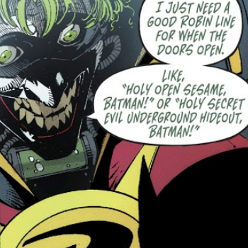
imo joker is at his peak when he does/says random ass things out of nowhere and he's geniunely hilarious rather than the edgy version of him that just wants to kill batman

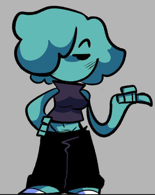

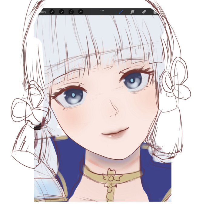
@yaeyeay //maap aku coret dikit mumpung lagi megang pen o(--(
Poninya ga usah terlalu tinggi imo, pas-in aja sama mukanya, lalu usahain rambut sampingnya rada dempet biar ga terlalu lonjong mukanya
Sisanya bagus kok👍


@huckori This is neat!! 😄however if i may provide feedback the area could use some nicer colours/saturation, it feels a bit drab with how desaturated it is, atleast imo compared to the original area.. Just a thought!! hope im not coming off as nitpicky or rude


@JosySlolf honestly he looks more expressive in his skin which i feel is an improvement imo
also his skin is just this

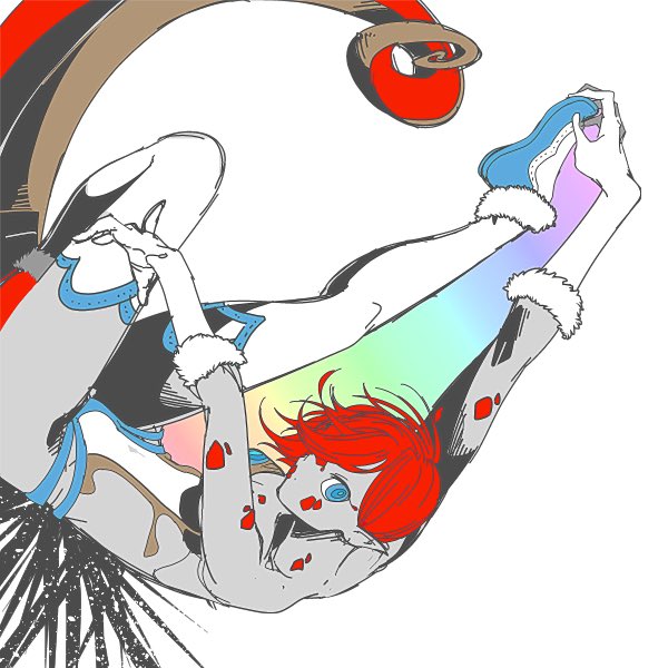

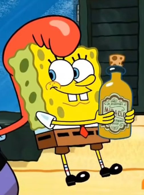
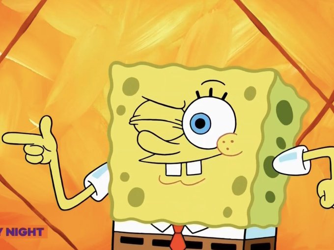

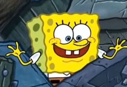
This is the most "return to classic" SpongeBob has looked in awhile imo. I love it!
Just something about how he looks in the most recent episode feels nostalgic, kudos to the team! Hope to see more of it!


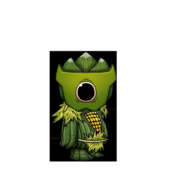
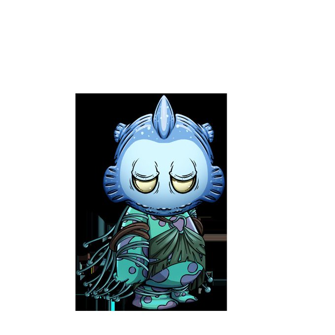

I feel like these are not getting enough criticism. Remember what you guys said about BEANZ? Those look alot more fun compared to the Kodas. Imo Yuga only got the Apes right, the rest is ugly.
Doesn't matter at all tho, will sell high regardless!


also idk if i like the black background for the pages or the white one better bc the black one doesn’t rly work for the second page imo💔


My most complex oc so far imo...
Behold the protector/wife of Clotted Cheese Cookie, Peanut Butter Cookie. A former royal guard/champion from a since fallen kingdom and has adapted to the Crème Republic ways.
#cookierunkingdom