CONTRASTのTwitterイラスト検索結果。 219ページ目


One of the ideas of Le Monde Courrier is to play up the surprise effect with certain serifs in order to improve letter recognition, such as C and G. Nothing very scientific, just visual! Rounded low contrast fonts are pleasant to read on screen. https://t.co/qbaHESHjsZ



quietly obsessed by this Chris Bachalo panel - the contrast between the handdrawn flowers in the foreground and the photograph of roses in the frame in the background. magnificent


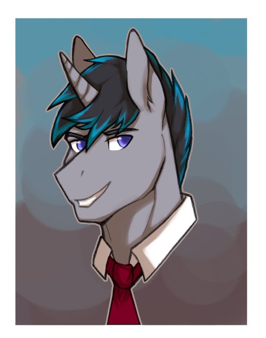
@kairolion I know it's kinda plain but I just LOVE red roses. The simplicity, the gorgeous, alluring color, contrasts so well with the green stem, I just really like it 💙 I'd say it kinda compliments my boy Jack? funny enough I've not gotten a rose in a pic with him hah


11) love the blue and red contrast honestly if u took out the mouse this would be higher


I’m just a fan of the contrast of Amethyst holding her tiny tiny babies in her big hands, ok? it’s cute

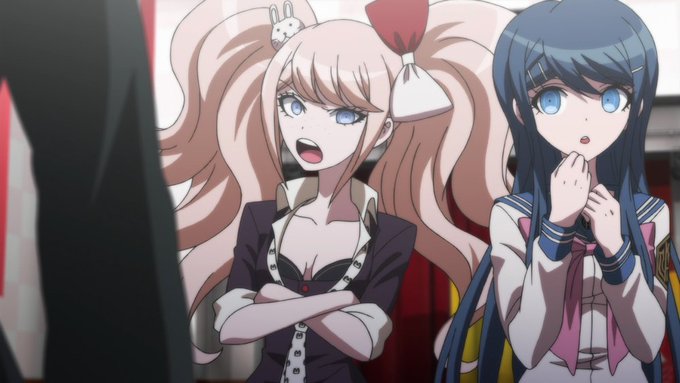

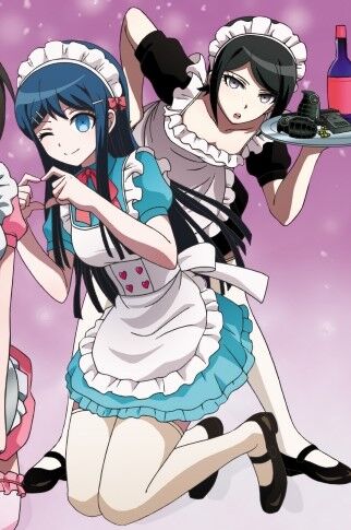

Tonight's color-contrast pairing is Mukuro/Sayaka (IkuZono) from Danganronpa! 🖤/💙
In TDP, Sayaka and Mukuro talk over tea. Mukuro asks if she had fallen for her (which she neither confirms nor denies). Sayaka then compliments Mukuro's slim figure and nice legs.

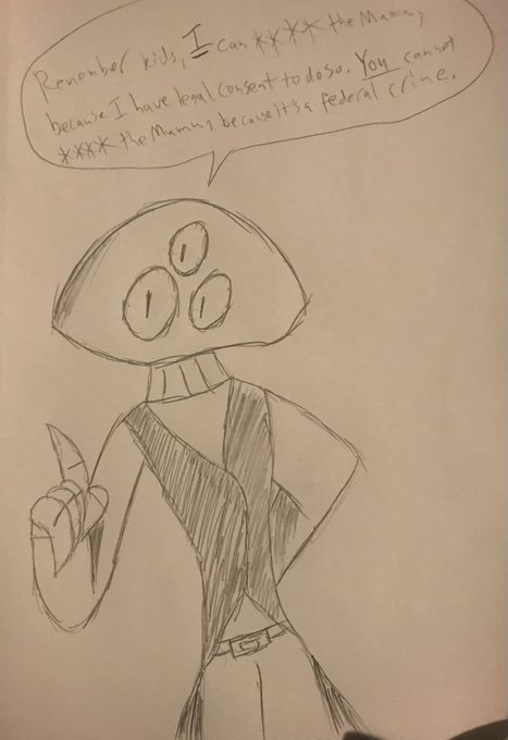
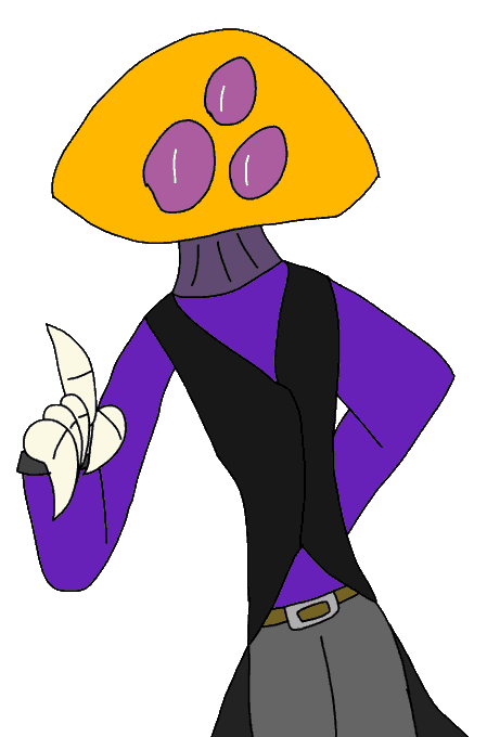
Had to wait 24 hours for for the glue I was using to fix one of my computer chair's legs cured
And during that wait I decided to do some traditional drawings of characters that were digital only, like Phoon, and then digitally trace the pencil drawing for a compare and contrast

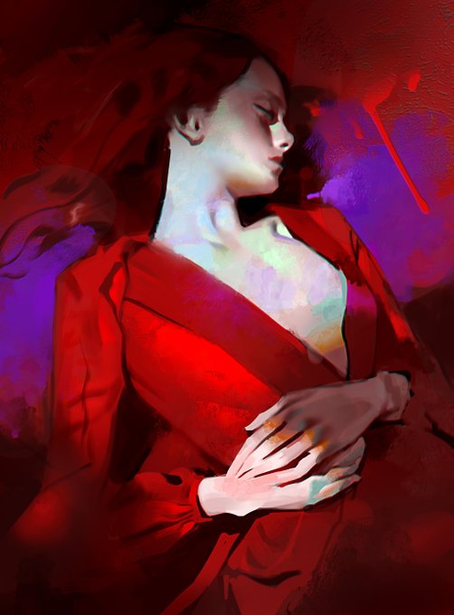

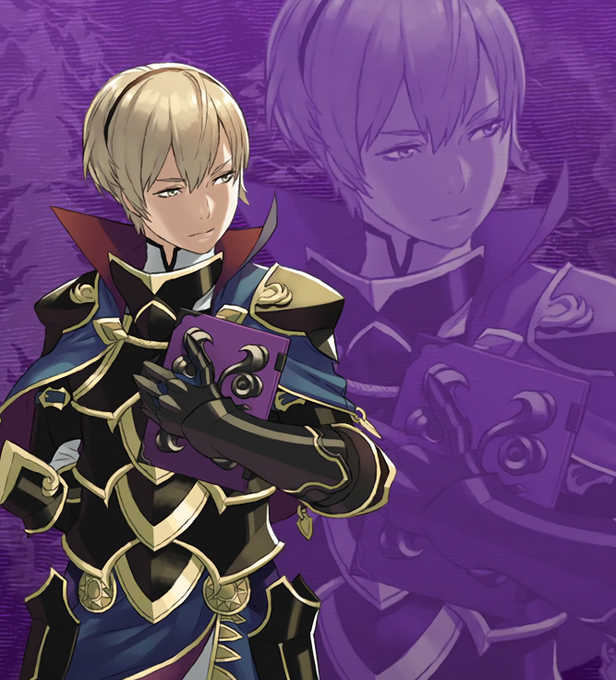
4💛 Leo - Fire Emblem Fates
oh leo your cold and calm demeanor in contrast to your romantic side gets me every time 🥰🥰😭 I will eat beef stew and tomatoes with you forever if you wanted :))


Pitch: If they'd rather keep the brightly-coloured comic book vibe for the sake of the multiverse jab, might I suggest at least having harsher lighting/contrast like old horror comics (a personal favorite style of mine/inspiration so I am deeply biased) https://t.co/VZQHhyEDjb


> In contrast, the lips that were moving against mine gradually turned gentle and carried restraint and compassion.
> During this short yet long time, my ears seemed to be covered by a thin layer and I couldn’t hear anything else. #不属光夜只属于你


@wtf_fra_
The White Queen of the GCOM, had tons of fun drawing her! Also, I'm a sucker for crass contrasts. I hope you are, too.


|Joan| Student Series [Part 2/7]
Joan in her uniform. I especially like the contrast in her uniform and bright hair color. 😊
#krita #art #illustration #oc #uniform


JUNE PATREON REWARD FOR RAMONAROSE
Im starting to get a bit of a liking to draw and use red filters 😳❤️🍓 i might use it more? Its always good to mix it with a bit of orange light! And some blue shading for contrast ~

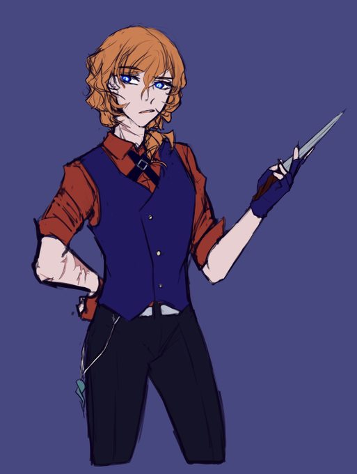
i managed, i did it. Finished sketch before going to bed.
Waistcoats hot ok.
Im really satisfied with this. Originally wanted to go with brownish colours as well but i figured itd be a nicer contrast to the au design for Atsushi to put him in more colourful clothes
#sketch

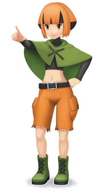

Gardenia is the Gym Leader of the Eterna City Gym! 🍃
Gardenia loves plants and nature, and uses Grass-type Pokémon—with Roserade heading her team. In contrast to her superb skill as a Trainer, she’s deathly afraid of ghosts.
#PokemonBrilliantDiamond #PokemonShiningPearl

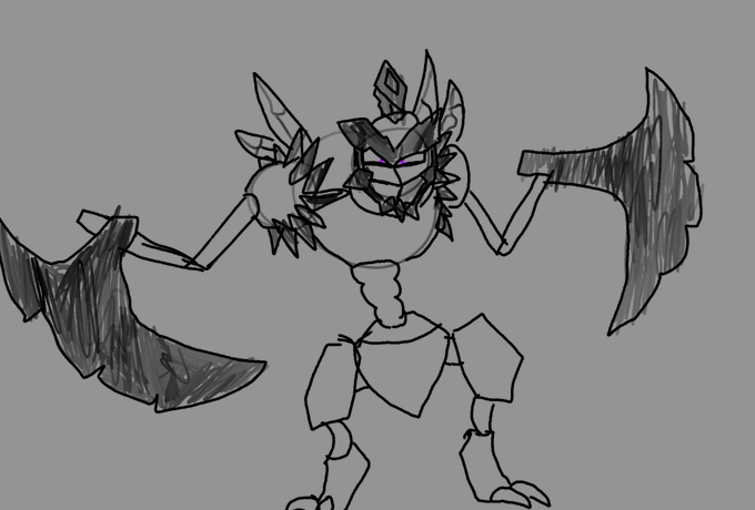
missed opportunity to give kleavor purple eyes to contrast scizor's yellow ones


Today's color-contrast pairing is Jack/Legosi (Jackgosi) from Beastars! 💛/🖤
They are close childhood friends. Jack is the only one who knows his closest secrets, as well as the only one is school Legosi talks to about personal problems.