comparingのTwitterイラスト検索結果。 23ページ目


comparing how i used to draw childe vs now.. there is a very big difference..


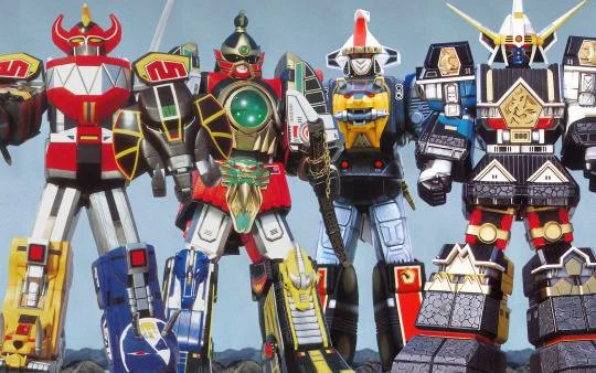


Digimon fan that thinks that comparing Shoutmon's digixros forms to Megazords is a legitimate complaint and not a petty nitpick that sounds way more like a compliment since Megazords are cool asf in a franchise where many digimon are essentially giant robots anyways.


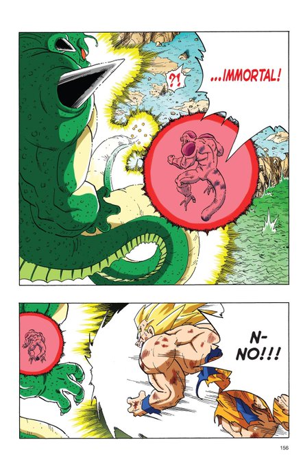
@BROONOart Every color there bothers me tbh
Comparing this to the DB full color is a joke because even back then they knew how to use highlights correctly.


Comparing art from the beginning of the year to now and holy shit 😭😭😭


Anyone got a clue on how to shade characters? here's my take on kobeni from #chainsawman and i'm legally required to say that im not biased at all when comparing it to the rest of the cast i've drawn /s


The similarities between the Avatar 2 Teaser Poster and the Teaser Poster for Avatar 1 continues when comparing the Official Posters!!
#avatar2 #AvatarTheWayOfWater


Almost forgot to post this, but -
Comparing my art from the beginning and end of chapter 2. I think I'm improving really well with environments, and I like to think my style overall has improved too. There are still areas for improvement, but I'm really proud of this!


The best thing to do if you want to see progress in your art is to stop comparing it to other art. Keep practicing, and compare yourself to where you used to be. I guarantee you'll see improvement. It's all about consistency.

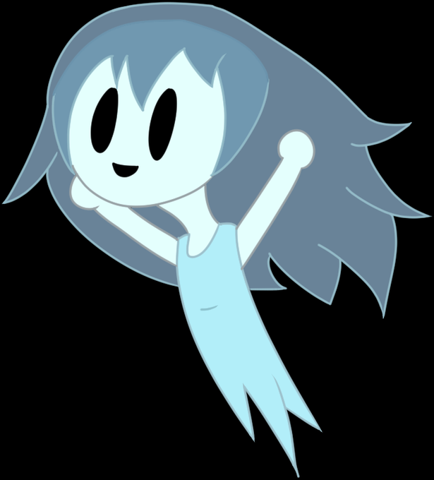

2020 and 2021 respectively. Comparing these, I really like the quality of my doodle, but I like how I did the coloured lines of 2021. Still, you can see some improvement in places. God that 2020 version is TERRIBLE. See you next year! Happy Halloween!


also for fun. yvette in the middle is the protagonist.
comparing her height to TUUW on the left, who is the antagonist.
and also freya there too just for fun cause shes p much 7 foot.

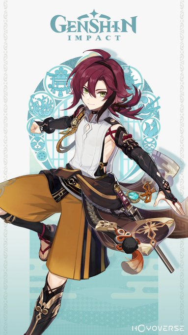
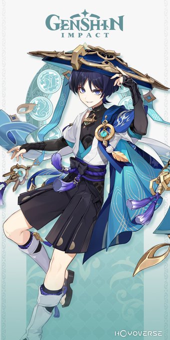
im sorry for comparing but i cant be the only one that thought about this.. right?? RIGHT??


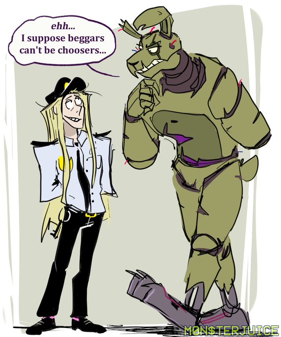
man, comparing the first one to a more recent one is just so jarring to me lmfao


y'know looking back at this tweet and comparing him now he looks like he stopped taking meth and became normal again. https://t.co/Uyy83z8pZs



I love comparing my mains between games I'm actively playing, and to most people, Blob looks SUPER out of place (image 4 is for the many people who have no idea who +R order Sol is)


I was comparing improvements on my are an o, so happy how far I have come!!
Early 2021 < Late 2022


Comparing apples with oranges
#satire #humor #humour #MonsterHunter #MonsterEnergy #grocery


While I was comparing Starry's refs, one of my discord mods pointed out that they look like the pipeline meme, so I made this attrocity ,w,


I've always thought that Mona Lisa's design in 2012 was too realistic comparing to the turtles
I mean, I love her, I love her character but they could have done a better job with her
#tmnt2012