CONTRASTのTwitterイラスト検索結果。 222ページ目

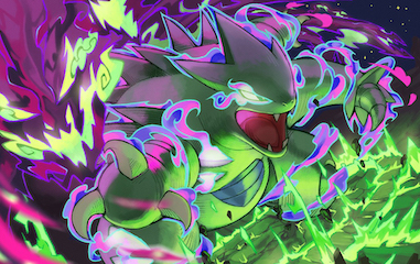
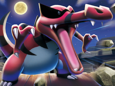

This seems to contrast with Dark-type Pokémon, which are generally coded as being ‘bad’; they have mean ‘Dex entries, moves like Foul Play & Snatch, and are weak to ‘heroic’ Fighting-types.
Perhaps, though, it's not the case that the Trainers are 'good' and the Pokémon 'bad' 2/


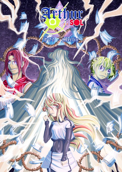


Fale uma curiosidade sobre o teu traço!
Eu adoro por muito brilho e contraste, o meu padrão é tudo cor chapada, mas hoje em dia eu brinco mais com estilo mais de pintura
Ah, e eu uso MUITO o conta gotas pq sou daltonico huehu (repare q tem uma cor q nunca aparece em desenho meu) https://t.co/SGr9XljaJA


@Noobverest @Nep_James @CosmoRyuji @TalesofSeries her jp va also played a tales character before and it's this cutie. lmao. really love the contrast of her voice between this two characters.


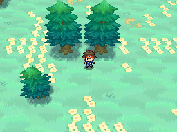
@DreamsBell Yeah, it's just not a great screenshot too ^^
For some more examples, the GBA Pokemon games used hue (aquamarine grass, green trees) for contrast rather than value difference.
The DS Pokemon games had dark trees with an interesting yellow -> blue gradient from top to bottom.


Colors of flowers in southern Thailand I like to paint with such intense contrasting colors.


I tried painting! Wasn't an *huge* success so I mixed it with line art to add more contrast. I suppose it's not perfect but not too bad!
#originalcharacter #digitalart #oc


Today's color-contrast pairing is Utena/Anthy from Revolutionary Girl Utena! 💗/💜
They represent opposite roles - the noble prince and submissive princess. However, this categorization is deconstructed, and the two eventually learn to love each other as equals.


Love the use of contrasts both visually and symbolically in this piece. #fantasyart
Uyuyan Guzel (Sleeping Beauty) by ertacaltinoz https://t.co/qnNG3GjZee


Ok but no joke, the first battle of this show is an absolute gem mainly because it was a genious idea to choose Chaos machina as the first foe to beat it made such a simple yet wonderful contrast with seiya
CH is truly such a gem 😔👌🏽


@Shannanigansart Hi hi! I'm Ruy, mexican artist and I loooove all fantasy themed stuff(?) Love dnd, magic, magi creatures and draw with contrasting collors and dynamic poses and hyper detailled illustrations


im sorry this is kinda funny to me. the contrast gap has with everyone else

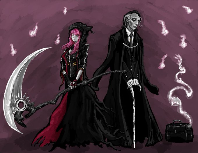
cali and her boss doing some reaping... well someones gotta collect them souls ya know!
slight redesign on cali i tried giving her a punkish reapers garb in contrast wid big boss death and his i am doing business atire
#callillust #DeadBeats #hololiveEnglish #HoloMyth





@CosmicQuacks prolly the bi colors bc i used it so many times w/o even realizing 😭👌✨ then i also like mixing in something bright for contrast


contenders for his other outfits; i feel like there's a lot of contrast here LOL


[OC]
Small reupload to include both Komainu fraternal twins, Ana & Una!
I really enjoy how their designs turned out and their contrast with each other!
I'll try to draw them more in the future!

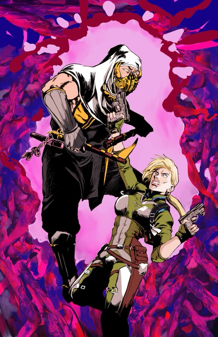
Alright, so the background should hopefully contrast the foreground of the two. I gave the background a bluer tint. I will work on the two later.
#MortalKombat #Fanart #krita #CassieCage #shirairyu
#ComicArt