PortionのTwitterイラスト検索結果。 222ページ目


Fortnite has no right to make a way better version of Siren then just not talk about it!!!
Anyway Victoria Saint with very accurate proportions haha


@Randyplays1 @DragonBallBLK I think the perspective is fine, but its just from this perspective that i dont think this part should even have a gap, it makes his one leg look really weird and his mid section look incredibly small in proportion to the rest of his body


Oh boy…so, for me, painting the human form is not terribly interesting unless it is distorted. “good” proportions are boring… that’s the reason I am stuck on this digital painting. 😢
How could I make this more interesting?


Cernunnos is also such a highlight in LB6 due to its role in the history of the LB but also its own personality and nature in contrasts to the Fairies and role its given at the ending portions of LB6


GM!! This is Betson Gongo. He is a rough-around-the-edges depiction of my daughter's favorite bunny stuffed animal when she was little. He will be a collection soon & a portion of sales will be given to #antitrafficking and #survivor assistance organizations. #betsongongo


#PorcelainMade
Thicc Jowol😍
(edited: Add in a cropped portion of the art)


Reworking the dragon dude/ actually drawing my ocs ! I feel like I’ve improved with face proportions but I don’t want to jinx it


My portion of an art trade with one of my good friends, @ZevanArt
Had fun working on this while he streamed.
Come check this nerd out.
https://t.co/c2jTXCyl0b

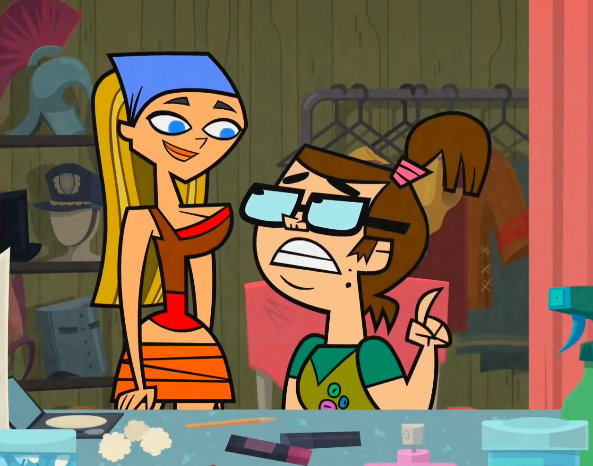
even with beth sitting down i cannot get over the proportions here. i guess lindsay is supposed to be behind her but she looks weirdly small?


@robnessofficial @fomamag Yo!
These are a Sample of my available work on foundation and portion, other work is available in my profile cheers! 🍻
https://t.co/jwO81zitfL
https://t.co/oXrysMmUim
@Crypt0Warr10r @EyesTeethFlesh @BChikun @Jan71592075 @hiram_mesa


Are these models janky? Absolutely.
Do they have their own unique personality that distinguishes them? Yep!
Tiny little beady eyes on the hyena and the bristly, mangy hairs of the mane.
Barrel chest on the plaguehound, mastiff proportions, too many teeth. Largely bare skin.


Artwork reveal, 2/3:
Dawn. Color sleepily seeps in. If you listen carefully, you may be able to hear music in the distance...
(Portion of Zach Brown's art for "How We Got On" by @idrisgoodwin, directed by @RobledoReturns. https://t.co/MHzURPCfVx. Final art later today...)


also my new design for Devil :D, the freckles don't have a nice origin but at least they look pretty (let's ignore the wierd proportions ty)
#cookierun #cookierunfanart #CookieRunKingdom #cookierunkingdomfanart #crk #devilcookie


I made this, but I think I watered down my style. From now on I’ll stick to a confident line art, crisp shading, exaggerated proportions and more contrast. #fanart #fnafsecuritybreach


A large portion of soup along with a dark kanji letter filled with a small pile of snow in the centered position.
#winter #winterday #winterdays #winterseason #winter2022 #art #artist #artwork #digital #digitalart #digitalartwork #illustration #illustrator #photoshop


getting to the font and word portion of promo image for mika///yuu bb hrnnnnnn
i am not a graphics designer pls dont eat me twit bdkjvbfkfdj

Artwork reveal, post 1/3:
1988. Nighttime. A sleepy suburb. What will the morning reveal?
(Portion of Zach Brown's artwork for "How We Got On" by @idrisgoodwin and directed by @RobledoReturns. https://t.co/MHzURPCfVx. More tomorrow...)


Finished! Candice, one of @KaiserAlmaz's OCs in a similar style and proportion to the Persona Q chibi art-style
Comes in two varieties; "no talk, me angy" & "no talk, me chily"

