PortionのTwitterイラスト検索結果。 223ページ目


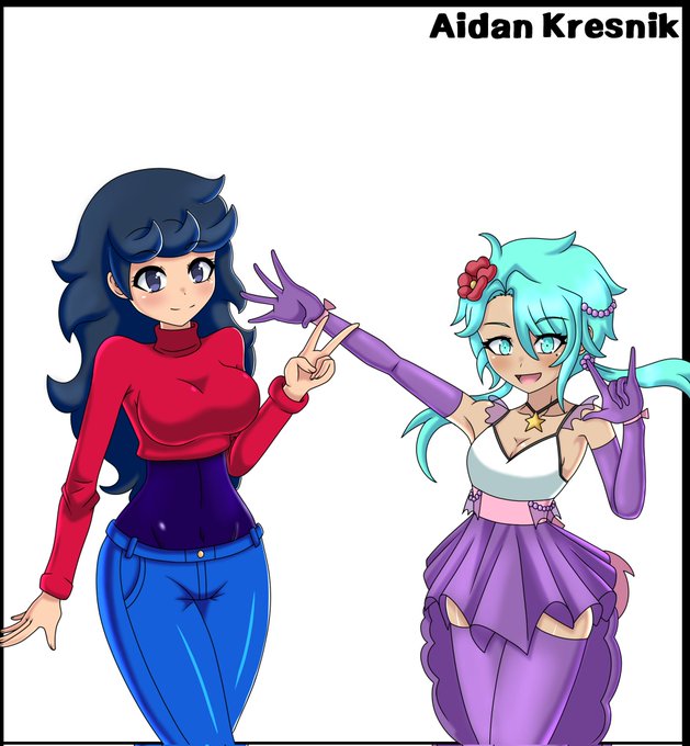
If you want to erase any kind of knowledge of human form and proportion; put that sweater on a character and pose them😂


guys
guys
guys
guys
MY SON-
(Idk if things are proportioned correctly, but MY BOY-)


Always so indecisive about how I want to be drawing my sona, really digging this for now! Torn between wether I wanna make him more human proportions or if I want him to be a little gremlin like this drawing uwu



@Kokoreth Howdy
Gonna try and get better at proportions and details
Tagging @bbqsaucepackets
@koma_prince @lunella96


Very lovely chibi from @Freezepop88 !!
I love this picture aaaaa it's so good I love his proportions



Huge portions of the Pokemon community are blue pill, loving blatantly fake rumors from twitter. My audience is very red pill, needing hard factual methods and info so Im proud of you for that.
Which pill are you?


Had to join @kumoxworld after reading what they were all about. Beautiful cause where a portion of the sells go to childrens and mental health charities.
They're also working on Children Storybooks and a game is planned in the future.
Also the art is unbelievably cute
#kumoxworld

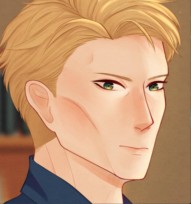

Comparing the two I definitely improved my proportions, and I'm still confused why I made him look mad when I intended it to be a domestic scene?💀


So I edited the Kylo Ren Origin Story Comic Book Cover to look more like our boy, Adam! I wanted him taller, with messier hair and bigger proportions 😏 I needed to see the illustration look more like Adam for science lol🔥🙌 #kyloren #BenSolo #bensolodeservedbetter #KyloRen

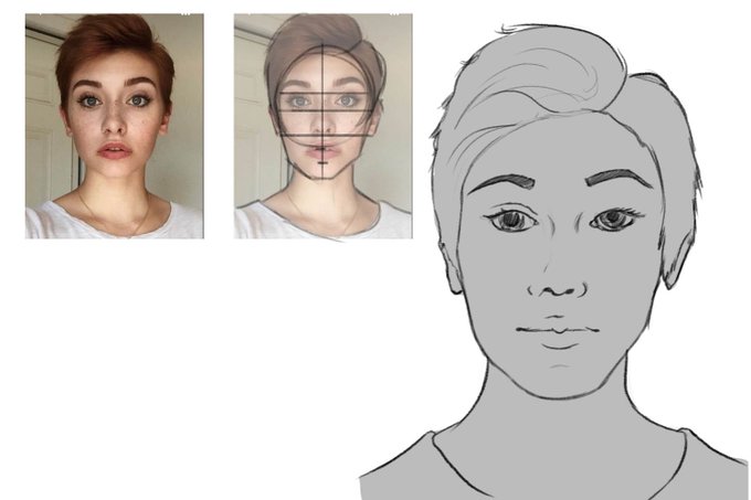
Day 1940: Neat! Tonight's result was really satisfying to do! The proportions were *mostly* correct when I checked them first, and the lines were working out. Overall, if I could get comfortable with faces to this level I'd be content! Which is clear steps in the right direction!


Just Arkin with different proportions just to test things out 😊


Had to give the new Ref Sheet YCH a test run, and decided to revamp Mimi's ref sheet.
Here's the comparison with her 2020 ref sheet!
Super happy with the proportions and feeling more confident for doing ref sheet commissions again!


This Sally back than didn't even get 500 likes but I still feel SUPER proud of this design, like all the proportions are perfect and the shapes are chefs kiss. Please ME teach me how to draw


1/9大阪のサンプルを上げました!!フェイディノ🎧🍕の小説です!!
新刊『Love&Portion』
全年齢/A6(文庫本サイズ)/76頁/二段組/600円
惚れ薬(?)を飲んでふぇいすの事が好きになってしまったでぃのと、でぃのに本気で惚れてしまったふぇいすのラブコメです!
詳細→https://t.co/a4xG0dxCOo

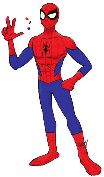
felt like drawing a spidey for fun and for doing a little human proportion practice
lines ain't clean because honestly? didn't feel like it
#SpiderMan #Spidey #fanart


coming along...
looking good enough for the texturing stage, i'll fix the proportion issues when that's done :D
(concept is not by me but I don't wanna tag tart/wyrmforge yet, this is nowhere close to finished jhsjdjshf)

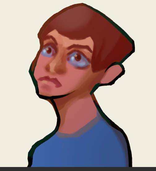
#rkgk #art #digitalart the first piece i feel good about ik proportions suck but idk dude im lazy af