ComparisonのTwitterイラスト検索結果。 22,095 件中 224ページ目


A couple doodles... a goblin and a troll Abby, in addition to her normal elf self in the first one for comparison


Comparison between #DiscoDiffusion (left image) and @midjourney (right image) with the same promt with a description of Lovecraft's portrait.
#Midjourney #midjourneyart #aiart #lovecraft #cthulhu #darkhorror


(Hoping cropping doesn't kill me here eee)
But here's a fun little comparison of my one of my character's first designs and their current design!
still working on the current one but here's how it is for now!!

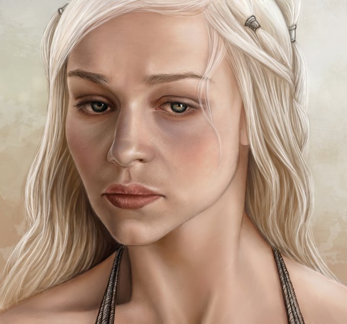


Beyond all the gross politics of the conservative art comparisons they all seem to miss just how fun it is to stylize things. My art journey over the last decade has basically been nothing but me going "less rendering, more LINES!"


for comparison
made the hat bigger, the ahoge orange and made the rider card stand out


@FontesRanter for fun comparison sake, here's a gift drawing I did for him 12 years ago
tempo voa pá


My Martial arts webtoon The Apex on Webtoon Canvas!! My artstyle has improved so much that i just wanna redraw my first few episodes! Here's a comparison of early and current art! Check it out!! #WebtoonCanvas #webtoon18 #canvas #comics #wacom #CLIPSTUDIO

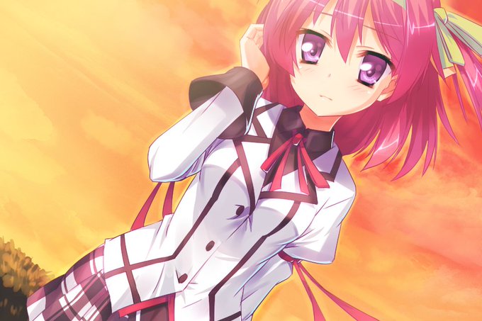


More Fragment's Note+ cg previews came out so here comes more comparisons. As always, left is old and right is new versions.


I re-colored this drawing with true CMYK instead of the filter I used to use… Comparison below!
Character belongs to @snarkfriend


as a comparison there's both this and Minecraft head


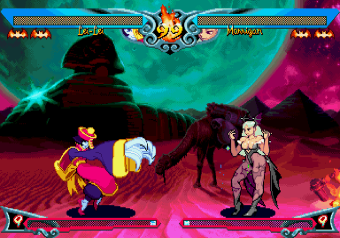
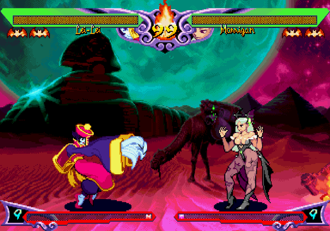
UI comparisons between VS/VS2/VH2. Note the aura around the lifebars & the frame around the timer/super meter changes color.
VS: Yellow/Silver
VS2: Blue/Blue
VH2: Green/Purple
Super meter fill also changes & the obvious background recoloring. More here: https://t.co/6PbxqOqwkJ


A less eye sore comparison lol. Btw I can't wait to get his outfit with his all new animation of his elemental burst


Art tip OTD:
Try something your not good at!
By experimenting with things yourent familiar with you create mental comparisons that let you understand it and hopefully improve at it!


I think my pressure has gotten better in some ways compared to the beta.
Now instead of safe-jumping, I just do meaty 6S. I find it to be WAY easier to time.
It move reminds me a lot of the old Deadspike.
(FYI, I'll be making Ragna comparisons until I die)


@voolingeveryday @MasterMatt64 @HamonBeat Fine? I mean yeah Araki's art is good but that font looks so tacky, it's a literal newspaper font. Where's the stylisation like the JP volume has? Better yet, you compare it to other Languages and it looks even worse in comparison


People like @jakethedegen and @DrifterShoots and @DeezeFi taught me that in Web3
ANYONE
and i mean ANYONE can fuckin MAKE IT.
And there are all of the tools here to do it BY YOURSELF.
Comparison of growth
Left = 2021 right = 2022
thread 🧵cont.


I’ve never had the chance to talk about it but I do really love how colorful and poppy all of Rise and Sunbreak’s original monsters are, especially in comparison to World’s. They just have a lot of visual flare that make them more appealing to me than the likes of Anja and Jagras