ContrasのTwitterイラスト検索結果。 10,815 件中 227ページ目


I think one of the most beautiful parts of Berserk is that when Guts forms his band and you see them bond and work together it's a contrast against characters such as Griffith and Mozgus who gave people a purpose but stripped away their autonomy and ability to grow.


This cover is so colourful and bright, in contrast with the basic looking colours of the Dr Stone characters' outfits
Not that I blame them, they're busy building rockets than making coloured outfits


I'm trying to study drawing more, but facing the problem of not understanding volume (mainly in anatomy) is kinda really hard. Maybe im bad at observing?
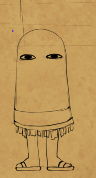
Anyway, I built this redioactive gradient map that contrasts values.
It kinda helps?
Thoughts?


What's a piece of trivia about your art style?
I have a three-layer color contrast going on in my artstyle, among other things.
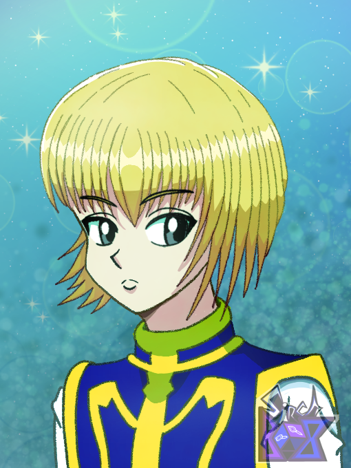
~Notice the gradually darker shades of yellow/orange in Kurapika's hair https://t.co/rLrTddaK1f


4. My favorite designs are a tossup between these ones. I have all their color schemes in my head but I also love big hands in a design and contrasting colors. Colorful things always catch my eye.


@CanalBrushRush No momento, minha maior dificuldade esta sendo escolher boas cores quentes e frias para gerar contraste. Também ainda não sei muito bem como renderizar e as vezes erro na perspectiva ksksks basicamente é isso kkk Abraço, Guilherme!😊


El color es importante en toda la obra de Nakayama, su contraste y el juego de luz son primordiales a la hora de tomarlo en cuenta como maestro.


ೃ♡ Hi there!✨ First commission of this month!🤍 These adorable twins belong to @/yuiikano 🥰❤️ I love the hair color and the color palette in general, it creates a nice contrast💕 Thank you very much for your patience, I loved to draw these cuties🥺💗


Today's color-contrast pairing is Akito/Toya (AkiToya) from Project SEKAI! 🧡/💙
As best friends, Akito helped him find where he belongs, while Toya noted how thankful he feels to have Akito in his life. They see each other as partners and rely on each other when performing.


And here's my third frog in a hat! A more realistic (ish) frog to contrast with the very not realistic last one I posted. Ignore the back feet, I couldn't for the life of me figure out what was going on with them in the reference. #InfinityTrainGallery


@NeviTheLettyFan probably third, red is nice ~
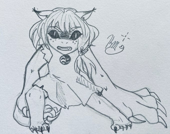
black contrasts her white skirt well ~
(though plain white and pink is always cute >u<)

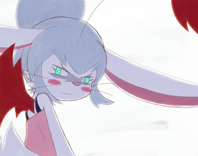
Angry Claire Doodle, cause I wanted to try that shadowed character contrasting with bright background thing.


Can I just say how amazing a choice it was to include white as a stark contrast to the darker colours used in the sunset fight scene in SAD-ist's new animation???? It's such a small thing but adds so much to the overall action


People forget that in the beginning of the Yashahime anime, Towa acted rough and looked down on others. She's surrounded by weak people so she puts on a face, she's not comfortable showing vulnerability (this is why her speech contrasts with the final episode "I AM the weak one")


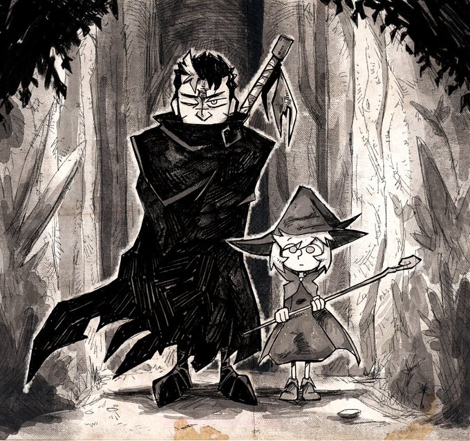
CARALHO EU AMO O CONTRASTE DE PERSONAGENS DE FAÇO-- tipo olha essa anatomia da esquerda! e agora olha o gnomio da direita


A quick experiment I did to see how contrasting colour would look on a more muddy coloured background~ I think it turned out okey


Today's color-contrast pairing is Cheren/Bianca (DualRivalShipping) from Pokemon! 💙❤️/💚🧡
The two debuted in Black/White as the first rival duo in the series. After the timeskip, their relationship is notably closer, Bianca wearing glasses similar to Cheren's previous pair.