downgradeのTwitterイラスト検索結果。 1,531 件中 24ページ目


@SoaHCity Stinky downgrade in my opinion. Not as bad as the other downgrades, but damnit all man, I'll miss the 2000s Uekawa artwork :(
I do rate the more saturated blue, not bad👍🏼
Feel free to be a true Sonic fan and attack me for having opinions on Sonic artwork.


The New Batman Adventures had some serious design downgrades like damn lol

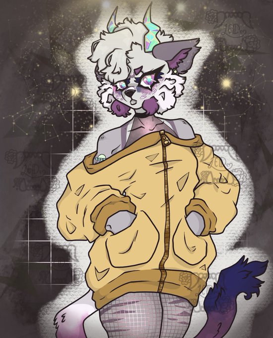


Wip—downgrade.
supongo y creo que haré esto de ahora en adelante para mostrar estos avances que no nuestro completos que le falta aún.
Yo solo buscaba el Blur. Pero bueno esto está mejor que eso y no nuestro todo
Y bueno , falta ponerle color a las botas y a pequeñas cosas


Excuse me??? What is this fucking nose downgrade??? they took half his fucking nose????


I know sonic origins has stirred up a lot of talk about where CD is in the timeline, but literally no one can tell me that silver sonic came after metal sonic. That chunky boy would have been such a downgrade


Yo new upload and ye sorry if its downgraded a bit I drew this on phone cus can't really draw on laptop here in the province :>
https://t.co/uCc81yofMA

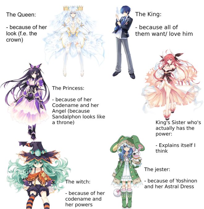
Is it me or does it seem that some of the goddesses together look like a cliché medieval courtyard? (Preliminary: None of the goddesses should be downgraded by this. I only noticed it casually) via /r/datealive https://t.co/imDVWQ6rjx


Was always intrigued by "graphics first" 16 bit games like the lion king getting visually downgraded nes ports in the last days of the nes


Cinder but Downgraded
Just a concept since you gotta start somewhere man https://t.co/CBtfy5nWiU


@UbeOtter Either way,,,, such a downgrade look how they massacred my boy


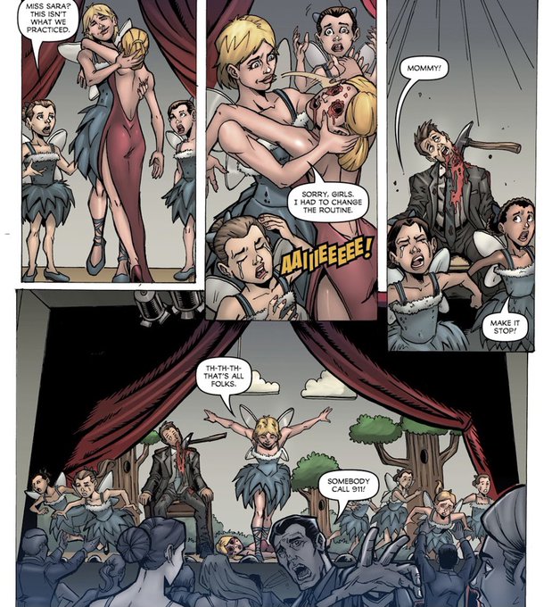

Tw: graphic imagery
Dude, if this is what the Willy’s wonderland crew did when they were still alive then I’d say what we got in the movie was a massive downgrade Jesus Christ. And for those wondering the people here from left to right are: Willy, Sarah, Gus and Arty.


Pluto! ❤️ Downgraded from a planet in the solar system, never downgraded in our hearts.


banner by downgraded
#pixilart #pixelart #pixilartapp #pixels #art #app
https://t.co/gMPHLZ2qO2

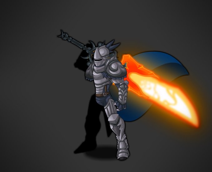
Felt hella nostalgic so I made a "Knight of Oaklore" And then I got a thought too. I really miss having the original Legendary Magma sword as it meant a lot to me, and I used it to make the Evolved one. Can we have a merge or quest to downgrade it to the original? @Alina_AE


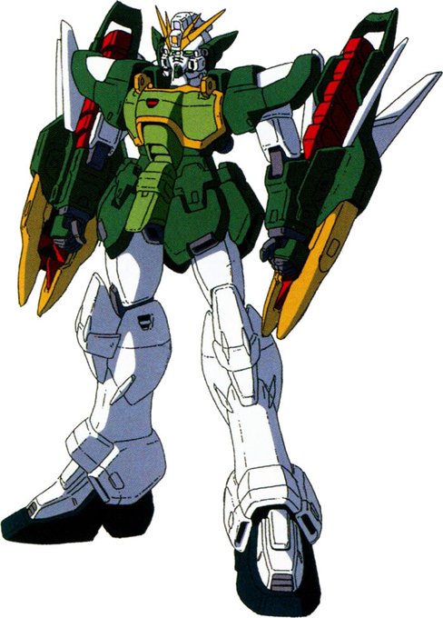
@GiantShootyRobo Every Endless Waltz redesign except Altron was a downgrade from the TV version
Giving the Wing Zero actual literal Angel wings was just too much and it looks tacky