FontのTwitterイラスト検索結果。 5,201 件中 231ページ目


"Matariel, Font of Life" by @bugmeyer #ArtStationHQ https://t.co/KgAvelhPcg


Matariel, Font of Life 💧
Matariel thanks sustaining members of the Angelarium Patreon!
https://t.co/FekexaxGYJ



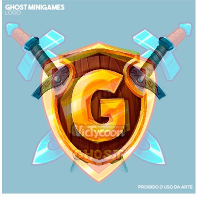
@DanNick_MC @EierHase @GommeHDnet Are you implying that I copied it? I've never seen this logo in my entire life. I make several logos in this shield style as I said, Crazy. See one above the other: different shell desing, different font, different tângulo, swords in different position.


A 4 part illo for the @wpmagazine which accompanies an excerpt from @SLuxenberg's book, 'Separate: The Story of Plessy V. Ferguson, and America's Journey from Slavery to Segregation', detailing the forgotten Northern, pre-Civil War origins of Jim Crow. Thanks AD Christian Font!




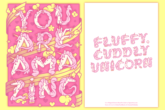
Happy #ValentinesDay! Love is magical, and what's more magical than unicorns?🦄 Sprinkle some unicorns into your card with this font by @typearture: https://t.co/VqZclcWMID #ColorFontWeek


Happy Valentine's Day 🧡❤️💛
To spread the love today we introduce you to Criolla Nueva ! This color font is inspired by the visual signs & symbols of original Latin American cultures.
Enjoy Vanessa Zùñiga's font for free 🎁 https://t.co/b9cvBgYjRc #ColorFontWeek #ValentinesDay

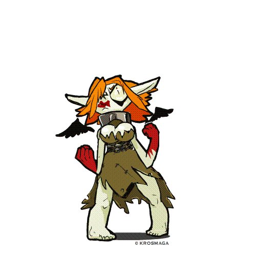


Ce message et adresser aux personnes qui font des logos avec chibi maker conseil arrêté avec ce truc alors que sur internet il a mille fois mieux quand ton cherche bien exemple.
https://t.co/4CP8uhP3ik
https://t.co/e44gkeHW3w
https://t.co/OIn0pXhIg4


Balloon tail widths, where they meet the balloon, should always be consistent. Here's how I do that: When I add tails (pic 1), I make sure the "fat end," where it touches the balloon, is about the same width as the letter-height of my dialogue font (pics 2&3). #lettering #comics


Un dernier PsychedeliBob pour ce soir :D Bob respecte tous les points de vue du monde, même les plus fantaisistes, tant qu'ils ne font de mal à personne <3


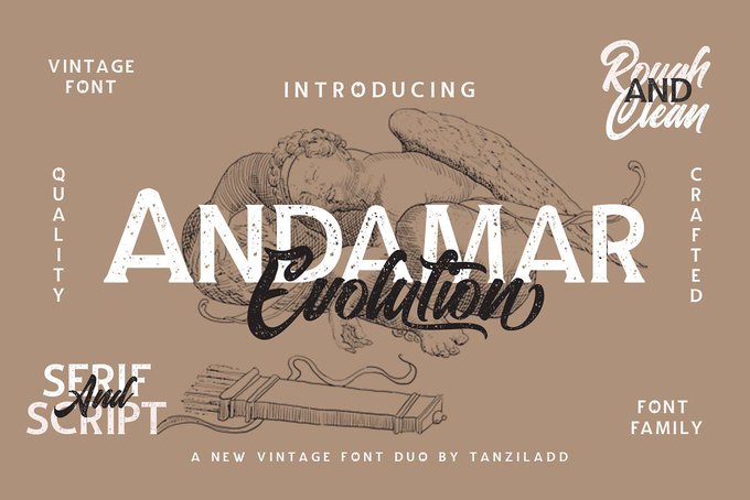


I have another poll because I'm having a lot of trouble with the font! It's almost done though! Poll in replies, RT's appreciated, trying to get a lot of feedback for this one~