comparisonのTwitterイラスト検索結果。 22,151 件中 232ページ目


@10MARC1 @particlesbbs Not that the ST was bad. It's MIDI capability was excellent, and I believe it had better buffering on the IO ports. But the Amiga had an extra bit of colour-depth (two, if you count extra-halfbrite), smooth horizontal scrolling, and superb sound capabilities in comparison. 🤔


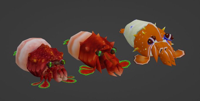

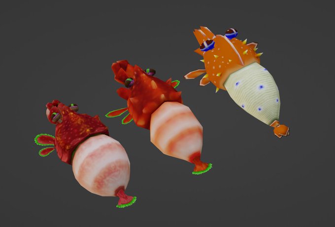
additionally heres some comparison shots between the 3 models, the leftmost model is the Pikmin 3 appearance, the rightmost model is Pikmin 2's, and the middle is the revised version that sort of combines both for its appearance in Pikmin: New Fortune https://t.co/1sBHRCV6ZT


@SonicpoX How about this for a throwback?
*I tried lol, actual design for comparison*



The poses are similar so it’s okie for a comparison…
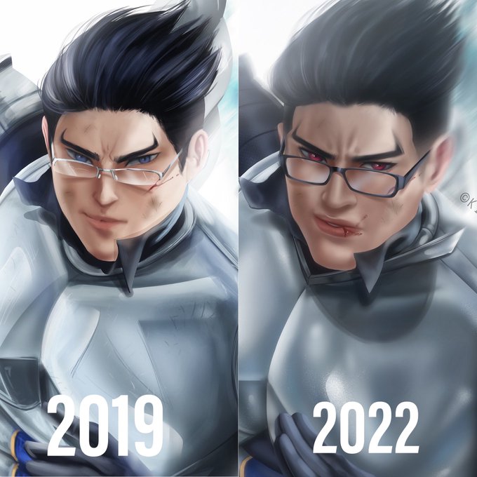
My first digital art (2021) and my recent digital art (2022)
Sincerely I don’t show this very often but I’m so proud of what I’ve done along this 2 years


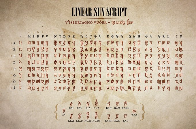

The Cursive Sun Script syllabary with major positional variants, with earlier Linear and Sovereign scripts for comparison 🌞
(not included: ligatures, logograms, and scribal abbreviations) #conlang



Asme Daywing kneels in the middle of the tiny cell on the fel hammer, nine paces by nine paces, an irony thats almost disgusting when she learns of the fact, but, that is to come later. For now, she is pathetic, not worthy of the comparison.


@ysvyri Thank you for this ! Little dragon artworks comparison : The first one is from 1 year ago and is far too boring in my opinion. The second one is my latest illustration and I think it's a little bit better.


Stream done! Here is a side-by-side comparison of what had been accomplished during the stream. OH THE DUALITY... THE MISERY...
Also, big thank you to @jasper_dt for the raid! I very much appreciate it and I wish for you to have wonderful streams to come! :>


@gigglybubblezz sure you shouldn't judge an animation by one of its frames, but *that* frame of ochako still haunts me, especially since they've adapted important panels perfectly before like this second comparison, it kinda makes it obvious when or not a scene will turn out ugly






you know the blank canvas set had some questions raised with the outfits being so ethnically ambiguous it came off as mishmashing multiple cultures together (especially with the song name being nomad and all) but imo the set itself is pretty inoffensive in comparison


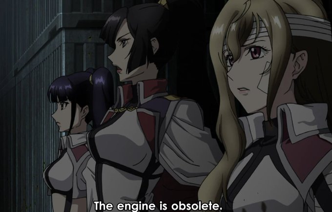

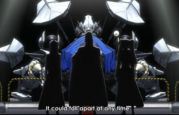
In case you're wondering this is part of why I keep joking about Ford Pinto as comparison, in addition to the fact that these are the dorkiest mecha in their shitty bike form. This is THE Ford Pinto-est mecha description of all time


This was lying around... some height and species comparison thing... Zzz
My mind is very blank with how to develop my characters and worldbuilding and creating new species/ocs too... fried




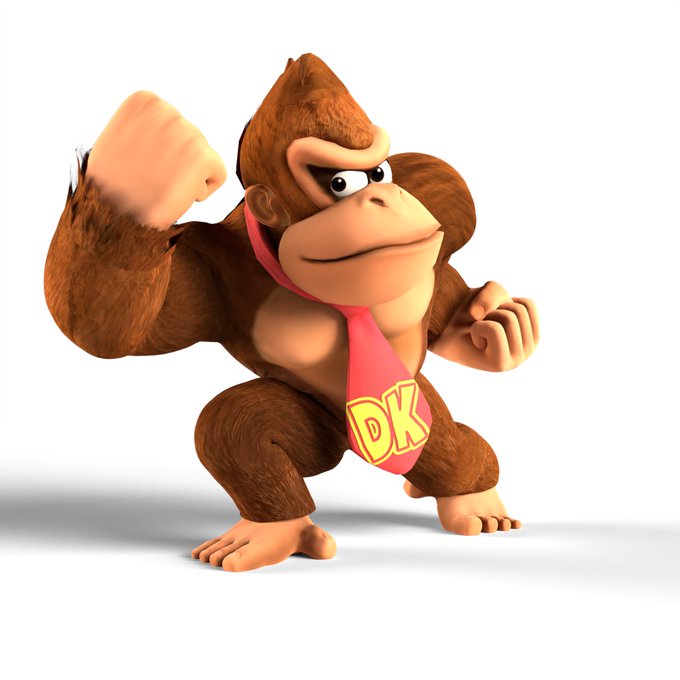
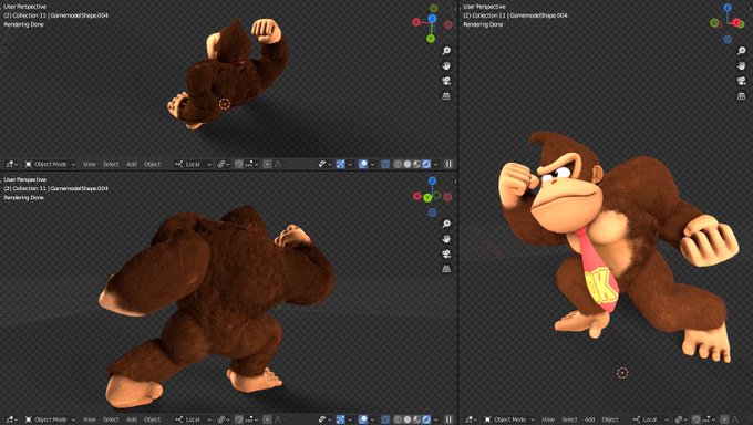

My first time ever using a hair simulation, I think it was VERY NECESSARY if I was gonna go onto DK's brawl render remake. Here's some comparison shots (idk why he looks almost yellow in the original, weird lighting I guess lol)
Lemme know how I did! Feedback is very appreciated


We getting closer to a reveal of my #Live2D model so I wanted to make a little comparison of current to future model.


