ComparisonのTwitterイラスト検索結果。 22,245 件中 233ページ目


Since my art style has slightly changed, I’m providing a few examples of how my art would look like! + a flat-colored and shaded artwork comparison!


Here's a comparison of a pre-DMT figure study & my post-DMT rendering (the background was drawn later). I also saved a post-DMT version that was a bit more subtle in the way it contrasted the values. I added a different background too (although it's not quite finished)


Obsessed with @singsthemoon tarnished OC who is an absolute babe and mine looks like a sad little rat in comparison


for comparison, this is the old one from last year - i think this was my first ever attempt at a ref sheet 😅 i think i've improved a lot since then!


heres a comparison between his version (2020) and mine!!!! Spot the differences lol

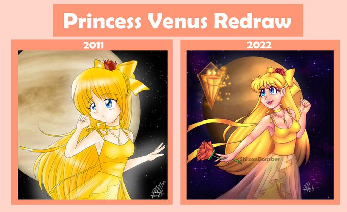
My version of the Sun (who I also have redrawn) is the father of my players and not so cowardly in comparison to his in-game counterpart #jsab #JustShapesAndBeats


Doing a settings comparison chart for PAD v.3 before releasing it--here's a couple outputs that don't even use the '#pixelart' modifier

The shoe sizes are the same as well 👍 (this was by far the most laughable comparison back then, when the old models were not rescaled.)


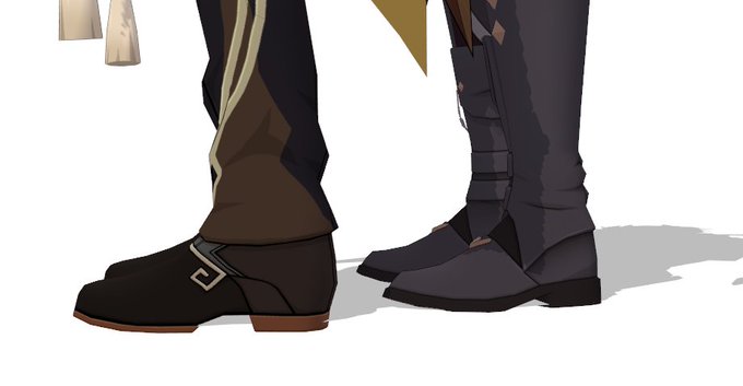
Product Overhaul Announcement: I've decided to revisit some of my older HO/OO Vans and revamp them to be more accurate. To start I've overhauled my LMS 10T Banana Vans. I've included an LNER van in picture 3 for size comparison. What do y'all think of them? Accurate?


@10MARC1 @particlesbbs Not that the ST was bad. It's MIDI capability was excellent, and I believe it had better buffering on the IO ports. But the Amiga had an extra bit of colour-depth (two, if you count extra-halfbrite), smooth horizontal scrolling, and superb sound capabilities in comparison. 🤔


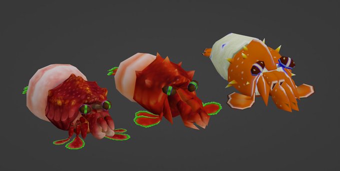


additionally heres some comparison shots between the 3 models, the leftmost model is the Pikmin 3 appearance, the rightmost model is Pikmin 2's, and the middle is the revised version that sort of combines both for its appearance in Pikmin: New Fortune https://t.co/1sBHRCV6ZT


@SonicpoX How about this for a throwback?
*I tried lol, actual design for comparison*


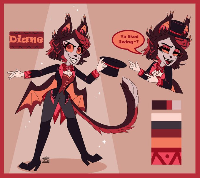
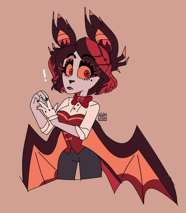
The poses are similar so it’s okie for a comparison…
My first digital art (2021) and my recent digital art (2022)
Sincerely I don’t show this very often but I’m so proud of what I’ve done along this 2 years


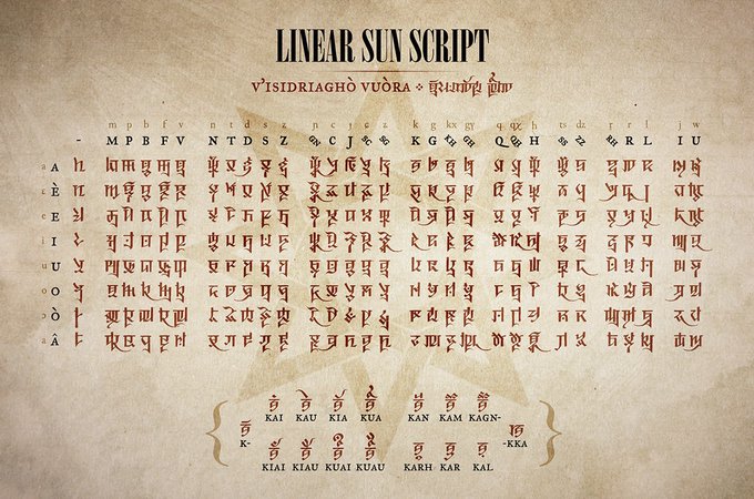

The Cursive Sun Script syllabary with major positional variants, with earlier Linear and Sovereign scripts for comparison 🌞
(not included: ligatures, logograms, and scribal abbreviations) #conlang


Asme Daywing kneels in the middle of the tiny cell on the fel hammer, nine paces by nine paces, an irony thats almost disgusting when she learns of the fact, but, that is to come later. For now, she is pathetic, not worthy of the comparison.