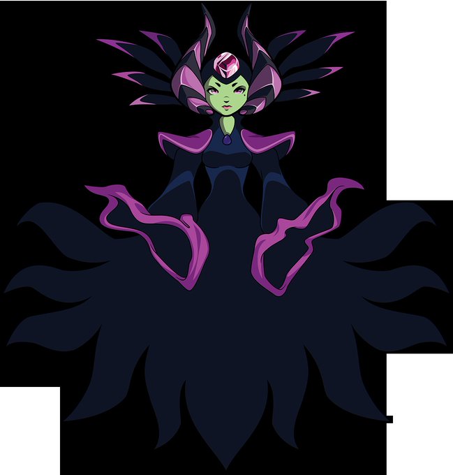
SubtleのTwitterイラスト検索結果。 6,446 件中 236ページ目


😭😭😭 poor Stolas
(But also what is subtlety 😂. The whole Stolas is Blitzo's Horse thing is taking petplay to a whole new level ngl)


@Platitudinous_X @ArcadiusDragon fun fact! she was originally gunna have a crow tattoo on her thigh which made her Way hotter, they removed it likely because the connections between the stories are meant to be subtle and that would be uh, not
granted Cyrus's isn't exactly subtle in its connection to Olberic's


So I’m trying to make a Raboot oc, it’s still a wip (I don’t even have a name yet). It’s hard to make him unique yet similar to a normal Raboot because I like pokesona with subtle changes. This is what I have rn smol stuff like longer hair and keeping the nose band-Aid


The subtleties of subsurface scattering - my fuckin' aesthetic. It's something I've shied away from trying to render for a while! I think I could probably stand to push it a little harder, but this is a pretty good start. c:


@sweatycokeslut IMBDKFUDJDSLFKS NOW THAT YOU MENTION IT THEYBREALLY DO LOOK LIKE FANARY....
bones be like: yes we ship them, no we won’t be subtle about it


@JennaGrip @YachtClubGames @TOASTINATIR some changes are more subtle than others! the key art shows them much better than those tiny sprites


This is the fullbody ref for the style I'm trying out for Vent World. It's similar to my normal style but with subtle changes and a little less time consuming.
It's also a ref for the glowing magic things we have in Vent World.


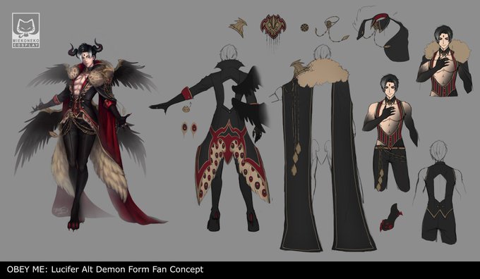
Started drawing his brothers and they ended up looking better than Lucifer, so I went back to work on Luci because he deserves it 😭 It's subtle changes but the most important one is he's looking down on us, as he should 👀
#obeyme #obeymejp #obeymax #ObeyMeSeven #Obeymelucifer


Here's a comic I did of the Du Couteau sisters, just wanted to go with something subtle. #artoflegends
Thanks to @Stepponalego_ for hosting!
& @arteapotstudio for design!
Check out the rest of the comics they're awesome!: https://t.co/uJ3r9eq7vr

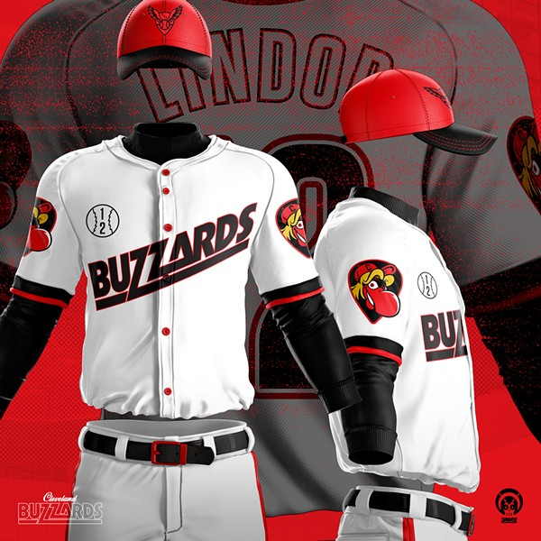
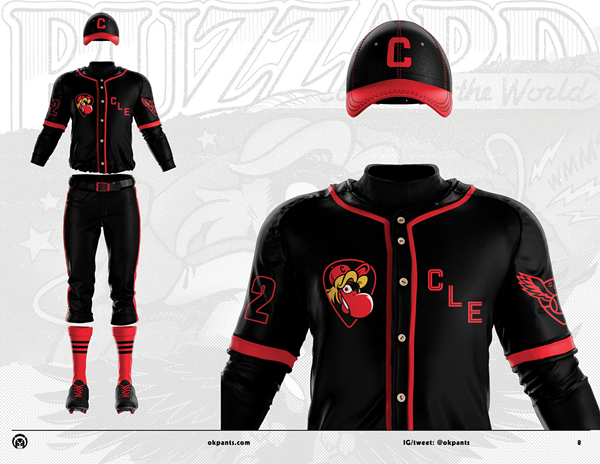
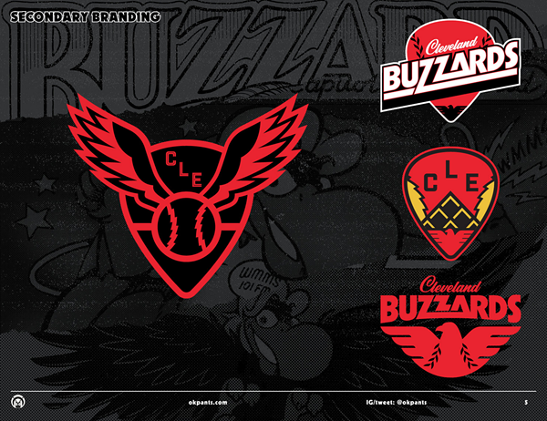
The Buzzards is the best potential Cleveland rebrand I've seen.
1) The guitar pick logo is a nice, subtle nod to rock and roll.
2) The white uniform does need to be tweaked to be less "minor leaguey"
3) They could call the team the Cleveland Scoops Sucks as long as they win a WS


excuse me but that, shading?? on his pecs??? yknow those two subtle lines hiding behind his necklace???? hmM?? HE RIPPED


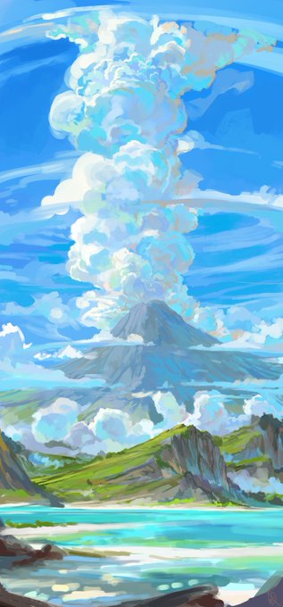

Felt like sharing some WIPs of this one. Initially was thinking to add the Traveler's visage into the clouds, but in the end I decided on something a little subtler by putting his symbol in the foreground and making it out of a driftwood arch and a winding pathway of sand.


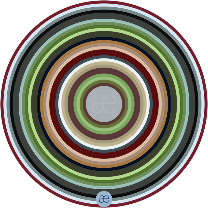
I dont know why the colours show up so vivid on my phone TTvTT on my laptop they r way more subtle... Either way, i hope u enjoy it!
#artwork #digitalart #originalcharacter


144. Folded paper by @buttonkat #change Subtle colour changes & exploring colour gradients. #wiganart #installation #installationart #changes #gradient #art #wiganart #artinwiganborough


Commissioned work for a client on deviantart of his hippogryph (or hippogriff depending on your spelling) character who owns a bar. It was quite the challenge to convey that in a fullbody artwork, but I hope I managed. ^^
Had loads of fun with the subtle colour variations!

Meili
Petrol
Phaenon
Phaethon (there is a subtle difference if you can find it)