CLASHのTwitterイラスト検索結果。 240ページ目


oh my god clash's eyes light up when squalo talks through it

clash is weird because it doesn't seem if you just described the basic idea that it'd be a very interesting stand, but the idea behind how exactly it works is actually super great, and it's also just a really fun visual gag (which araki's best ideas often seem to come from)


久しぶりにお絵描きを✨
いつもより立体感強めな
ロイちゃん・:*+.\(( °ω° ))/.:+
…こんな寒いのになんでノースリーブなの(`;ω;´)??
#クラクラ鋭角部
#ClashOfClans


先日のクラクラ世界大会第2位に輝いた@hagureyuta14さんのYouTubeチャンネルアートを描かせていただきました!😁
丁寧な解説と毎日投稿される動画に定評のあるチャンネルです✨
yuta14さんのYouTubeチャンネル😆チェけらぁ〜
https://t.co/K4xUD0p8MJ
#ClashOfClans


these are examples of textures/patterns that don't clash well. to some, the outfit might look busy or have unneeded elements.
the main thing with these outfits are that they have too much texture/patterns or said pattern/texture only appears once, giving it a disjointed feeling.

another good way to texture clash is to have textures/patterns as a repeated motif!
in these costumes, the textures are reintroduced in different parts of the fit. yayoi's denim, emily's floral patterns, and makoto's chiffon/leather are spread out, giving it a unique oneness.

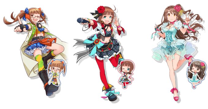
in contrast, these costumes go against the rules of color schemes and have little color similarity. this can lead to people finding the outfit jarring + asynchronous.
in haruka/uzuki's outfits, the bright blues seem to heavily clash the reds, making the outfit seem disjointed.


however, the experimental design in some of the costumes caused a wave of dislike by fans
though the costumes are conceptually great, the execution on some of them is subpar. the clash of colors/textures (esp. bright/complex) can be seen as directionless + "sensory overload"


another thing that makes them good concept-wise is the level of risk/how abrasive they are. imo they were made be hard to forget, so there's a lot going on in the designs
there's often a jarring clash of colors/textures that draw the eye not to a singular point, but the whole fit


snk vs. capcom card fighters clash redraw!! they only put whip on a dang spell card and i can't forgive them.


We need a grandma brawler 🤔
Picture is: clash royale mother witch sketch by Lyosha Atomski


This is from a series of character studies I’m doing to get ready for an upcoming #AClashOfKings sketch challenge. Here’s #Theon
#asongoficeandfire
#ASOIAF
#GeorgeRRMartin
#watercolor
#Art
#portrait
#TheonGreyjoy
#IronIslands
#Ironborn
#HouseGreyjoy
#characterdesign


Updated WIP of my D&D Merfolk! Fairly happy with the patterns- but only time will tell if the clothing will clash with them badly or not.


Quick Mother Witch. I'll be making a full version of her tomorrow.
She's such a good card. #clashroyale #Artwork

This is from a series of character studies I’m doing to get ready for an upcoming #AClashOfKings sketch challenge. Here’s #Jhiqui
#asongoficeandfire
#ASOIAF
#GeorgeRRMartin
#watercolor
#Art
#portrait
#Essos
#Dothraki
#characterdesign


Average Colt fan. / Average Dynamike fan!!1!1
#BrawlArt #BrawlStars #BrawlStarsArt #Supercell #Meme #ブロスタ #ClashOfClans #ClashRoyale #BrawlStarsFanArt #memesespanol


I don't usually do alts - I lose patience very quickly and it sort of clashes with the 'draw the inks by hand' part of my process - but I know @ErosPerTempus is a pro at it!