greyscaleのTwitterイラスト検索結果。 3,865 件中 25ページ目
This has been so hard to color maybe I am tired idk I could just stick with greyscale
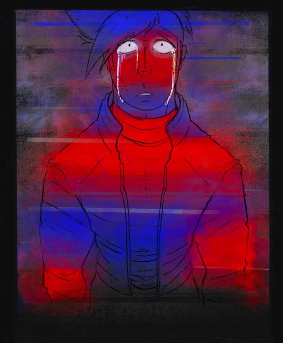
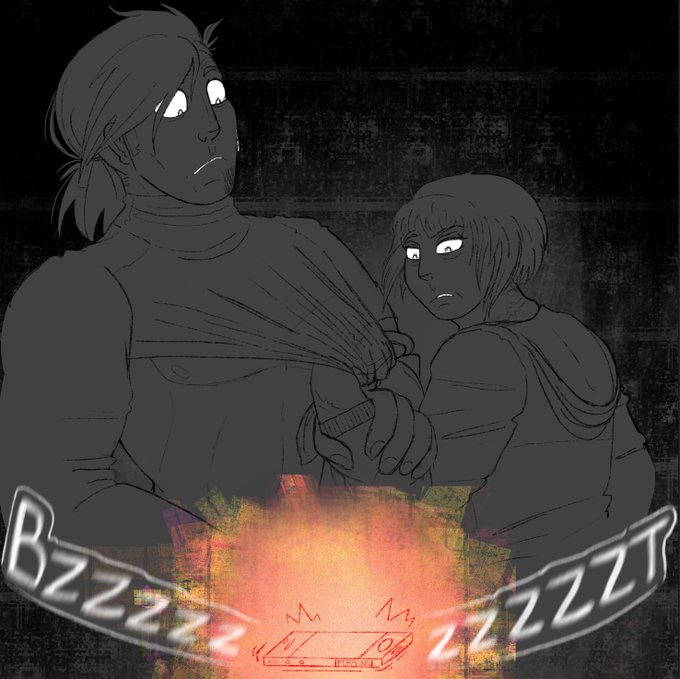
Throwback to when “Test Run” was originally done in half colour, half greyscale.
さっきツイートしたネガティブgreyscale、もしかして中々良いんじゃないか良いんじゃないか
#WaifuDiffusion #stablediffusion
ネガティブプロンプトとやらに「greyscale」を入れるとギャンギャンに彩度が高まるという知見を得た
#WaifuDiffusion #stablediffusion
A late night #wip for spooky season! Really want to practice with my values and composition. Should I try out greyscale or just go with color right away? 🧐
Something with a very limited palette to excercise once again with an 80s poster vibe- greyscale, dithering, and high black and white contrast.
Vaguely inspired by Patrick Nagel :3
Also viewable on my site! https://t.co/B1yw6hNu3e
The most interesting thing is how muddied the values were on the original one (greyscaled version bellow for comparison of each)
i was doing a challenge where i set my screen to be greyscale and get a random palette so i can't see what colors im using, then when it's done i turn the color back on !! I didn't like the result for this one so the one above is heavily edited to be cooler lol
More examples of my shaded sketch, greyscale "manga"-style, fully-rendered, and flat-color full-body pieces! 🖍️✨
Working on greyscale values and mixing the wonderful yonails.gel on Instagram with League of Legends star guardian Soraka✨️🌠🌟🌌
Haven't had a lot of time to draw due to college but I've been trying out greyscale


