readableのTwitterイラスト検索結果。 912 件中 26ページ目


Here's the Penny Girlfriend animation slowed down, to better explain.
Each number is a new frame. Sometimes they're spaced out by 2s, sometimes by 1s. By alternating between the amount of frames, I can reduce the number of drawings, while keeping the motions readable and clear.


How to Make User Interface Readable: Tips and Practices - Design4Users https://t.co/dKanMvTHRQ #UI #webDesign

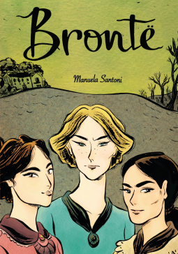
Brontë by Manuela Santoni is a graphic novel about the Bronte sisters. Short and easily readable, it's a narrative of the three sisters and their path to producing their most famous works. Lovely storytelling and great artwork.


Thanks for coming to tonight's stream!
I'm definitely out of my groove, but here's to me getting back into it! Gonna brainstorm/refine emote ideas! More sketching & research to learn what designs are readable
Thank you @GamingxShrimp for the ludicrous amount of gift subs!


imo I might use this to check how readable my art is!
real fun to use, and some of the results are fuckin hilarious
like phos got fuckin deleted in this one LMFAO


@Rageful_Tomato I thought they were OK. Dan Slott is no John Byrne, but it was way better than She-Hulk 2014, though I won't lie, the art did help A LOT, both to help the 2000 run and severely hurt the 2014 run. Seriously the 2014 run was completely unreadable, the art is so bad and boring. X_X


I realized Twitter compression may have made it slightly unreadable 😅 so here are some panel crops


You guys have no idea how long I've waited for a proper, readable version of the single bravest moment in Ben Turner's life:
When he basically asked the Mistress of the Martial Arts if she was dtf.


I did smaller layouts with each group individually too! These might be more readable at this res


testing out emotes, here's a sneak peek of one of them. This is mostly going to be a trail and error experience for me as I am not used to making such small images yet still make it readable.


@AlinaTnss or maybe one of them, if you need more readable references :3


People with dyslexia: I'm busy working on adding OpenDyslexic support. Some questions, if you don't mind:
* Is the attached image sufficiently readable (font size 24pt)?
* Would more line spacing help?
There will be additional font size options, probably 20pt and 28pt.


The Adventure Time Season 11 comic is AWFUL and UNREADABLE. LOOK AT THIS SHIT. Huntress Wizard is clearly seen siting next to CB in these two shots, but is somehow missing from the large group shot celebrating the future. This is discrimination and an unforgivable sin.


Steps 9-10
We can go as far as we want at the rendering stage. I create highlights along the line of wherever a creature breaks the water's surface to make it clear and readable, and do some noodling with small brushes to finish it off!


🌙 Immortal Souls 🌙
Readable on @webtooncanvas #CANVASHiddenGems
Druids, witches, magic and blood-thirsty monsters oh my! Fantasy and adventure where everything is on the line, including their souls.

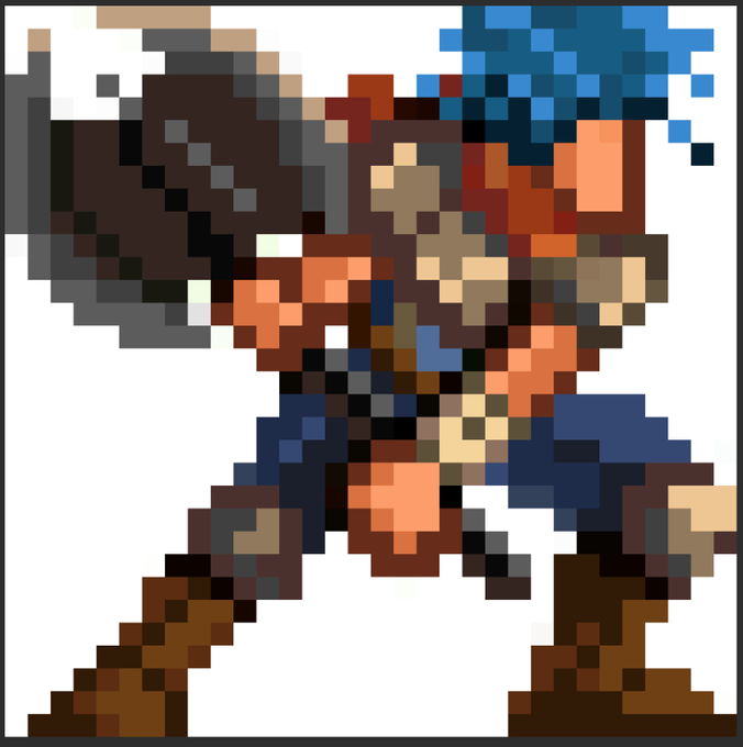
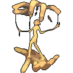
Here it is at readable size (OG is at 16x16)

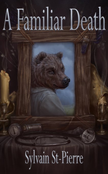

Looking for a great deal outside of our sales? Our "Books with Character" are always 40% off! 1st editions, cover defects, slight damage—still fully readable!
https://t.co/mtGj4YQFBv
Maybe get caught up on @TheTigerWrites's Death by Predation series before books 3-4 come out.


@lapsterr I think what’s amusing is this “Second Generation” Dejiko was made this seperate entity in the short gag comics that are still readable on the website. I wish I could find some translations for ‘em, though.


Western screech meowl doing gymnastics~
The pose was quite challenging, hope it turned out readable😁