ntのTwitterイラスト検索結果。 259ページ目

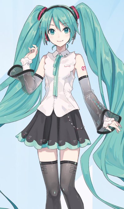


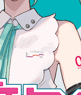
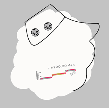
While looking at Miku's new design (which looks amazing btw!), I noticed they replaced her Vocaloid badge with a note sequence and an sfz logo, which is an open source format for instrument samples
I wonder if that means that Piapro NT is using .sfz under the hood🤔

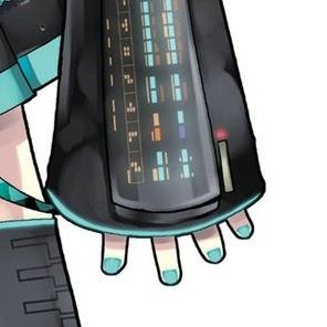


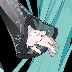
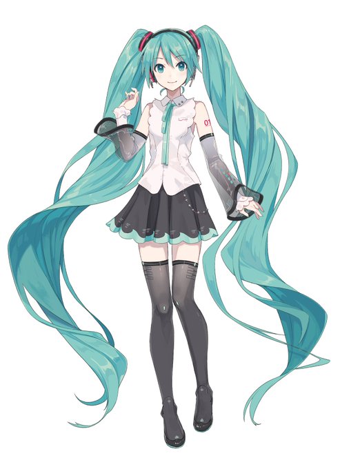
손끝 하나하나도...시리즈별로 다 귀엽단 말이야...NT에선 다 컸다고 우아하게 손 끝에 힘주고 있는 것도 귀엽단 말이야 팔토씨가 두개인것도 예쁘단 말이야....

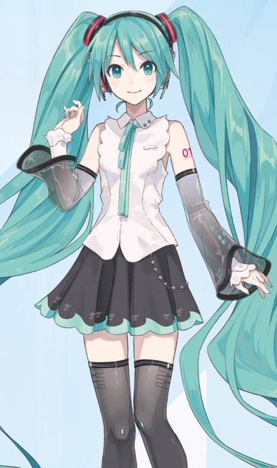
I want to bury myself in Miku NT's poofy hair. It's so big and poofy. Consumed by the poof.
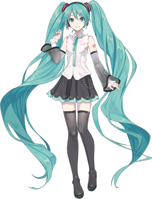
미쿠NT 일러를 맡으신 ixima님의 코멘트 번역
트윈테일의 볼륨이 화제? 인 것 같아서 제 개인적인 인식을 적어 보겠습니다.
원형인 V2미쿠의 머리카락은 (머리카락의) 양이 맣지만 근본은 (극단적이라고 할 수 있을 정도로) 타이트하고, 이 균형감에 비해 비교적 독특한 디자인이라는 인식이 있어서


i'm not a fan of Hatsune Miku NT Design, but i never love any "kawaii" Art.


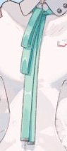
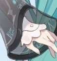

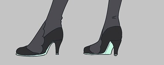
初音ミクNTのここ好きポイント
1:どうやって結んでるのかわからない縦長おしゃれリボン
2:二重アームカバー内側のひらひら感
3:丸くなった髪留め
4:ピンヒール

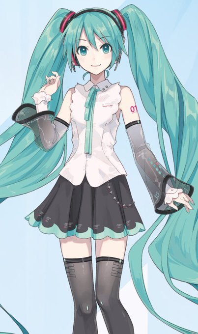
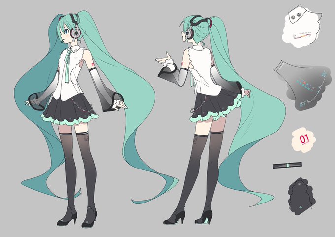
have yall seen Hatsune Miku NT's new design?
now you have.


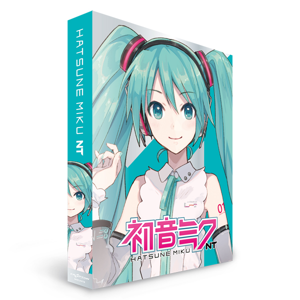
【予約解禁】
「初音ミクNT/BOX」
🎵新技術による次世代の初音ミク🎵
初音ミクNT(ニュータイプ)のパッケージ版予約がe-zoaでもついにスタート(*゚□゚*)y
これが・・・ニュータイプの力か!!
ご予約はお早めに↓↓↓
https://t.co/Dx2QmToSxy
#ZOA
#初音ミクNT
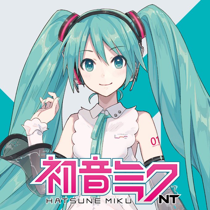
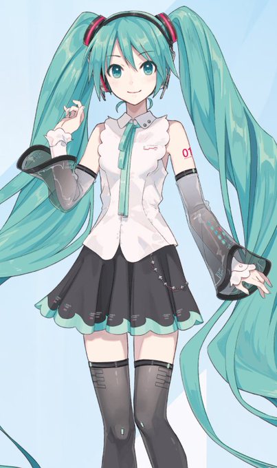
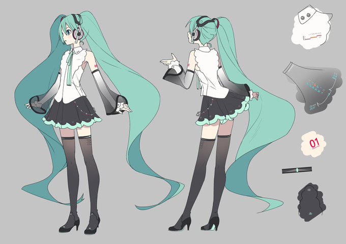
미쿠 NT 드디어 상세이미지가 나왔구나!! 프릴을 사용해 이전 미쿠보다 부드러워 보여서 좋아 목소리도 V2랑 가장 비슷하다는데 맑고 청아한 미쿠 음색이랑 잘 어울릴 것 같아ㅠㅠ하늘하늘한게 맘에 든다 NT 빨리 사고 싶다!!!

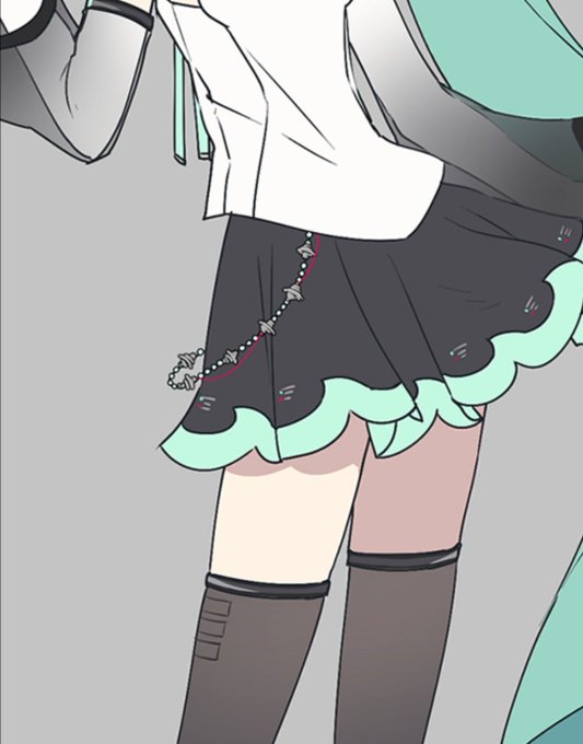
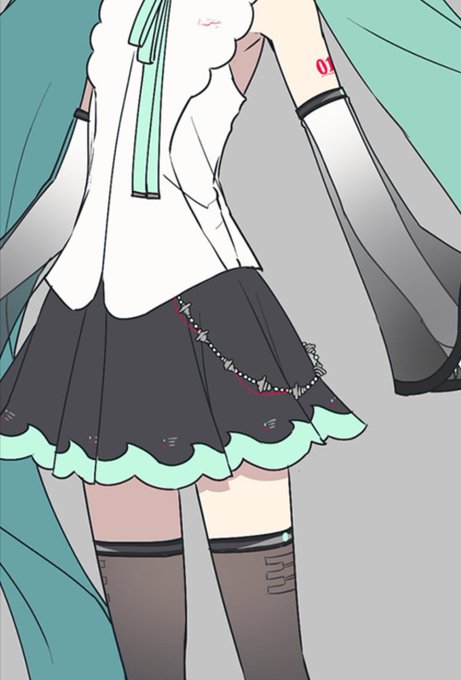

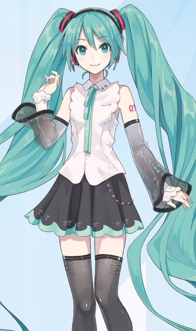
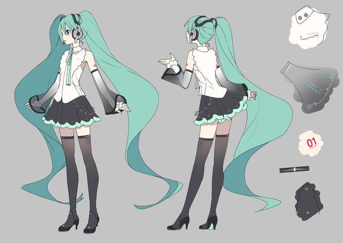
https://t.co/UrSbjEjnD0 初音ミクNTさんのヴィジュアルを引き続き担当させていただきました!新しい歌声と姿のミクさんをこれからもどうぞよろしく!


『初音ミク NT』メインビジュアルを公開&パッケージ版予約受付開始。
https://t.co/lvCyvho1Pb
#初音ミクNT


【展示エリア:特集作品紹介】
「ソードアート・オンラインシリーズ」
Newtypeで掲載された版権イラストの他、設定資料や複製原画、場面写を展示いたします⚔✨
#sao_anime #NTアニメ・クロニクル


✨ Secret Crush
nt_scribbles te ama en secreto! 😳
¿Quién te ama a ti en secreto?
➡️ https://t.co/JSYJFVTMo4