GradieのTwitterイラスト検索結果。 8,790 件中 260ページ目


I designed another character that I definitely dont need but love a lot
She has no name!
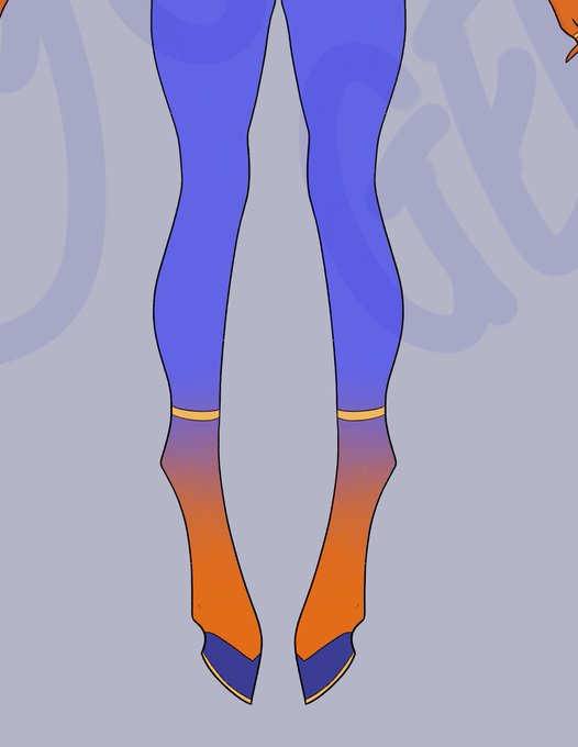
I've been dreaming abt a Draenei with gradient pigments from herb/fruit dyes for awhile and now......she is here
All I know is that she's a dancer.


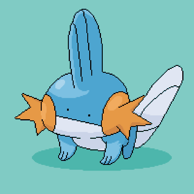
heres my little oc guy.. i was playing with gradient maps. his name is abel :]


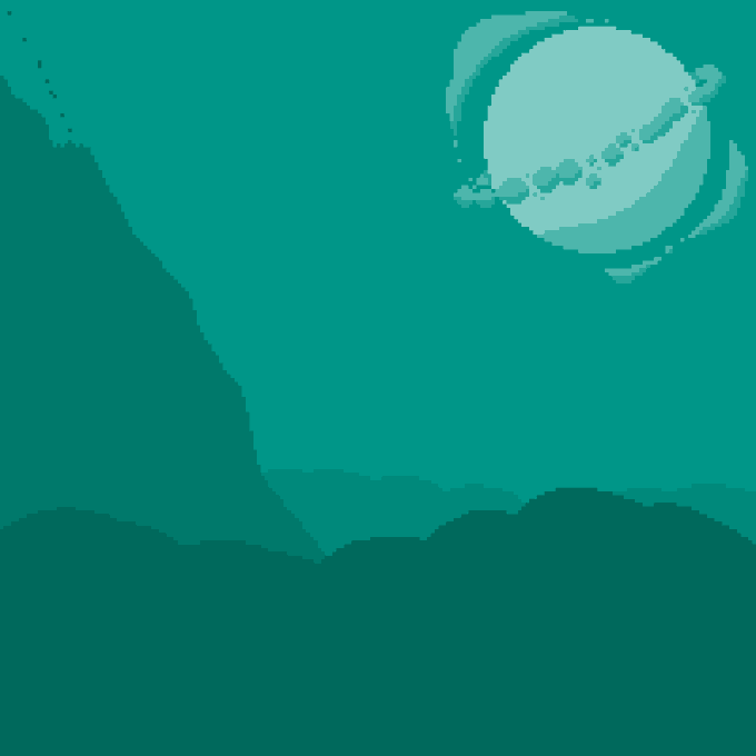
day 5. Still practising landscapes when i wake up. Tho next one. no gradient maps, dont wanna fall into habits


and to end off my good drawings and what I learned, did some low poly stuff, drew mugip, drew one last landscape piece, and found out how to draw circle gradients
order:
337 346
358 363


I have no clue what the future holds for Doom, but I do know that I'd love to see the return of the blue to yellow gradient on the logo. Just look at Kar En Tuk mod's logo and tell me that it isn't beautiful.


TAKING ONE CUSTOM CHARACTER DESIGN COMMISSION!
the price is $50! no extra costs
i cant do super complex designs (mostly gradients) so be warned!
these are FERAL ONLY!!!!!!!
dm if youre interested!


Painted the domakin minion this morning after using some of the new things I learned recently
Geometric shapes with smooth gradients and prominent textures is always fun for me 😊
Ps my art style is all over the place so don't @ me lmao
#FFXIVART #digitalpainting #domakin


some school work featuring my beloved: gradient maps (and my boy Gallivan) #oc


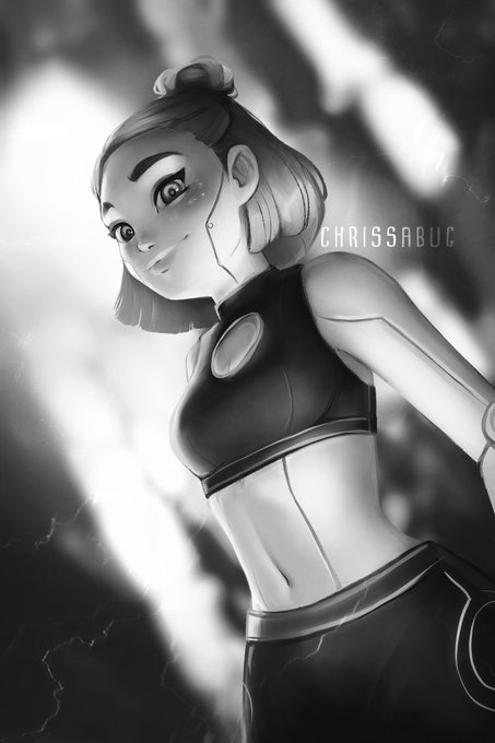
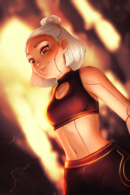
Another colored variation of this android~
Ended up playing with this really warm color scheme using gradient maps for this tutorial: https://t.co/4FFd6NLPi0


It is extremely funny to me to compare my art pre and post 95 gradient and overlay layers


@titathetitanium @octolinghacker Pretty simple: tentacles are four giant single hairs, and the texture is half blue gradient, half off-white, lines in the middle and side to mimic the model's 3D outline. The hairs have a diamond cross-section, so adjusted the texture to have the blue on top and white underneath.


@OolasDraksy the final texture will accentuate certain areas too, i just ended up feeling like the paw markings don't really "fit in" with the rest, they kinda come out of nowhere
and yeah more dark blue areas is definitely more contrast, but it also defines a smoother gradient


Here is a tip about values for working from life, find the big relationships first! Here was my first step in this painting, with a foundation like this the small changes like blending and gradients fit well within the overall impression and the parts then relate to the whole.

My water markers deserved a rematch! I realized you can use a watercolor brush to make gradients and fades and blends with them! the results are much closer now!
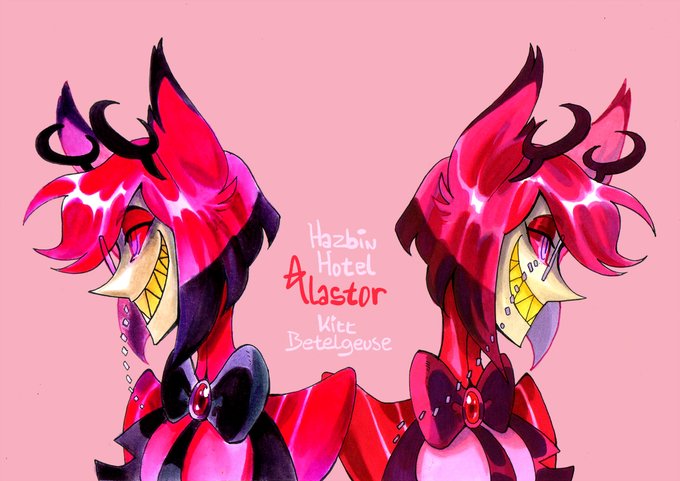
Oh and yeah... Guilty pleasure Alastor from Hazbin Hotel