contrastsのTwitterイラスト検索結果。 779 件中 27ページ目


An Alphabet full of Illustrators...J is For...Helen Jacobs an English Illustrator and latterly Primary School Teacher. She worked mainly in watercolour & in Pen and ink. Her early Fairy work contrasts with her later graphic style #ForgottenChildrensBooks
#BookIllustrationOfTheDay


An Alphabet full of Illustrators...J is For...Helen Jacobs an English Illustrator and latterly Primary School Teacher. She worked mainly in watercolour & in Pen and ink. Her early Fairy work contrasts with her later graphic style #ForgottenChildrensBooks
#BookIllustrationOfTheDay


An Alphabet full of Illustrators...J is For...Helen Jacobs an English Illustrator and latterly Primary School Teacher. She worked mainly in watercolour & in Pen and ink. Her early Fairy work contrasts with her later graphic style #ForgottenChildrensBooks
#BookIllustrationOfTheDay

An Alphabet full of Illustrators...J is For...Helen Jacobs an English Illustrator and latterly Primary School Teacher. She worked mainly in watercolour & in Pen and ink. Her early Fairy work contrasts with her later graphic style #ForgottenChildrensBooks
#BookIllustrationOfTheDay


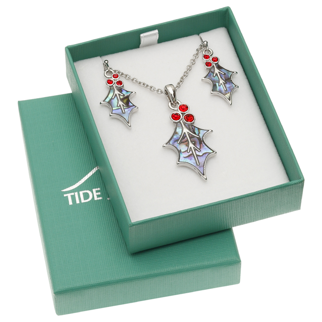
Beautiful Holly Leaf & Berries Earrings and Necklace Set. The iridescent natural paua shell contrasts wonderfully with the red glass crystal berries. Hypoallergenic. Includes gift box. https://t.co/EcBjll9KAl #PowerHour #necklaces #holly #jewellery #jewelry


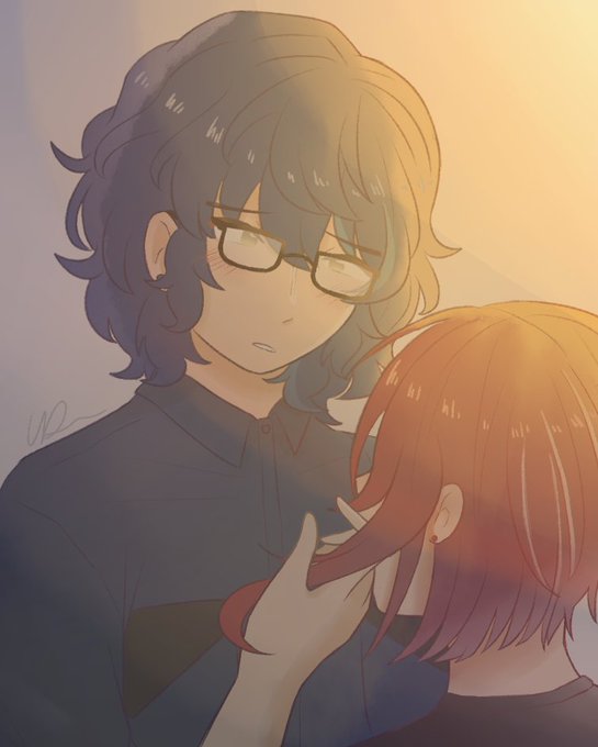
One particular thing I like is how Joshua contrasts the rest of the cast by dressing rather casually compared to how stylized everyone else is, which does a great job at hiding the fact that he’s actually way more powerful than everyone else.


I made another version with more contrasts sooo here it is (I always change stuff after I posted ffff)


Discover the drama of contrasts in #watercolour with this #ThrowbackThursday article from July 2000 issue of The Artist by Hazel Soan https://t.co/EWIHXcG1vk

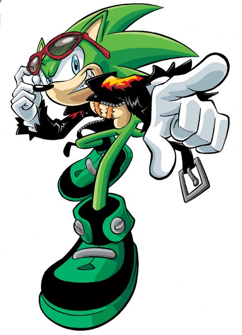
Scourge would be a nice addition. He contrasts against Sonic as a rival differently from other characters. He's less of Sonic's exact opposite & more of an "evil Sonic". He still has that cocky cool attitude, but he's also a huge asshole, and is secretly insecure about his image. https://t.co/m6z23nIXdw

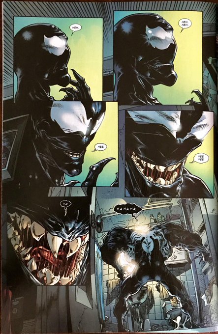
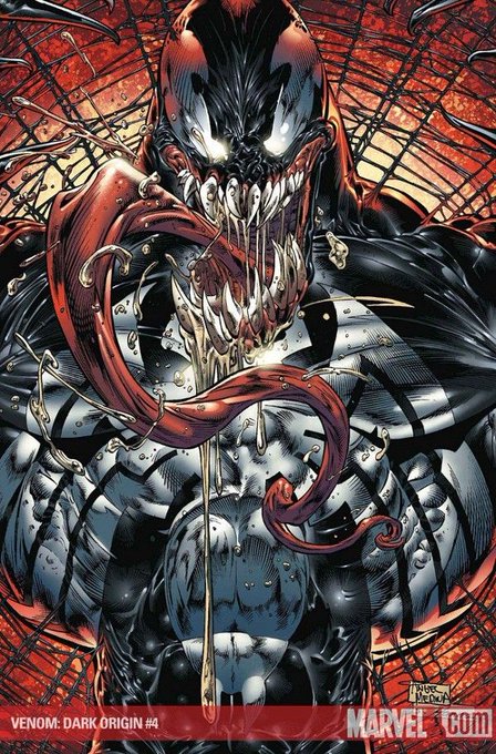
@DankoDeadZone @Yotakuboi I prefer bulky venom because he contrasts with spidey more slim/acrobatic form, as for personal faves, I liked the medina one of Dark Origins

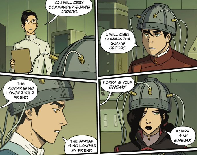
I feel like there's smth smart to say abt how it shows each character say a line that completely contrasts them or their relationship w korra, like bolin defected from kuvira, mako has made a point to always be there for korra as a friend, and asami is in fkn love w korra


#Grotta is a #font family created by Due Studio 🇮🇹 It is an irreverent, contemporary and neo-Grotesk typeface with strong geometric accents and sharp contrasts in its form. It can now be purchased from @type01_ curated marketplace https://t.co/tIVfeuOnrK #type01 #typedepartment


Hi!! #VisibleWomen my name is Deya I’m an architect & illustrator and I love bright colors + contrasts ✨

This seraphim design reminds me of a falling star, but I’ve also been told it looks like a fish. I like that it’s not symmetrical, so it contrasts with the other seraphim designs.


Name's Zawa, I'm usually drawing images with dark and bright lumis contrasts.
Hope you'll like my art and will enjoy it.
#BOOSTALONG


@FeedYourGames Thanks! Color is probably one of my favorite parts of art. I like bright contrasts and stuff. (Also made a 10page original comic recently, though tragically not in color)
Tagging: @Mr_Mansand @septi_art


“Smooth and rough, soft and sharp”: @SimoneNoronha’s illustrative portfolio is full of stylistic contrasts > https://t.co/mdAO4Nq8Gm


💀Only a real artist knows the anatomy of the terrible or the physiology of fear—the exact sort of lines & proportions that connect up with hereditary memories of fright & the colour contrasts & lighting effects to stir the dormant sense of strangeness🎨Adrian Smith💀#Lovecraft