jarringのTwitterイラスト検索結果。 595 件中 27ページ目


Not going to judge until the full vol is out but my first reaction base on the Prologue alone is....Jarring.


@thebittersnake That might explain the giant claw game hook he’s on — it’s how he was lifted out of his jar!
But, who jarred all these clones? Who’s *unjarring* all these clones? Who’s maintaining the Exegol clone jar inventory?!
Oh no
Y’ALL
THE CLUE WAS IN HIS NAME THE ENTIRE TIME


@DrJohnHWatson Harvey is jarringly close in color scheme and appearance to my OC Hugo but Harvey is like, WAY SWEETER and oh my god he has traumas and I literally spent hours yesterday setting up my house and farm (with cheats) so that it's beautiful and calming for when he moves in


Dislikes continued: It wasn't so jarring or in such poor taste to make me not want to play the game but I admit that I felt Atlus definitely could've approached that situation a lot better than they did.


Redesign of an old OC. I finished this whilst enduring an absolute assblast of a migraine so ignore how jarring the dots on the frog look, you get the concept. Also ignore the shoe, long story 😂👌
#DigitalArt #art #originalcharacter #digitaldrawing


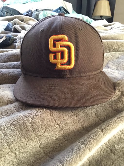

Take the new logo and just add orange it gives it more warmth and is still Padres unique .Use this hat that I bought over a decade ago. It’s not too busy or jarring in contrasts like the camo SD or road alt hat since ‘04. The orange seems to blend in and not fight with the gold .


here's my #2009vs2019 !! one of the first digital drawings I ever made (june 2009) , and the most recent one (december 2019).
(sorry for the jarring color in the left one, apparently I loved having all my backgrounds be neon 😅)


@ChikoritaCheez This could be rather jarring because one is traditional and the other is digital, but here ya go.


the product placement of green vs red will never not be the most jarring bullshit


TBH even if there weren't other things putting me off from FE3H, I wince at so many of the badly handled color palettes on the characters. I really wanted to like Claude's timeskip design, but that kelly green is just so jarring. Any warmer green would've been better IMO.


this art is from some new jpn exclusive mobile game called awakening but holy shit vegeta with blue eyes is jarring

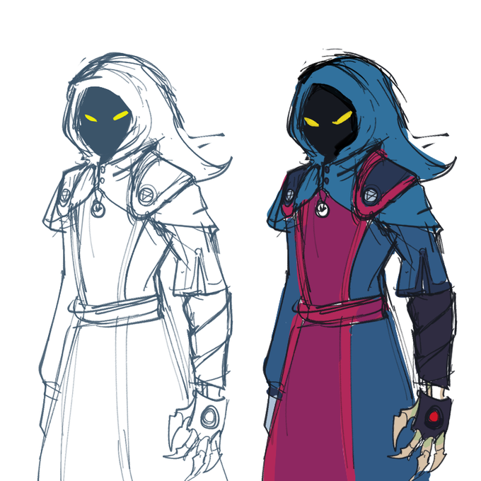
Finally got around to tweaking Osteon's design, because I drew the shoulderpads on a whim and they never quite fit with the rest of the character. They're a bit less jarring now, I think!


@notsoseriouss Carrie!! I’m so glad you’re okay, I know how jarring it can be. 😣
Here’s some babies from work!


this is so jarring.... there is no way both of these outfits were chosen by the same person


@TitanicTerra kinda did a rough pass it using a low opacity layer on multiply mode. White's will pop up much easier on top of darker tones. This way you don't have to use jarring black outlines, but still, be able to vary up your shades to fill that void.


Roman Series Three, I/XXX, made with my fiancee Lotta. The xross of this image with the pornish frame is particularly jarring remembering the session and the art produced from the raw images. You can own it now for 1.5ETh via @Blockchainartex
#eth #btc
https://t.co/Vb0b1nd1Ca