CONTRASTのTwitterイラスト検索結果。 262ページ目

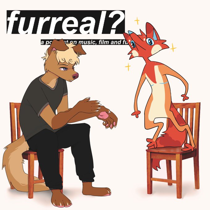
HERE’S THE COVER FOR TOMORROW’S PODCAST EPISODE!
Genuinely love this so much 😭 @goldendoqqs’s two distinct styles work so well here - I adore the contrast between serious and goblin mode hehehe
Tomorrow’s episode releases at 8PM GMT! Some really good discussion in this one. :)


Bon c’est tout crado et dans ajustement après photo (certains contrastes sont bouffés) mais c’est pour vous donner une idée de ce qu’on a avancé aujourd’hui!
Je pense que je vais me replonger dessus ce soir un peu.




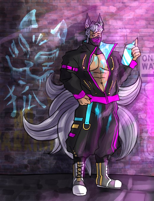
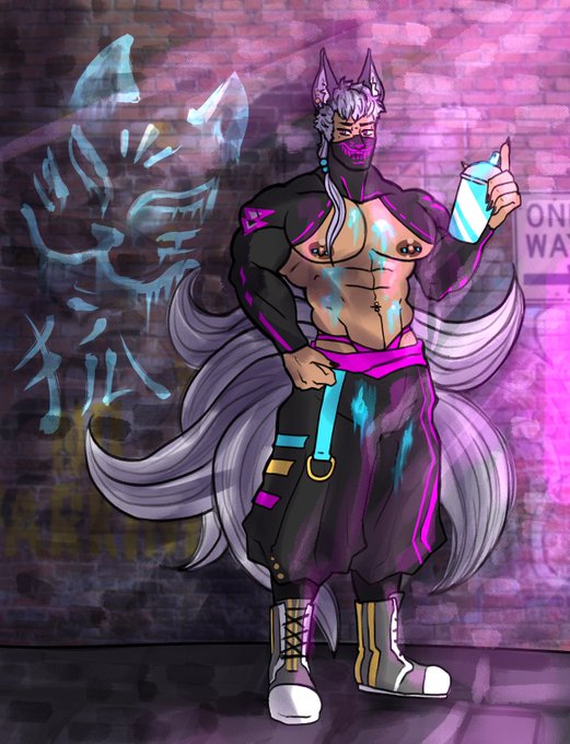
I said id give Oni a friend so heres a Kitsune boy, I gave him a more modern-ish aesthetic to contrast with the traditional Oni has


adora's eyes are already really pale/grey-ish so the contrast is almost invisible
my new headcanon is that some ppl don't notice that he's blind in his left eye 😌


Here's my full piece for @RutileZine !! I wanted this to be a play on how Rutile's inner turmoil and the contrast between their past and present selves :3
#housekinokuni #宝石の国


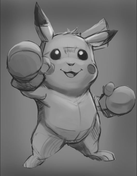
With my recent Pikachu study, I think I found a process workflow I can get behind. Contrast is still something I need to work on.
Also Im so scared to render it out cause I don't want to mess up haha.

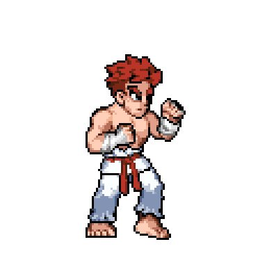
Idle stance for Kaien-
Kaien serves as a "shoto" in #SmackStudio: a well-rounded archetype that helps to balance the roster and contrast with more eccentric characters! We're planning to give this shoto a little more 🔥 than most
#indiegames #indiegamedev #ドット絵 #retrogames


@delusion_disc Behold! Your new vocal synth kin is Masaoka Azuki.
Azuki is a cheerful girl who tends to act first and think later, in contrast to her best friend Kobayashi Matcha.
Originally released for VOCALOID2, her voicebank wasn’t public until her V4 release.


@MonhaCinna Las sombras también son confusas pues no está claro de dónde viene la luz
Pero al menos mencionaré q los colores que utilizaste son muy adecuados para dar ese toque adorable.
Las sombras pese a que no están bien empleadas del todo, también tienen un contraste bien empleado


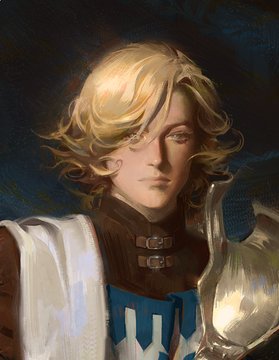
@Justsayapples the contrast between how confident he looks in his game portrait vs how SAD and despondent he looks in the show makes me 😭😭😭😭

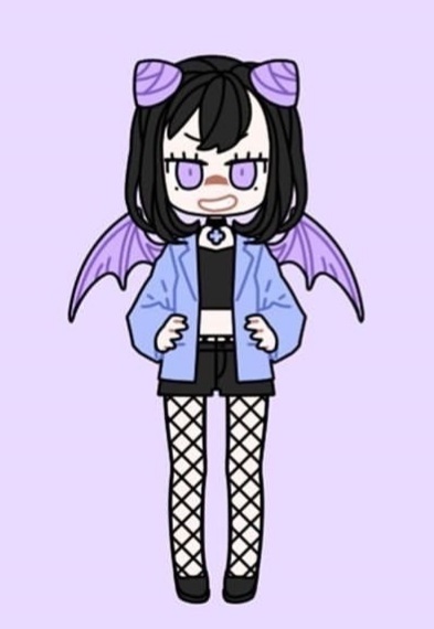
Just asking
Wich strawberry dress would fit Hazel (pics I qrted) better, the pink one (that has similar colors to her usual clother) or the black one (that gives more contrast)??✨
The one that isn't chosen will be for her wife Rory 💕(pics I'm adding now)
Poll in the thread https://t.co/aC4wq814KN


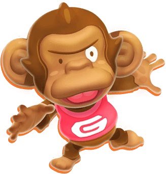
I’d hope this skin is like a texture WIP or something because GonGon has never in the history of this series looked like this lol. He’s always had a darker skin tone in contrast to the rest of the cast so idk what happened here?


Catching up with our friend Diana is hot work this morning, sitting in her conservatory overlooking the back garden, in contrast to midsummer’s day when there were a few patches of frost in the Dales.
#gardenshed #backgarden #penandwatercolour
https://t.co/BwYQGKFIi7


i love how their illustrations are a pairing theme but there is a warm and cool contrast between the two, it's like daylight and the nightlight

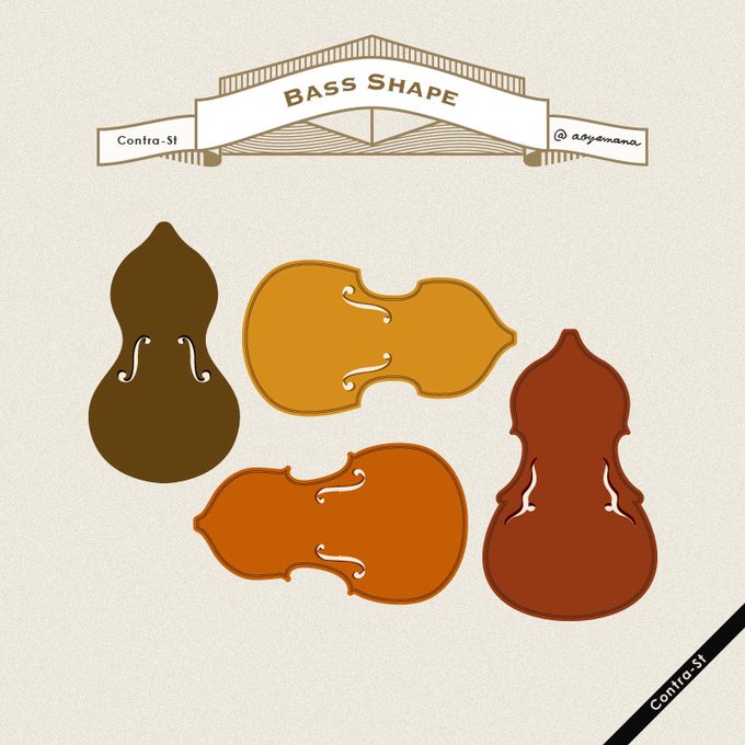
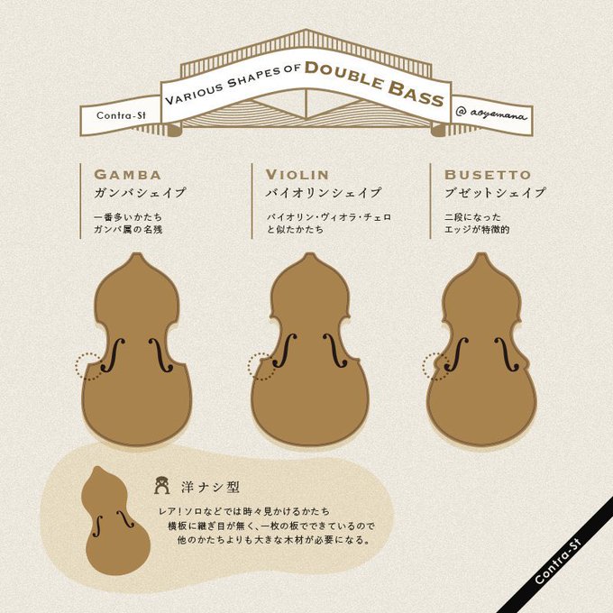
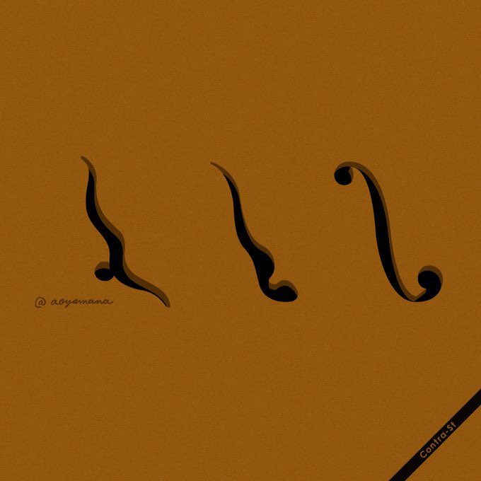
コントラバスを正面から見た時、かたちや色、f字孔にも個性があります。楽器を買うときは、予算はもちろんだけど、見た目が好き!ていうのがとにかく大切だと教わりました
#contrast_design


was trying to find this old doodle on here but i couldn't, so here's this gas mask girl again! i figure Brutus, my robot dude, finds her and temporarily acts as her guardian- just left with some knife her dad gave her.
very soft and cute, to contrast brutus' sharp edginess!


Daily Drawing!
Much like Maldur was gonna be the villain, Francefine was gonna be the hero.
Felt the contrast in both species and body types would work, since usually it's the other way. Sorta in an attempt to subvert expectations if you will. Well, if I ever MADE it that is.