compareのTwitterイラスト検索結果。 263ページ目


@LogPowerslave @thedestinyshow @DCP_Live @DDU_Podcast Playing Devil's Advocate for a moment, the only thing I could essentially compare the colours too would be the original promo material for Witch Queen which had very much green/yellow elements... if the green and gold were inverted.


I love how the Tactics Ogre Reborn cover looks compared to the original


@processive6 Good question. Original was 768x1280. The final is 8,000x10,394. I repainted or painted over most of the figure and critical areas. Look at a small detail of the head. Compare to artists that sell for 50 ETH and don't do anything.

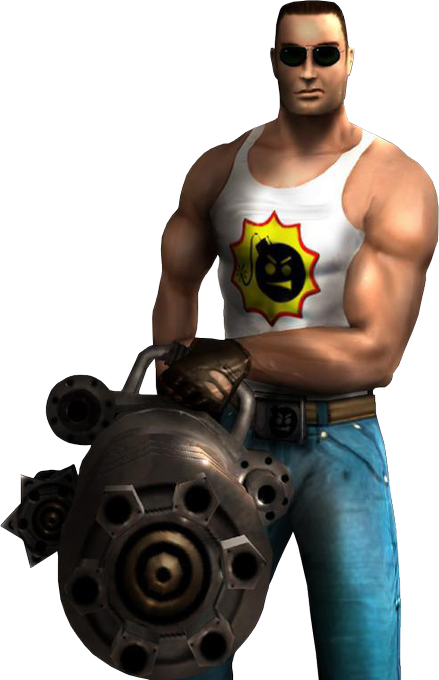
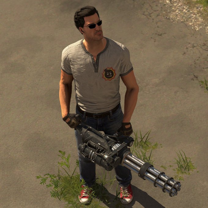
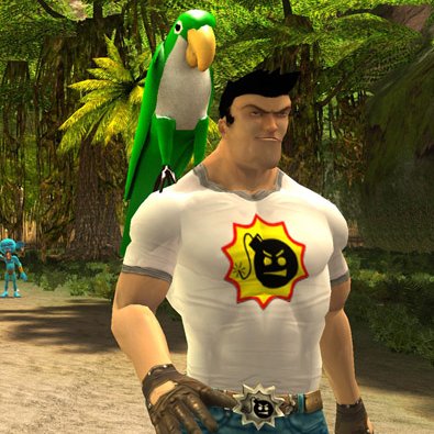
To further my point here, just compare Serious Sam's model from First / Second Encounter to his model in SS2 and SS4. Serious Sam 4 simply looks like an evolution of the First Encounter design, Serious Sam 2 strays way too far for my liking to feel like Serious Sam in many ways https://t.co/m6Tde1wwml


I think it's cool to compare their designs before and now, how much these 3 have changed, I created them in 2019-2020 and I've been developing them over time.
this is their first design. https://t.co/DUZeUkvHCI


When the C/D ratios of 10+ checks stay above 1.0. Today is a much happier day compared to last Friday. I almost didn’t want to stop working but I need to come home to work on zine stuff LOL


I've learned a lot and I gotta keep on being nice to myself about it ehehe~ I've grown a lot, I think. And I'm really proud of how my art looks now compared to when I started. Thank you 155! And to the ones on the way, hi! I'm G!
#Vtuber #TattooArt #ENVtuber #VtuberUprising


Whenever I feel stuck I compare my work to remind myself that I AM learning and getting better, my goal for 2022 was backgrounds and atmospheres and I've already improved so much! 😤🥳 #artprogress
✨ 2020 >>>2022 ✨

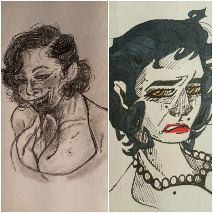


@Saerg01 Here it is then! It would have been funny if you asked me about making Keita, to compare with the one I drew you years ago xD


compared to their previous designs... im so much happier with all of their general looks
originally they were all more xmas themed, now theyre like a vague winter theme


You know, I remember the prevailing thought in the mid 2000’s was about how much more mature and substantive comics were compared to the shallowness of the 90’s...


Heavy rain will bring flood risk along the foothills, but how does it compare to 2013 in Calgary?
Buffers:
- Low water table, slow mountain melt = below normal flows into reservoirs ahead of event
- Lower freezing levels, alpine snow
- >50% better flood resiliency in #yyc


I gonna keep Gacha Pull Commissions open while my dominant hand heals
Here’s some stuff I’ve drawn with my other hand to compare.
Gacha Pull Commissions are $11 for a minimum value of $33 based on my normal commissions prices, but I draw something random base on your reference


Another Cyberman concept. Mainly because I was put off with the other design being constantly compared to Grievous. So I had to try another limb design instead with a more thin, sinew like texture.



lamda this lamda that none of them can compare to the el melloi’s supreme mystic code, volumen hydrargyrum