compareのTwitterイラスト検索結果。 22,405 件中 265ページ目


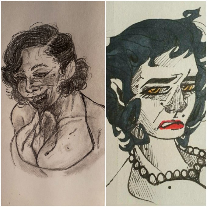
#TittyTuesday💋💫🔥
Is it a wonder, I’m so desired the world over? My tits are big, natural and magnificent. I love big tits, it’s a shame I can’t find any that compare to Mine!

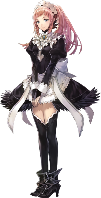

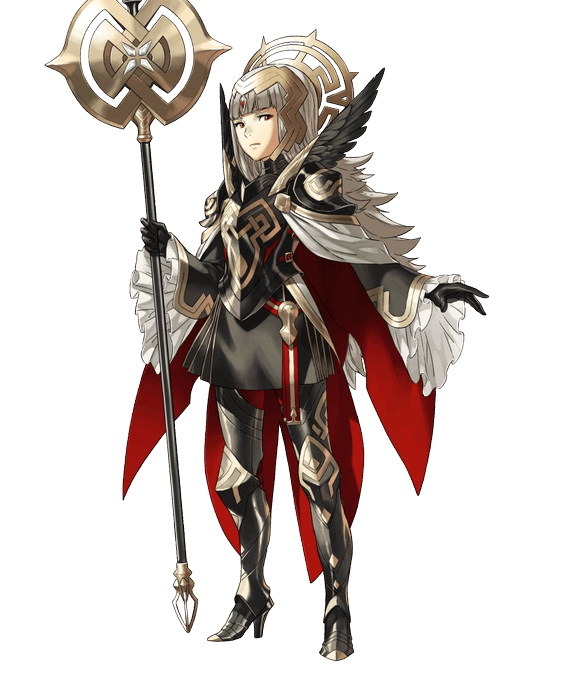
@VeronicaOfEmbla I think it might also have to do with how complex the design is. I guess Felicia's outfit and overall design is a lot simpler for an AI to figure out cause her design has tons of places where its just one color, compared to Veronica.


when you want to draw cool pose in cool perspective but you cant rely on references and turns out to be a little bad compared to my other drawings 🤡🤡🤡
#イラスト #illustration #AnimeArt #pixiv #mangaart #hisoka #digitalart #fanart #animedrawing #ヒソカ
#ハンターハンター


As for assets some things will not be in the game compared to what we expected. This mainly means a couple of CGs and probably some sprites, however in the case of backgrounds and most other things everything is complete! I'll look for a way to get around it, hopefully uwu. 3/6

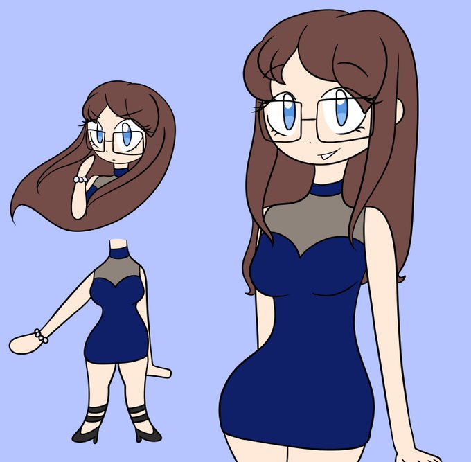
Wake up everyone, new Lenaverse addition officially dropped!
This is Lena from Yakuza! She definitely has a more mature look compared to the others, huh?
I don't have much of a story for her yet since I want to complete the series first! #yumetwt


I still adore this piece. And love the contrast of improvement in only a year compared to the 5/2021 piece (right) I did for them with similar theme.


Made more progress on updating my old maps~
Here's Route 1 compared to the old version!

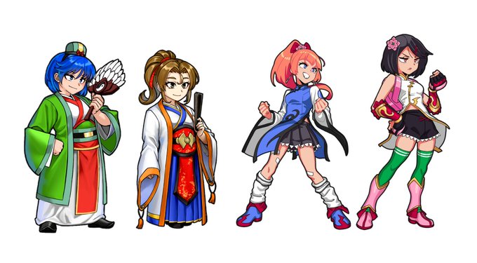
The designs for RCG Misako and Kyoko in Three Kingdoms look sick and it's clever that despite being in a different game, the artstyle is still the one from the game the two originated, having a more cel shaded look compared to the rest of the cast.
#RiverCitySaga #rivercitygirls


2020 ➡️ 2022
Haven’t had as much time to draw this year compared to the previous two but it’s nice to see the progression of my Weilans haha




@LogPowerslave @thedestinyshow @DCP_Live @DDU_Podcast Playing Devil's Advocate for a moment, the only thing I could essentially compare the colours too would be the original promo material for Witch Queen which had very much green/yellow elements... if the green and gold were inverted.


I love how the Tactics Ogre Reborn cover looks compared to the original


@processive6 Good question. Original was 768x1280. The final is 8,000x10,394. I repainted or painted over most of the figure and critical areas. Look at a small detail of the head. Compare to artists that sell for 50 ETH and don't do anything.

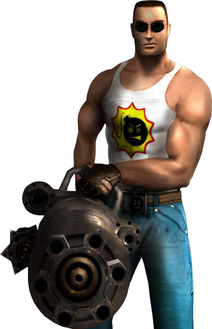
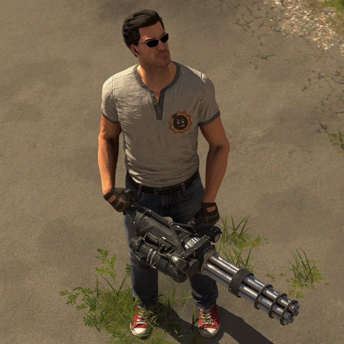
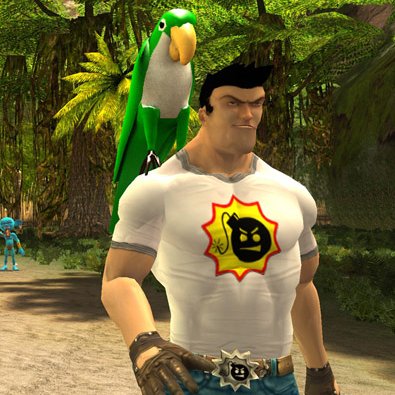
To further my point here, just compare Serious Sam's model from First / Second Encounter to his model in SS2 and SS4. Serious Sam 4 simply looks like an evolution of the First Encounter design, Serious Sam 2 strays way too far for my liking to feel like Serious Sam in many ways https://t.co/m6Tde1wwml


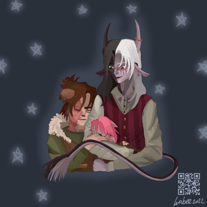
I think it's cool to compare their designs before and now, how much these 3 have changed, I created them in 2019-2020 and I've been developing them over time.
this is their first design. https://t.co/DUZeUkvHCI


When the C/D ratios of 10+ checks stay above 1.0. Today is a much happier day compared to last Friday. I almost didn’t want to stop working but I need to come home to work on zine stuff LOL


I've learned a lot and I gotta keep on being nice to myself about it ehehe~ I've grown a lot, I think. And I'm really proud of how my art looks now compared to when I started. Thank you 155! And to the ones on the way, hi! I'm G!
#Vtuber #TattooArt #ENVtuber #VtuberUprising


Whenever I feel stuck I compare my work to remind myself that I AM learning and getting better, my goal for 2022 was backgrounds and atmospheres and I've already improved so much! 😤🥳 #artprogress
✨ 2020 >>>2022 ✨