comparisonのTwitterイラスト検索結果。 22,146 件中 266ページ目


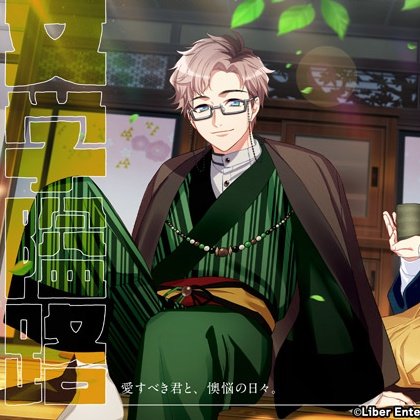

i saw haru 9th tsuzuru being connected to both 1k3 3v3l4nd and gentaro yumeno on my tl and i suddenly know why 1k3 is always said to be "kinning them/liking them" when it comes to these two and why this comparison was made


The scene of the aerial assault is particularly impressive. The animators had access to Disney movies of the 1940s, which are the only comparison in terms of storytelling and technique. But it's only rarely derivative, drawing heavily on domestic animation history.



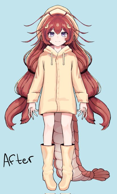
Another update ahah! The model was changed a bit so that the head wouldn't seem as big! Here are comparisons!
What do you guys think?!
Again, art by: Norvosk! 🦞 ♡
#Vtubers #VTuberEN #Vtuberuprising #Vtuber #art




Had a go at rendering a Quadstar and putting it in a random hangar I found on art station by seankernerman. Artie by @ZKabbit is not authorised Tribunal flight deck personnel and should definitely not be there for a scale comparison.
Security has been called.


Doing a height comparison for The Three! Love them
#characterdesign #conceptart #Procreate #digitalart #art


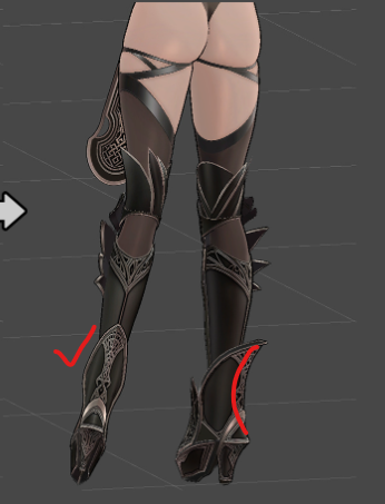
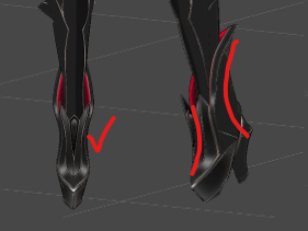
@Oitan_04158 I think you perfectly captured the shape really well~! But i think the shoes are a little thick in design in comparison to the curvy legs.
完璧に形を捉えていて、本当によくできていると思います。でも、カーヴィーな脚に比べて、靴が少し太いデザインな気がします。

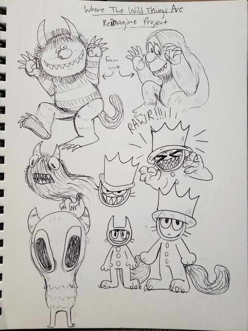
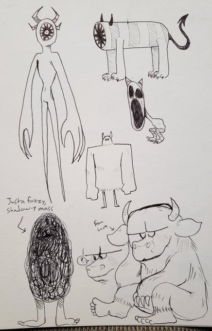
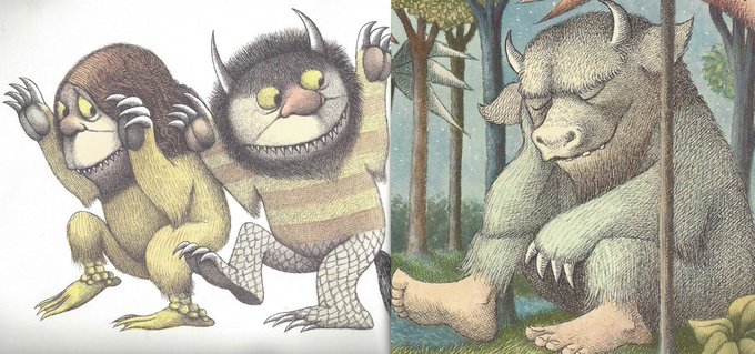
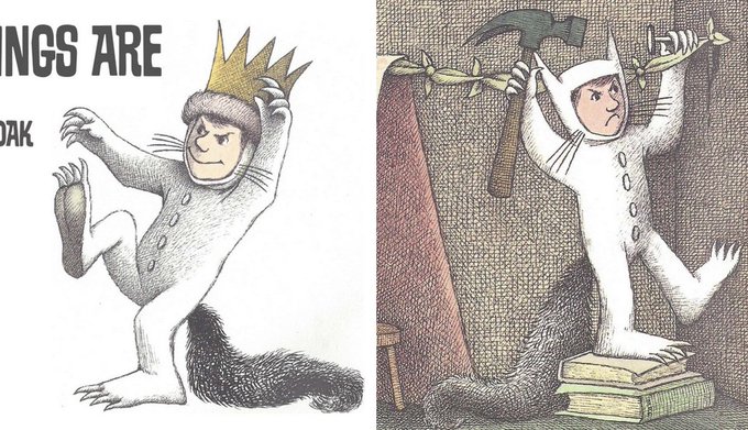
Finished my final assignment from my concept and storytelling class this semester! Had to do a take/redesign of Where the Wild Things Are and I ended up going in a more creepy/goofy direction I suppose ha (last 2 images for comparison from book by Maurice Sendak)
Thread🧵(1/5)


@b1odeuwedd so based blods
this is from July and looks wonky in comparison to new art & doesn't include like the newest design i have for him but i agree with your tweet
(is this shameless self-promo? maybe i mean i don't think it is but it bould be)

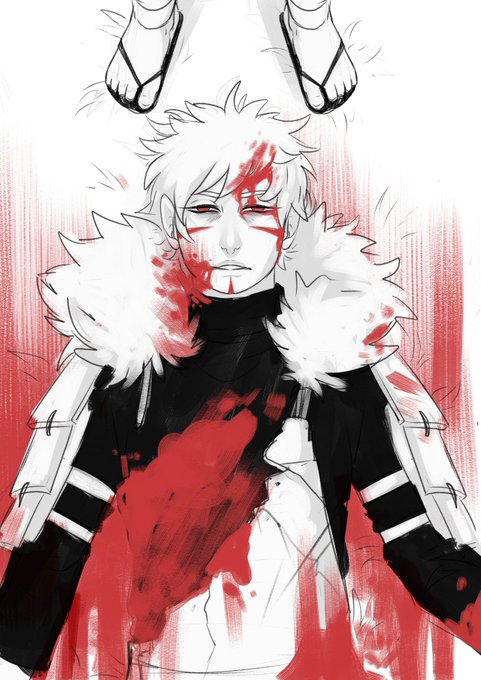
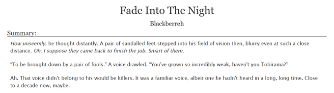
The fic is here!! https://t.co/kbKBqPLcBP
And the old picture for comparison eheh


if you guys were wondering which one i was talking about , here is a comparison from august to now ! what do u guys think ? :) https://t.co/eB0wa9QE8v

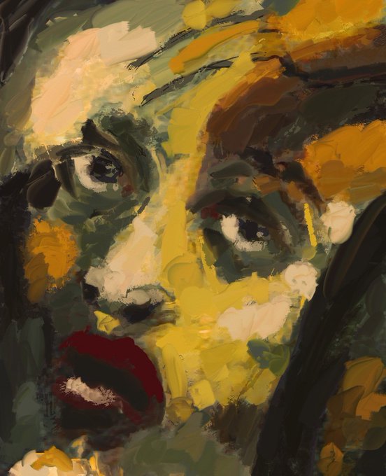

The difference between ArtRage (left) and Procreate (right) when it comes to oil brushes
Is there even a comparison?
I personally love and use them both but when it comes to texture ArtRage wins every time
What apps do you love?


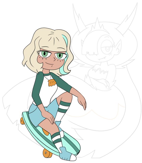
Talking with a company about a possible #JackieLynnThomas pin. The two designs I’m considering are below, along with a comparison to the Hekapoo pin I already made. Vote below to let me know your thoughts


@brndnsng here’s a comparison between the flat coloring and the one with the overlay so you can see it clearer!


@ElRhymesWithHel It makes a big difference imo. Here's it without (left) and with (right) for comparison. All I did was draw a bunch of messy hatched lines on a clipping overlay layer and dropped the opacity to 30% so it was pretty simple! Curious to see if the same thing will work on the shirt.

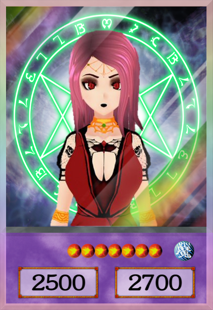

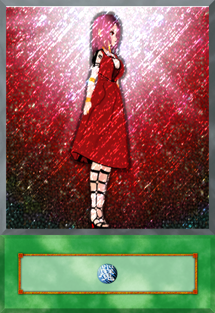
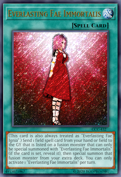
@Everlasting_Fae I couldn't stop thinking about the Seal of Orichalcos comparison, so we ran with it!


I did a 'redraw' thing.
(See the comments for a comparison)
#Ingo #Submas #Pokemon #SubwayMaster #EmmetandIngo #SubmasNobori

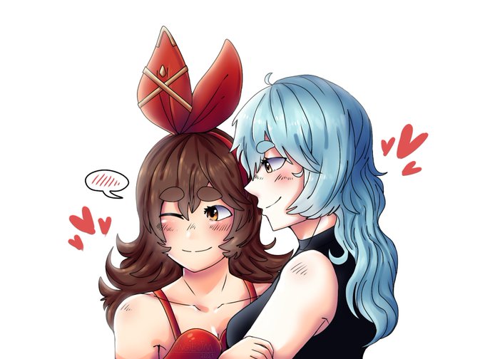
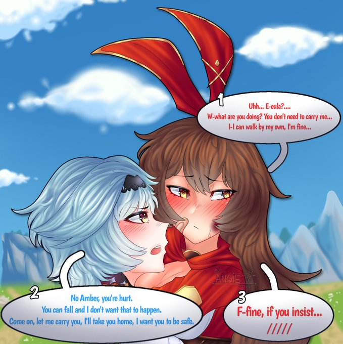
Comparison May 2021 // May 2022
The 2021 one sucks I know, what a horrible thing I made 🤢