contrastのTwitterイラスト検索結果。 11,163 件中 28ページ目


They don't look that much different but I love the contrast of these two artwork I made


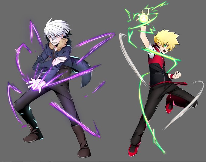
Wait I'm stupid but also the smartest MF ever
It just hit me how much the two rival characters in my story have complete Contrasting Colors in almost everyway:
- Main Color
- Power Color
- ALMOST hair color
- Eye color (?)
I love my OCs fr dawg how come this never clicked LOL


GM friends💜
Happy Sunday!
Dive into my fantastic world of amazing stories and unusual characters, bright colors, contrasts, and lots of cute details! It's about emotions and feelings here. My illustrations are a bit childish and naive, and that's the beauty of them.
⬇️


Rosa and Ryker!! Mine and @thelionfromhell 's newest OCs! As always such a contrast from a pastel and soft aesthetic to their dark and edgy aesthetic 🍓❤️🖤
.
Both designs were customs from @Mothmew with slight tweaks by me!
.
.
#furry #furryartwork #furryfandom


✨Wasn’t happy with it, so I changed it
(Before vs after)
✨It needed a lot more contrast!! Now I’ll be working on the eyes, then onto highlights and other finishing touches!!!! 💕 https://t.co/4FILlcEk1F


One thing I've gotten used to doing with character design is to not use as much much black since it would tend to dull out other colors & rather use a very dark but saturated color that compliments or contrasts w/ the character's design. A little thing that makes a BIG difference https://t.co/ooRfDxiXoz


The contrast between my serious art and my silly doodles is really funny https://t.co/paBFq9pHU5


Personal frustrations of my attempts to get back into comic art aside, it was nice to tackle another digital drawing stream & I loved doing a contrast between two Kara's; Supergirl and Power Girl.
Back in 30'ish minutes with 7 Days To Die stream for the rest of the evening.


Seeing the contrast of how beel felt after he fell is incredibly sad. Considering the fact that he’s not only lost his home but his sister…you can just see in the first picture how solemn and hollow he feels.
While the other picture shows off his anger +


Loving my little Red partner in crime (great contrast with the Green Hair).
Its mandated, every @AzukiOfficial needs a partnering Beanz.


Watercolor #painting of the dramatic #storm sky, titled "Sky No. 6'" (30 x 40,8 cm, 2017). I just love those contrasting colors!
You can find the original watercolor and signed art prints of it here:
https://t.co/BO4WBzUoE0
https://t.co/cSVqObweKm


Gros HS mais j’ai complètement oublié de vous publier ce petit dessin de la forme humaine de Baba! Je voulais qu’elle contraste de fou avec l’air simplet qu’il a en version Yokai ! 👌
Baba c’est le petit parapluie Yokai qui accompagne Maora ♥️


➤ “Naturaleza muerta con lámpara”, Fernand Léger, 1914, @museoreinasofia©
➤ Léger lleva su estilo cubista casi hasta la abstracción, en una serie de pinturas tituladas genéricamente Contraste de formas, basada en la disparidad visual entre discretos volúmenes geométricos
🧶/FIN


@Sofnas2 Bueno bueno, el logo en las portadas va a ir tapado por una ilustración enorme de un personaje distinto cada capítulo, así que salvo que se pongan a comparar y contrastar varias portadas distintas no creo que lo descifre ni dios. XD
Por eso también va el nombre legible en pequeño


【世界のリゾート水着美女】
今日はサントリーニ島!海と真っ白い建物のコントラストが美しいリゾートです☀️
Santorini today! It is a beautiful resort with the contrast of the sea and pure white buildings!
#AIイラスト #AIart #AIArtworks


Recently I wondered where the legs of my passion for contrasting/interspecies couples grow from. And remembered #Gargoyles TV series, which I saw in school days and shiped Goliath and Eliza, not even knowing that's it is called so! ☺️😈💜


@TheRafaArts I have these 2 with warm colors with very contrasting moods. One is panic/pain, the other one is flirty/passion