saturatedのTwitterイラスト検索結果。 4,892 件中 28ページ目


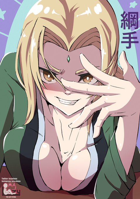
@ArtDominika For me, I love the not too saturated part xD


Redesigning Oc’s Pt 1: @ShepGoesBlep
For the most part he stayed the same with a more saturated color pallet


Saturated
-
Sorry i keep drawing french, he is my closest best friend im afraid
-
@eldenringmylove sorry i keep spamming u man.. Ill draw someone else with my oc sooner or later i swear 🥲👍


Canyon Reds
by Erin Hanson,2022
This small canvas captures the grand vista of Canyon de Chelly in AZ with expressive brush strokes. The saturated colors in this petite work create a medley of texture and movement within the piece.
https://t.co/6STdGEkjeW
#art #petitepainting


Honestly if I were Aziraphale I’d risk it all too for this pirate 💀
There’s a normal version and a desaturated one for the vintage-y vibes
#GoodOmens #GoodOmensFanArt #Crowley #GoodOmensAU


Sunbeam!! I imagine her with very saturated pelt colors!
#warriorcats #digitalart


// saturated colors, suggestive ig??
Mixtape because I opened my eyes and said my God they're gay
#MixtapeShipping #LEGOMonkieKid #MonkieKid #redson #portymk

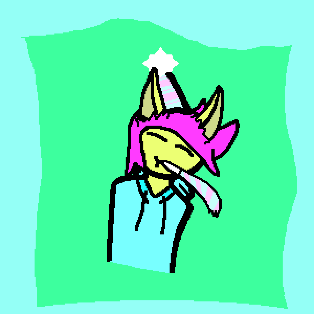
Happy birthday to @SlatopGamer!
I saturated the colors btw because ¯\_(ツ)_/¯


they completely desaturated all the colors and it became a lot less dynamic in favour of making the female characters as sexualized as possible (which is kind of saying something because the 2009 series was really bad about that too, it just got worse somehow)


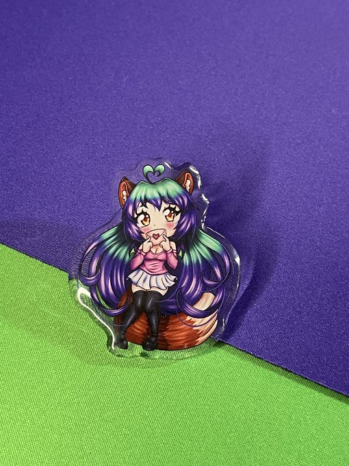

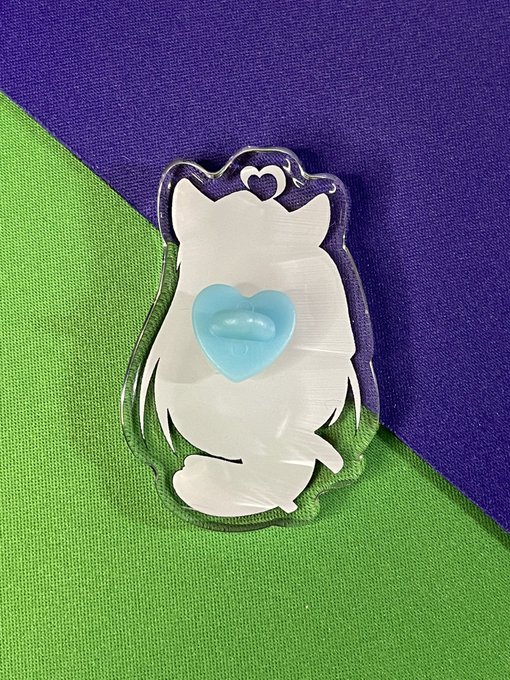
I always wanted to do pins but been too afraid to put money into enamel pins, so the next best thing is acrylic pins! 💖 They are super adorable! A little more saturated and a tiny bit grainy, but they are still great and look amazing! The heart shaped backings are my favorite!🥰


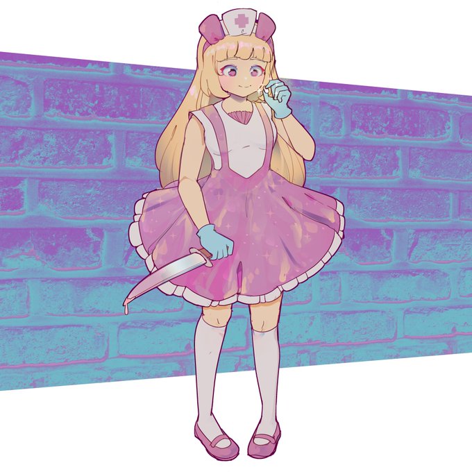

i made this for a holographic sticker. i tried to make the colors bright and saturated and used the left one. but not sure which version to actually post so... here's all 3 i was considering ♥ which do you like best?


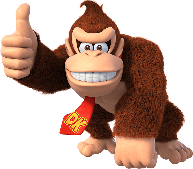
I like how DK looks in modern artwork but I feel like his fur should be more saturated
left is an official render and the right is an edit based on how I think he should look closer to


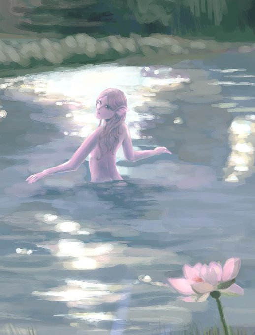
and the original, pre-edited pic that i prefer because its a little easier on the eyes
had to make it more saturated for social media purposes :P


Other things related to these designs, including a more saturated version of the Hatter and Hare piece!


@akkisshimiii I'd really like her if not this, not only it looks out of place compared to the rest of desaturated colors but also stupid


I also have a slightly less saturated version idk ummmmm
*disappears into the ether*