compareのTwitterイラスト検索結果。 272ページ目


@savatude i miss them too :( i like medieval fantasy of course but the character designs for ff16 are really forgettable compared to a game like ff12


Zander Steele
Class: Lord
Zander is the next in line to rule House Steele, an overly flirty playboy who spends way too much time shirking off his duties. He’s laid back and cocky on the outside, but he doesn’t actually think that highly of himself compared to others.


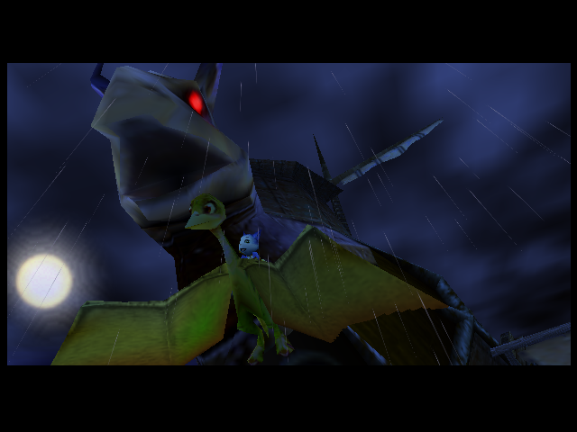

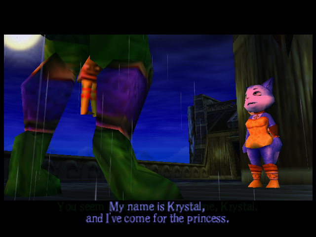
Curious to see how different it will be compared to Starfox Adventures, but some of the stuff in the beginning is already near identical, right down to camera movement & angles in cutscenes 🎥

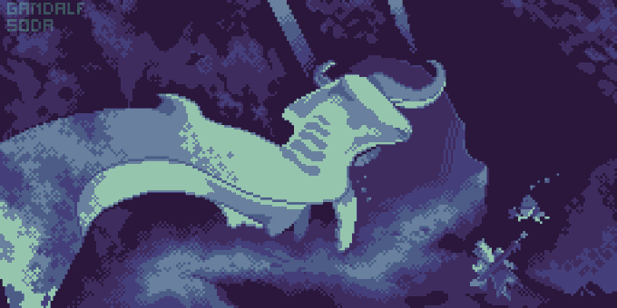
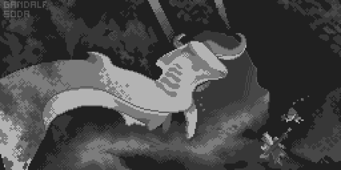
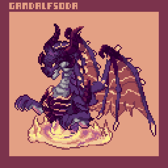
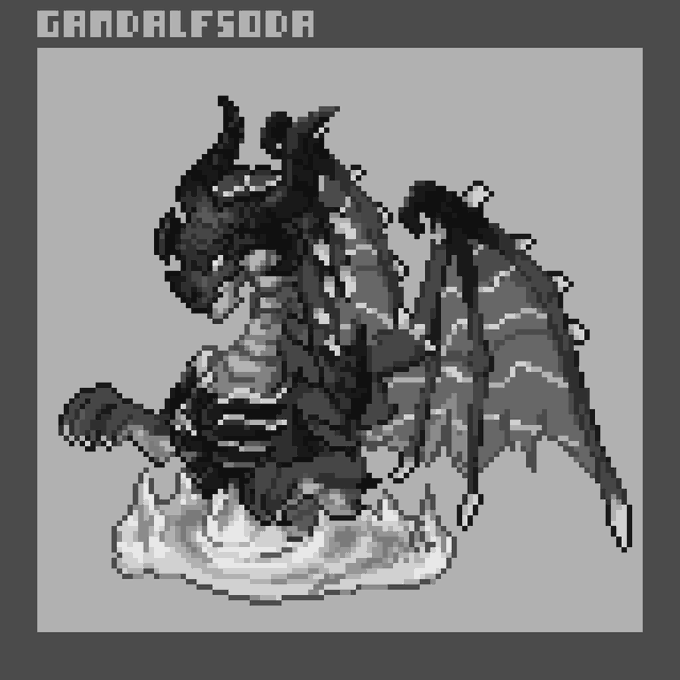
@cosmelucero @Bainite14 im a big fan of the value trick! it also works in pixel art if you fill the painting with either pure white or black and set the blending to Colour. You can tell the values are a lot more bright on this ceadeus piece compared to my muted colour palette for the hyperion dragon.


-Storyline has vague similarities to BW, involves two fueding families who rule the region with one of the two (this number is conjecture on my part as they were compared to Cheren and Bianca) rivals getting the opposite mascot legend
If Nemona is them, Pawmi is ElectricFighting


[treasure weverse] 20220603
#SOJUNGHWAN reply to fan comment 💬
👤: doyoung-ah~~if u were to compare junghwan to a pokemon what is it~??
🐮 : doyoung hyung gives me kind of like 우츠동[weepinbell] vibes
#소정환 #트레저 @treasuremembers


Second Ame I've ever drawn. Compared to the last, I would say this is an improvement ww
Definitely feels more alive than my last work and it's totally because I used the official portrait as a base reference instead of doing it all by myself (I like the portrait style)
#ameliaRT


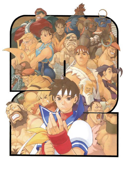


if you ever fell down about your art, just compare it to how it was a long time ago. On this example this was made two years ago. My art style changed so much since then! (feel free to trash this pice as munch you want lmao) #art #artistontwiter


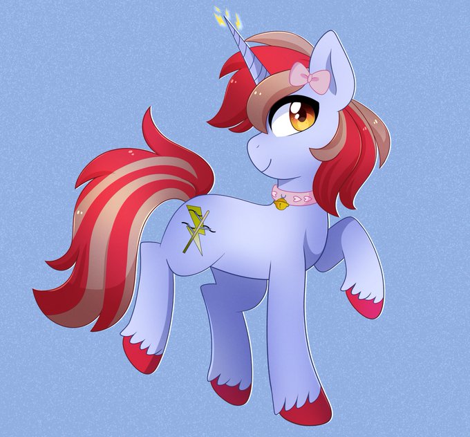
Here I am going to show off some art from my good friend @ayveestars! You should check their stuff out! Here is their first pic they drew for me back in 2015, compared to their last one they did last Nov! Look at how much they have improved! Before --> Now


I've got no new art to share yet so here's what I think was me trying to compare the various blues you're likely to find on that one guy from that video game. I'm pretty sure none of this is useful, but I hope it helps you spiritually in some way or another.


@MysticalHami THIS ONE SHALL ALWAYS HAVE OPEN ARMS FOR YOUR EXCELLENCY! THIS DEMON WISHES TO GIVE THE BIGGEST BEAR HUG TO SHOW HIS APPRECIATION FOR YOUR EXISTENCE IN HIS LIFE! EVEN ALL THE STARS IN THE UNIVERSE COMBINED CAN NOT COMPARE TO YOUR GRACE! EVEN ALL GODS ARE NO MATCH FOR YOUR PINKY!


I'm excited for Nintendo World. Universal Cali is so much smaller compared to Universal Florida. It desperately needs more rides. https://t.co/IkhEWYlhsl


@TwiliteWood @SpoofsWithout I mean, compare pic. 1 (Josh's request) with pic. 2 (my drawing of my OCs).
Somehow I did age better artistically!

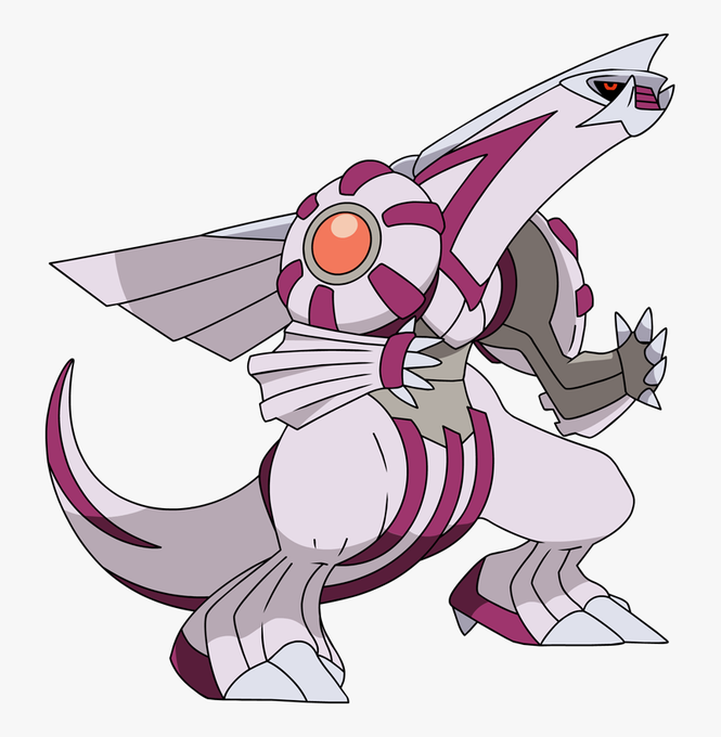
you forgot palkia that looks like a genuine penis compared to all of these https://t.co/LpUGEXglgg


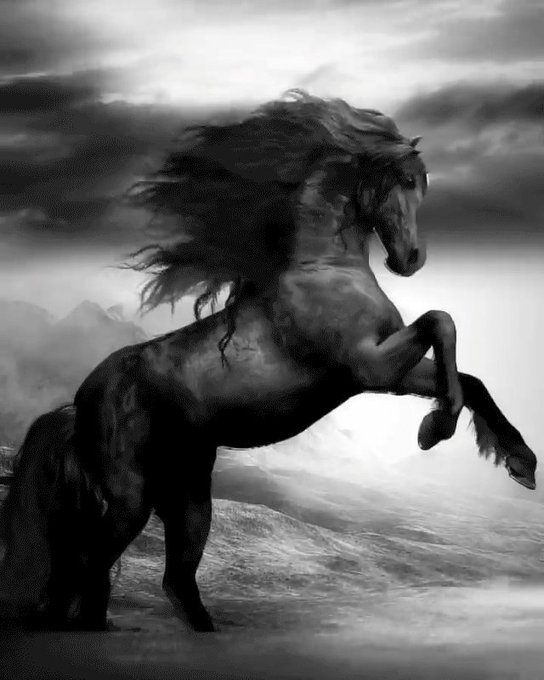
🐎 Feeling the breeze 🐎
Nothing compares to the feeling of wind in your hair while in the saddle🍃... such a masterpiece expressing the freedom you feel when galloping🤠
📱Werble by https://t.co/tgazDugHUc
#werble #werbleapp #horseaddict #horsetraining #horsesofinsta