ContrasのTwitterイラスト検索結果。 10,815 件中 274ページ目


Oh hey Stocksom Art Prints, maybe not a great look when I find you infringing on my copyright and calling it your own, right?
I don't think cranking the contrast and deleting the foreground makes it yours.


@where_istand @twentyonepilots @tylerrjoseph @joshuadun @artbytheclique @New_Era_News thank you ellie, it means a loot. This was an earlier stage and to add the lines and contrast... that took longer than I expected tbh but i had a reference, so i just had to have patience


PP #0173 is an absolute force of nature. This is truly a stunning #PicassoPunk, with clean lines, controlled use of color, contrast, and space; it would look incredible hanging on a wall. Currently on Dutch Auction via OS, take a look before it's gone. https://t.co/2CFh4nEHn5


@JYPETWICE Did another version where there's less textures, less contrast, and a bit more heavy with lighting because idk, just trying to experiment stuff😂

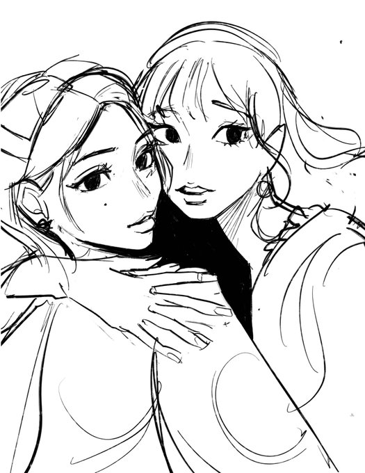

WIP vs Final 🤣 The contrast is funny. Timelapse down in the replies!


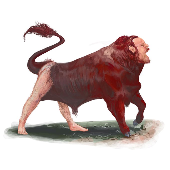
@drcorabeth Adore the pathos of Emil Alzamora’s sad Minotaur…so in contrast herewith some “Oh No!” Minotaurs!


@xXN0NAM3Xx Healing vs Casting
the Healing version has a higher contrasting


Wanted to do an equivalent type poster for the warriors that matched this poster of the scouts so I gave a sunset to nicely contrast


why did i make their color palettes contrast eachother so much HASJKHFSD


Found a new hashtag ✨ #artposter
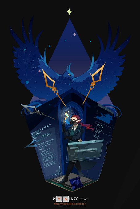
I'm nvalkry, a Vietnamese illustrator, and I really like to paint blues with contrasting colours I guess 😅 I love to draw anything that's Asian, fish, fantasy, or cyberpunk-related!


Two Halves
Queen Ruby(Tourmaline)for @/meroaw's 10k dtiys on insta!
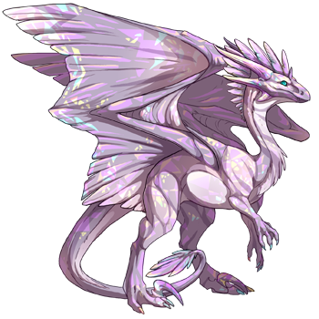
how i personally imagine her. i wanted to give her a piebald look, contrasting between the two sisters.
#wingsoffire #wof


コントラスト展、その二!An update to my Contrast cheerleading post after another year. #paintingwarhammer #warmongers #contrastpaints

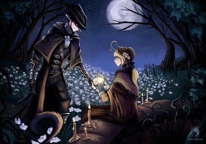


Hi #artposter I’m Celestia! I’m good with colours and high contrasts, and I love dark stuff and dudes with swords. I’m always struggling with imposter syndrome, and a bunch of other fun stuff, but I’m slowly doing better about it as I go!


this is what the colors 1 off from orca look like for reference............... even other colors with a contrasting accent color like radioactive and tarnish arent fucked up like orca is


@yassloid mine sometimes take like an hour but its when i do stuff like this.... also manga panels are notoriously easy to clear the backgrounds of considering they're black and white and tend to have a lot of contrast so any easy to get bg delete tool does the job 😭


Standard artworks are lined artworks that are cleaned and have more defined colors and shading.
These are more background friendly, and make for better icons since they have better contrast and defined edges.


In contrast Ashe gets like 4 different outfits in the game.
Gotta look good at bae's funeral too, right?


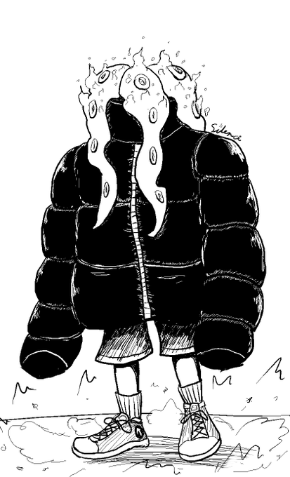


@Solstice_oo You can call me Silence, Sil, or J. I love drawing characters, Ocs, fanart, and occasionally some chaotic memery. As a contrast to my partner @SaboKittyKat, my work tends to give off a more chaotic aura.
Some more of my work: https://t.co/NRSyK0jnpC

Cool! I just worked out a really neat render filter to make scenes look like 16-Bit video games in @ToonBoom Harmony. It keeps those really crisp contrasts and colours.