ContrastのTwitterイラスト検索結果。 10,510 件中 280ページ目


Quick warmup with @Chromazurel 's persona Sinn and my oc Cory before I do anything else. Definitely fell in love with the color contrast between the two 😩
#FNF #fridaynightfunkin #fnfoc


@pngtuber ah, i also made a higher contrast version to match your style more! i hope you like it 💛
which one do you like the most? :o

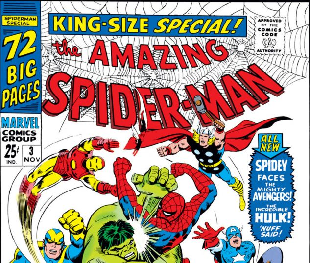
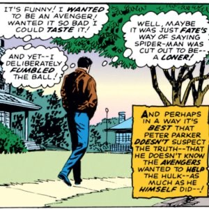


Amazing Spider-Man Annual #3 and the end of Spider-Man: Homecoming are such great contrasts to Peter not "joining" the Avengers and not knowing the truth behind both situations with the Avengers wanting to help the Hulk and Tony having a real press conference which Peter.....

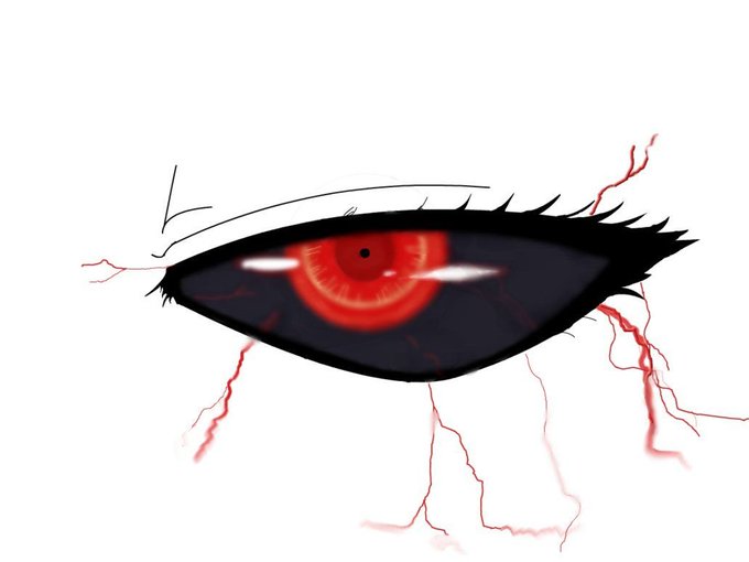
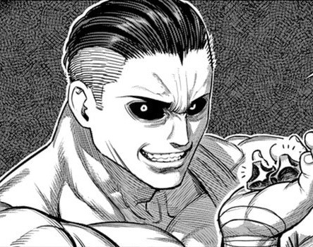
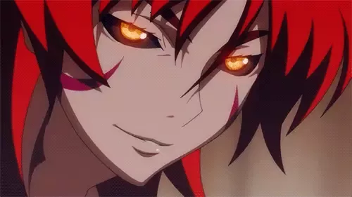
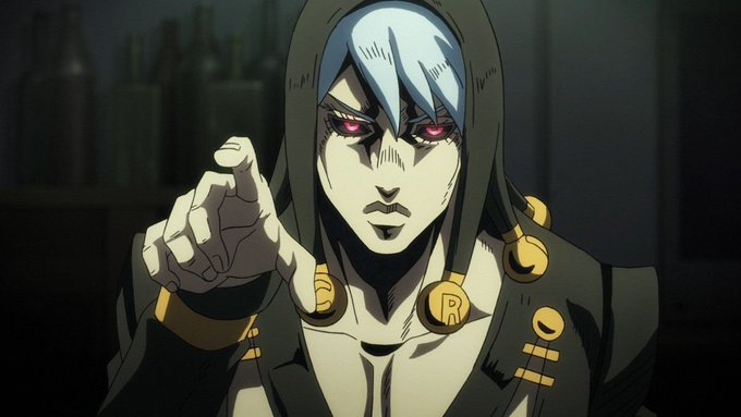
another key detail of doc is he's got blood red eyes and black sclera like in the images provided,giving hima scary look overall which contrasts with his personality. he's also got a bit of orange cassidy in him. and slate greyish skin colour


Thank you, Earthlings, for attending my Science Fiction Influences in Early Anime Design lecture!
Though now I am expecting a two page paper comparing and contrasting the differences between your favorite character and their namesake by Friday at 3 pm! Better get started!


~ Character VS Creator ~
Yeah, its a big contrast !
https://t.co/vFBndA4kcr https://t.co/V3O6P7LIoB


Technically a genderbend of my main but not really.
Dyvonny exists in her own universe w/ her own canon.
Was changed to mirror characteristics of my main but still have major contrasts, not being a generic voluptuous rule63 but rather tomboyish.
Hope you dig 'er.
#pixelart


again my bby Noah, tried to work more on facial structure, contrast and 3D shapes :)
#illustration #commissionsopen #lookingforartist


I went wide-angle to show space/ceiling. Then I placed some washer models to get a sense of scale. I try to think about how to get the focus on tammy-bot. so I've tried to direct eye flow toward the area of most contrast (bright light, shadow behind + blue pool) 2/2


Took too much more than it should, but #fashionINAsta in high contrast
#inART #hololive #hololiveEN


My art without Multiply vs My art with Multiply.
Literally weird af like my entire color scheme/contrast just goes BLEH when I use it lmao https://t.co/fNIcsdLJdQ


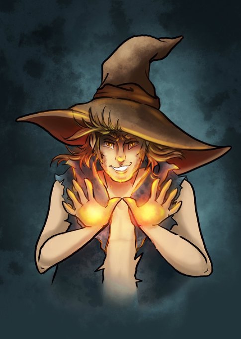
@IndiiCreates Blue art! 💙 One of my favs because of how light pops in contrast. Thank you for the share!


Applied some contrast and stuff to his bodysuit bc I'm shameless


#MonsterHunter #MonsterHunterRise #MonsterHunterStories #MonsterHunterWorld #iceborne #timelapse decided to spend a few more hours to push this piece further, I just adjusted the contrast before I started the timelapse.


The contrast between Boomerna's skin and voice makes me laugh so hard idk why
#boomerNA #boomerNAfanart


Brand new ref with several adjustment made to Asteria's design.
I also made her a tad bit taller than Saber. I tried to add contrast with Saber's much more lean figure, so they feel less samey.
Also fits better with her feisty nature.


Soo-won is extremely intelligent, strategic and has a deep understanding of human nature. You can tell he still loves Hak and Yona (cries) and I believe he wants the best for the kingdom. He's gorgeous and he can be cute and funny which is such a great contrasting side to show https://t.co/m4yfi33Y5E


@HaleyJean_Tho I designed Buster around how an explosion looks, which is why he's almost all warm colors. However, I made his eyes and the explosions he can release from his arms a light blue to contrast with them (Except the last one, that's an older drawing :p)


In 1941 Keith Vaughan reported to Bulford camp, near Amesbury in Wiltshire and at the end of his first year in the army had filled five books with sketches of his fellow recruits. The strong contrast of black or sepia shadow make these works very dramatic.