FontsのTwitterイラスト検索結果。 1,634 件中 29ページ目


Belle de Mai in use! 👏
Poster @60kilosnetos made for @palazzomediceoservaezza summer party powered by @salsa.crew 🔥
Test and buy Belle de Mai here 👉 https://t.co/dmsKaJcNTD
#typedepartment #typedesign #typedesigner #typeface #typefacedesign #type01 #fonts #font


New font: BEYOND BELIEF! Includes six fonts (Regular, Italic, Bold, Bold Italic, Heavy & Heavy Italic) with upper and lower case alphabets, automatic alternates for every letter, Crossbar I Technology™ and Western & Central European language support.
https://t.co/eLIFKUJuu8




👋SAY HELLO👋 We’re happy to welcome Linda Hintz to the Future Fonts family. Linda draws letters and designs type in Copenhagen, Denmark. Her first release here is Pouf, a cheerful font that can inflate and deflate! https://t.co/I3hMOI9ds7


Yes I traced this, I am aware. I am by no means taking credit for this screenshot of the anime. I simply did this to just-- point out that these two boys are the same gremlin in different fonts


Little kustard children concept,their names are random fonts, don't take em too seriously,unless...you like them I guess
#kustard #underfell #undertale #undertaleau #sansau

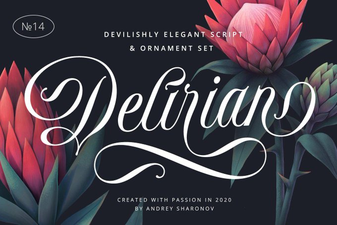
Delirian Script Font & Ornaments https://t.co/I09VSs28l4 #fonts #pencil #logos #branding #resume #italic #bestseller #bundles #styles #ttf #geometric


#FontsOnFriday #FontCovers The magnificent Salle, St Peter,Norfolk (c. 1410-30s) though it is skeletal, it still rises gracefully w/a crane projecting 10 feet from tower gallery.
https://t.co/GBjzqWJx4l


7/ Time flies...getting closer to the "Publicly Private" Genesis Collection drop at 11:11pm U.S. PST today. Thank you @chankfonts for the amazing fonts inspired by @muratpak's $ASH fonts. #WeAcceptAsh. https://t.co/PatDrDgbHa


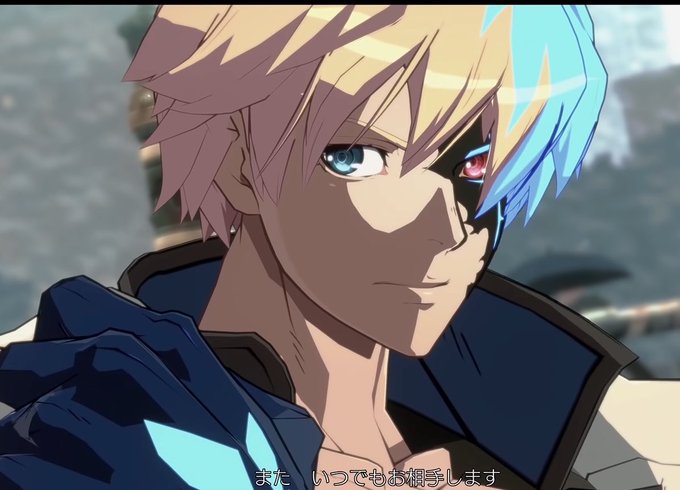


I don't like people who put lyrics of the songs in pretty cursive fonts that match with the screen because I cant read the damn lyrics


These are the same posters but in different fonts (literally)


Tokyo Revengers designs are in!
Valhalla’s jackets are as in the manga.
Tokyo ManjiKai’s jackets are tech-style which I love! (Fonts are not final, I used the ones Procreate have)
💜Preorders on Saturday 15th! ✨
Payments through PayPal. Shipping worldwide with FedEx.


I have ZERO sense for fonts or text placement but I've settled on the title and made a little logo for my STALKER series comic. Prologue chapter is also almost done! #stalker #roadsidepicnic #webcomic


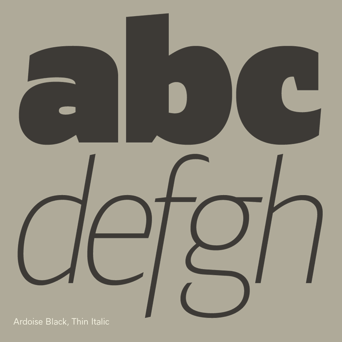
Looking at lettershapes in a mirror is probably the most revealing thing about learning to draw type, or rather to see the shapes, the regularity of counter-forms and forms.
— Ardoise https://t.co/Cie5hXC4Iw A straightforward sanserif in 45 fonts, 4 widths


okay poll time, which for yall do you think is better? Poll attached to this tweet to vote!
All art by me! Fonts from google font free use!


After 1933 the new government fully embraced the traditional Fraktur-related fonts for official publications; initially deeming Futura and it's likes as too modernist.
As you can see, other fonts weren't banned, they just werent preferred.
This soon changed


A designer was wronged in the Marvel universe, to get back at the world he painted letters on his face, and called himself Typeface
He would throw letters at people. Presumably more than three fonts at one time. Criminal.
https://t.co/Sl3eRl9NAm


fire force YesYes
i love em all they are all "god why", but in different fonts
#enenプラス