comparingのTwitterイラスト検索結果。 3,658 件中 29ページ目


Harley Quinn’s origin story ♦️
📺: Comparing Paul Dini, Bruce Timm, Rick Taylor, & Tim Harkins’ “The Batman Adventures: Mad Love” (1994) to Dini & Timm’s ‘The New Batman Adventure’ episode “Mad Love” (1999). #HarleyQuinn #Batman #Joker #DCAU #TNBA #BTAS @MarkHamill @Paul_Dini


@soluryn I color portraits, but I don't draw them.
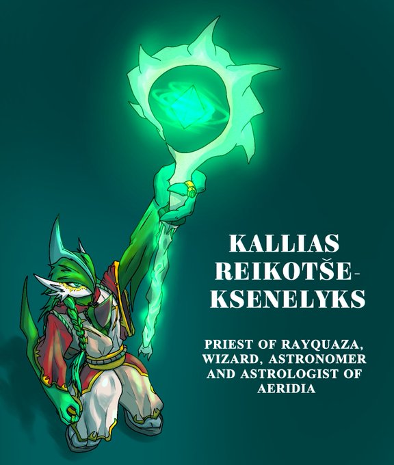
Available for hire.
I like exploring light. One subject in lighting scenarios, multiple lighting sources, comparing styles, and optics.

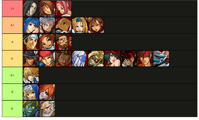

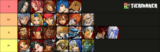

Like comparing the community list from 2019 vs a few from more recent times (mine, @tyrantravesigma and @OmegaTomHanksFL in that order) and while the top hasn't changed too much the middle and lower portions have changed up fairly significantly, mostly wrt to Chipp and ABA


Now theres an official Gazimon VB sprite, I'm comparing my take with theirs. Mine looks way too friendly which I guess thats why they skip the big eyes for Gazi. Don't like the limp tail or how the ears are but I do like the head shape. Give the official a 7/10


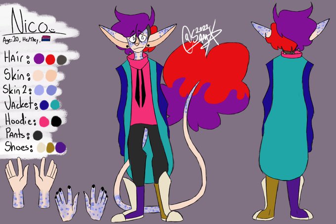
Gave my bb Nico a lil makeover :> He's lookin real good now 8) U can see the changes by comparing it to the old ref sheet i have


I think the Gamecube Zelda's is where they tried the most experimenting. Comparing how the redesigned two of the enemies in different ways for two different games.


Mar: I found you faker!
Darkside: Faker? I think your the imitation here your really comparing yourself to me? Heh...Pathetic
Mar:I’ll make you eat those words


//splatoon 3 story spoilerz
i LOVE how Big Man's boss fight is a very direct callback to Super Mario Sunshine's Phantamanta, even using the same ink colors. Takes me back to when Splatoon 1 was first revealed and everyone would not stop comparing it to Sunshine. full circle.


people comparing gacha game NPCs but use the major characters of Arknights for comparing (like Ulpian for example), did you forgot that even the background character of Arknights have good design?


Can't believe I've improved so much in two years 😔 Comparing these four most recent pieces with my old art makes me go extremely proud of my progress, even though I still have a LONG way to go LMAO
Anyone who reads this, feel free to quote & retweet with their art! https://t.co/hetLcc5QlM


I found an old wip of pre-redesign Hyozan. Comparing him to his current design


comparing that to some sprites available online, we can see that that's this guy.


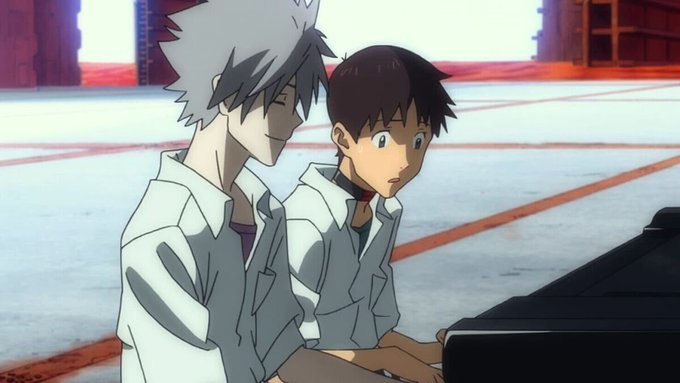
Evangelion: 3.0 You Can (Not) Redo (2012): I... didn't hate it? I'm honestly shocked. The story this time is so wildly disparate to the original, so the frustration of comparing to the show is p much moot. Just an interesting spectacle I could sit and enjoy.


@tinakitten was comparing @Corpse_Husband to Snufkin so have a lil #corpsenufkin doodle lol
Please don't repost or use without my permission ~
#moomin #snufkin #corpsehusband #nuuskamuikkunen #corpsemuikkunen


So uh...why is Twitter comparing TASM and Homecoming now? They're entirely different types of film. The fact we have both of these films for the same character is honestly a testament to the versatility of the character and how unique these two visions can be.


@JanRockArt @SER_HAL0 Just comparing 4 year difference (yes your original was just lines, but anatomy, style etc is big improvement)


Caught myself comparing my work to others AND I WON'T HAVE IT! NO MORE FEELING SORRY FOR MYSELF let's just kick ass and work even harder to achieve our dreams >: )
#vtuber #ENVtubers #VTuberUprising


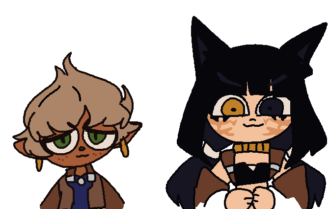
comparing my older lineless pieces w now hehe im flexing on myself a couple months ago ( tw gun )


Comparing different designs for Minas Tirith here is interesting - look at the first painting, evidently predating the movies, the second sketch, which seems to be a transitional piece, and then an image from the eventual film. A gradual decline in "stock fantasy"-ness


its so funny comparing the very first pic of masha 2 how i draw zem now...