imoのTwitterイラスト検索結果。 12,992 件中 281ページ目

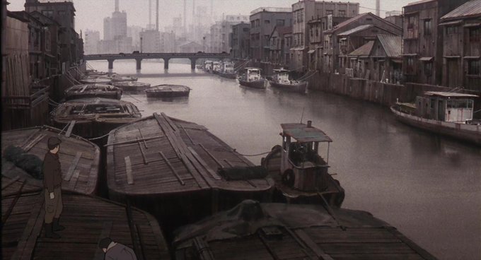
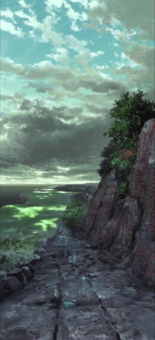
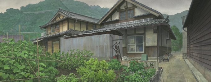

looking at anime backgrounds, and I think I.G Production has some of the best BG game in the industry imo.


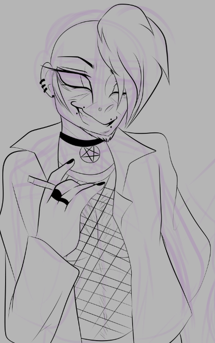
I'm so angry bc this is deadass one of my best designs imo and nothing more materialized from this sketch



I really think SEGA's only gotten pretty good with the 'Modern Sonic model' recently
Even then, they still insist on reusing old renders that look static, but here are some recent highlights imo.


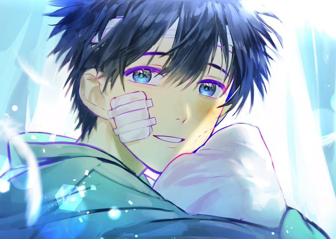

OT1 is a masterpiece imo
I miss my boy the old Touma
That volume got me crying, specially the re-read I did after the ending of New Testament https://t.co/LAVSuDPQ4i


@CureGirlPrince also just the colors and lighting just looking a bit ass in the 3d games. this is still the most drastic downgrade imo


To be honest LTC and the Cuphead trailer are more inconsistent and maybe worse off for it IMO. They're better at repeatedly creating the illusion of 'full motion', then breaking it afterward with characters being digitally squashed/stretched or half-tweened in some way


if y’all wondering, this imo definitely had a much smoother and better ending than expected. better than tlye💀 /lh


#NewNFTProfilePic NFT by Doodles_LLC - also now lets people click through to see original shaped image (square instead of circle); traits; & direct link to OpenSea listing. Worth it imo.


o yeah I started doing that recently too
It looks really good, especially on Luke imo https://t.co/lQiLpq8iO0


The real question about the "reminder to breathe" app is what data it's collecting and who it shares/sells that data to, imo.
https://t.co/7ssG2wJPBl
There's also questions of if/how these apps use gamification, and its effects on human behavior. https://t.co/E90K4muNGE


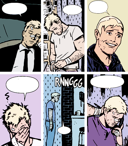
@Jinxfarer kate is definitely comic accurate imo!! the only problem i have with clint is that it looks like they tried to combine comic clint with mcu clint.
his face definitely looks more akin to comic likeness, but why isn’t he blonde?


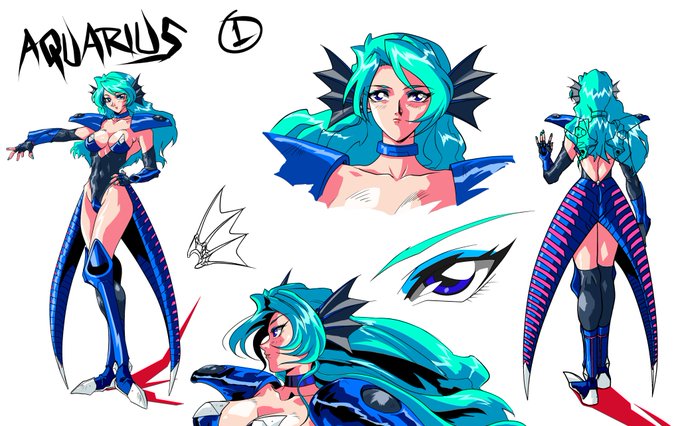
Aquarius second try. This one stuck around for awhile but imo she looked to much like Freya. At some point I ended up redrawing this character myself to get the ideas down pat.
#conceptart
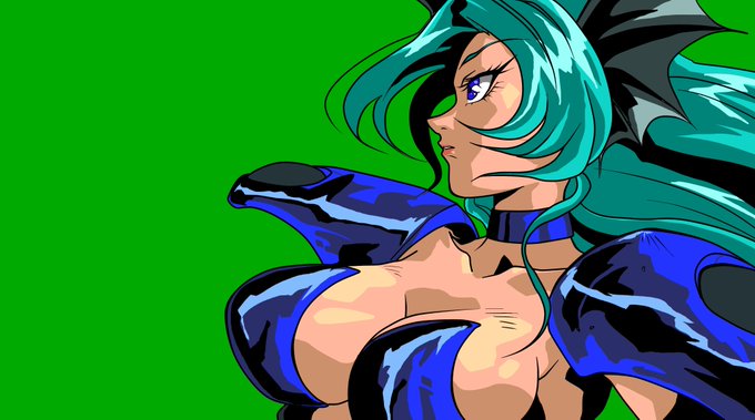
Our current artist first artwork of Aquarius her concepts are more refined here. She also looks a fair bit older something we objected to later on and is it me or do her ear covers look more like bat wings then fins? Still a good first try imo.
#originalcharacter #conceptart


Early design but in sprite form. She was quite pale but always had the bluish hair. Though her original human color was blonde. Her tail here works but it quite generic imo. You can see here she always had unique ear coverings that look like fins.
#conceptart #IndieGameDev